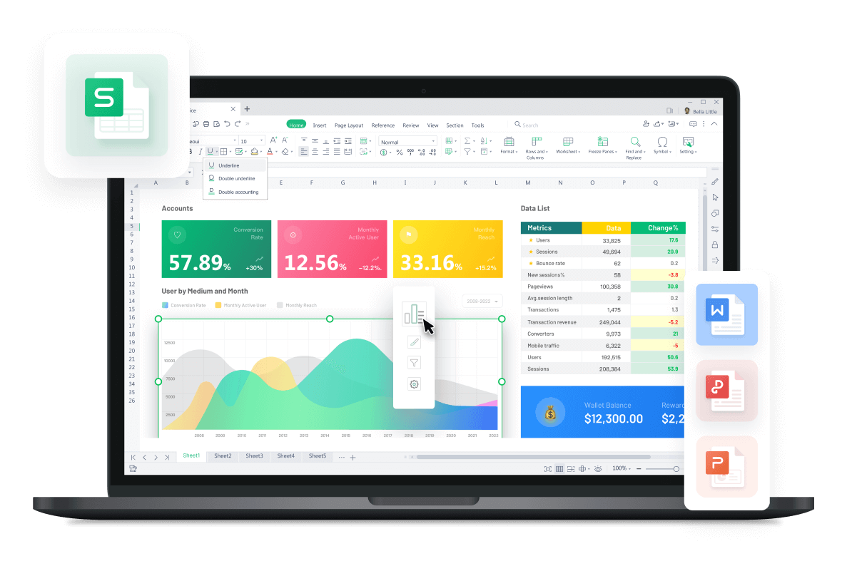
Free All-in-One Office Suite with PDF Editor

Edit Word, Excel, and PPT for FREE.
Read, edit, and convert PDFs with the powerful PDF toolkit.
Microsoft-like interface, easy to use.
Windows • MacOS • Linux • iOS • Android
How to create dynamic charts for data visualization in excel
Welcome to WPS Official Academy to check the contents of how to make dynamic charts to visualize data in WPS Spreadsheet.In today's tutorial, you will know how to turn a plain table into a powerful chart in WPS Spreadsheet, the place where magic happens.
· Create dynamic charts to achieve data visualization
Dynamic charts are often used in our practical work. Use the mouse to select different preset items in the slicer, and then the chart will change with the selected items.
Click here to see how to make the table and the created chart change at the same time.
 The magical finished results
Slicer is a very useful feature in WPS Spreadsheet. It can only be applied to a PivotTable and can help users quickly filter various data. Let’s explore how the slicer can be more powerful when coming across the PivotTable. Why not click here to start with how to insert and change the name of the slicers?
The magical finished results
After learning how to create a PivotTable and slicer, let’s step to advanced tutorials that enable data visualization.
Do you want to know who is another perfect match for PivotTable? Click here to find the answer.
Spoiler: This is what we get, and you can try it on your own!
WPS Academy not only covers tutorials about the basic charts of Excel, like what we learned in the previous tutorial: How to create charts for data visualization in excel, but also teach you advanced skills for making dynamic charts.With these tutorials, you get familiar with bubble charts, k-line charts, radar charts, scatter charts, pie charts and magical PivotTable in WPS Spreadsheet. If you are interested in other powerful charts, stay tuned for more useful tutorials!
· What is data visualization in WPS Spreadsheet
According to Wikipedia, Data visualization is an interdisciplinary field that deals with the graphic representation of data. It is a particularly efficient way of communicating when the data is numerous as for example a time series.
In WPS Spreadsheet, you can turn the mundane data into magic charts, graphs. You can also upgrade your plain table to PivotTable.
The powerful PivotTable and its friend Slicer can be free to learn in WPS Academy. There's no denying the fact both of them make our lives easier and if you're an Excel user, you can refer to WPS Speadsheet guide to learn other charts with easy steps.WPSAcademy lists some of the most important Microsoft Excel shortcuts for Windows, PC, Mac, Linux, Android, and iOS devices to make your work easier.WPS Office Academy teaches strategies for free. Come and give it a try!
Also Read:
- 1. Top 10 best excel templates of Gantt Charts free download 2022
- 2. 10 Excel Graph Paper Templates to Make Data Visualization Easy
- 3. Conditional Formatting for data visualization
- 4. How to create charts in Word
- 5. 10 Gorgeous Excel Graph Templates for Data Analysis and Visualization
- 6. How to add a second axis in excel charts (Step-by-Step)


15 years of office industry experience, tech lover and copywriter. Follow me for product reviews, comparisons, and recommendations for new apps and software.
