
'%3e%3cpath%20d='M8%200C12.4183%200%2016%203.58172%2016%208C16%2012.4183%2012.4183%2016%208%2016C3.58172%2016%200%2012.4183%200%208C0%203.58172%203.58172%200%208%200ZM11.6162%204.38379C11.2257%203.99337%2010.5927%203.99338%2010.2021%204.38379L8%206.58594L5.79785%204.38379C5.40732%203.99334%204.77429%203.99329%204.38379%204.38379C3.99331%204.77429%203.99335%205.40733%204.38379%205.79785L6.58594%208L4.38379%2010.2021C3.99348%2010.5927%203.99341%2011.2257%204.38379%2011.6162C4.77426%2012.0066%205.40734%2012.0065%205.79785%2011.6162L8%209.41406L10.2021%2011.6162C10.5927%2012.0066%2011.2257%2012.0067%2011.6162%2011.6162C12.0067%2011.2257%2012.0066%2010.5927%2011.6162%2010.2021L9.41406%208L11.6162%205.79785C12.0066%205.40735%2012.0066%204.77429%2011.6162%204.38379Z'%20fill='%23080E17'%20fill-opacity='0.46'/%3e%3c/g%3e%3cdefs%3e%3cclipPath%20id='clip0_3761_713'%3e%3crect%20width='16'%20height='16'%20fill='white'/%3e%3c/clipPath%3e%3c/defs%3e%3c/svg%3e)


'%3e%3cpath%20fill-rule='evenodd'%20clip-rule='evenodd'%20d='M21.4999%2010.9993C21.4999%205.20009%2016.7986%200.498901%2010.9993%200.498901C5.19994%200.498901%200.498657%205.20009%200.498657%2010.9993C0.498657%2016.2404%204.33858%2020.5844%209.35855%2021.3722V14.0346H6.69238V10.9993H9.35855V8.68594C9.35855%206.05427%2010.9262%204.60062%2013.3248%204.60062C14.4736%204.60062%2015.6753%204.80571%2015.6753%204.80571V7.38979H14.3512C13.0468%207.38979%2012.64%208.19921%2012.64%209.0296V10.9993H15.5523L15.0867%2014.0346H12.64V21.3722C17.66%2020.5844%2021.4999%2016.2404%2021.4999%2010.9993Z'%20fill='%231568EA'/%3e%3c/g%3e%3c/svg%3e)


Histograms are valuable tools for visualizing data distributions, aiding data analysis, and facilitating effective communication of insights. However, users may need help creating Excel histograms, leading to potential misinterpretations. In this guideline, we offer a comprehensive step-by-step approach to making histograms in Excel, ensuring readers can confidently create informative visualizations.
What is a Histogram?
Histograms are crucial data analysis tools in business, science, and engineering. They visually depict the frequency distribution of a variable within a specific range. Each column represents a value range, and its height indicates the frequency of occurrences in that range. They help reveal patterns, trends, and outliers not easily discernible in data tables. For instance, in business, histograms can analyze sales, customer feedback, or employee satisfaction, while in science and engineering, they can analyze experimental data, test results, or error rates.
How to Make a Histogram in Excel
Histograms are powerful tools for visualizing and analyzing data in the business world. They offer a convenient and efficient method to visualize data distribution and detect underlying patterns. This segment will present a detailed guide on generating a histogram in Excel 2022. We will also cover how to make a histogram in Excel on Mac and create a histogram with two data sets.
Step 1: Organizing the Data and Preparing the Worksheet
Before creating a histogram, you need to organize your data in a worksheet. Start by entering your data into columns or rows, ensuring it is consistent and accurate. Label your columns and rows so it’s clear what each data represents.
Next, create a new worksheet and enter the following headers:
Bin Range: This is where you’ll enter your bin ranges.
Frequency: This is where your data’s frequency will be calculated.
Now you’re ready to move on to the next step.
Step 2: Using Excel's Data Analysis Toolpak to Generate the Histogram
Excel has a built-in tool that you can use to create a histogram: the Data Analysis Toolpak. Here’s how to use it:
1. Go to the Data tab in the ribbon.
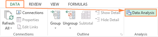
2. Please select the "Data Analysis" button located within the Analysis group.
3. Select “Histogram” from the list and click OK.

4. In the Histogram dialog box, enter the input range (the range of the data you want to analyze).
5. Next, enter the bin range (the range you created in the worksheet in Step 1).
6. Check the “Chart Output” box for a graphical representation of your histogram.

7. Click OK.

And that’s it! You have generated a histogram after successfully utilizing the Data Analysis Toolpak in Excel.
Step 3: Customizing the Histogram's Appearance and Labels
After obtaining the histogram, you can personalize and enhance it for better readability. Here are some things you can do:
Adjust the bin range – Change the bin range in your worksheet to see different distributions.
Change the chart type – You can change the chart type to a bar or line chart using the Chart Design tab in the ribbon.
Add chart elements – Add chart elements like titles, axis labels, or a legend under the Chart Design tab.
Customize the chart layout – Adjust the chart’s layout using the Chart Layout tab in the ribbon, including gridlines and chart style.
Step 4: Understanding and Interpreting the Histogram's Results
After creating a histogram in Excel, understanding its implications is crucial. Here are some key points to consider:
Each bar's height in the histogram corresponds to the frequency of data within the associated bin.
You can use the histogram to identify patterns in your data, including where the data is clustered, its range, and how dispersed it is.
Use the histogram to make decisions based on your data. Do you need to change your processes, marketing strategies, or data collection methods?
How to Make a Histogram in Excel from a Frequency Table
Histograms are frequently employed in the corporate realm to depict data visually. If you already have a frequency table, creating a histogram in Excel is easy. Here's how to make a histogram in Excel from a frequency table:
Prepare the Data: Arrange the frequency table in two columns, with the first representing the data set and the second representing the frequency of each data point.
Create Bins: Bins are the range of values the histogram will show. Decide on the range of data values you want to display in the histogram and then create bins with equal ranges. You can do this in Excel by creating a separate column with bin ranges.
Calculate the Bins: Use the FREQUENCY function to calculate the frequency of data in each bin. The result of applying the FREQUENCY function is an array depicting the items' occurrences within each bin.
Create A Chart: Select the data range that includes the bin ranges and their corresponding frequencies. Next, navigate to the 'Insert' tab located on the ribbon and opt for the 'Histogram' chart type. Once selected, Excel will promptly generate a histogram chart for your data.


How to Make a Histogram in Excel with Two Sets of Data
If you have two sets of data and want to create a histogram in Excel, you can do so by following these steps:
Prepare the Data: Organize your two data sets and decide on the range of data values you want to display in the histogram.
Create Bins: Create bins with equal ranges covering the data values you want to display.
Calculate the Bins for Each Data Set: Use Excel's FREQUENCY function to calculate the frequency of data in each bin for each data set. The output of the FREQUENCY function will be arrays that represent the frequencies of each bin for each data set.
Create A Chart: Select the data ranges that include bin ranges and their corresponding frequencies for each data set. Then, click the 'Insert' tab on the ribbon and select the 'Histogram' chart type. Excel will automatically create a histogram chart with two data sets on the same chart.

Best Free Alternative to Microsoft Excel - WPS Spreadsheet for Creating Histograms
While Microsoft Excel is a popular data analysis tool, other options that provide similar capabilities are available. One such alternative is the WPS Spreadsheet. WPS Spreadsheet is a spreadsheet program that offers many features similar to Excel but with the added convenience of ease of use and affordability.
WPS Spreadsheet can be very useful in creating histograms. Histograms are widely used in data analysis as a valuable tool for displaying the frequency of a variable within a particular range. With WPS Spreadsheet, users can easily create histograms following simple steps.
How to Make a Histogram in WPS Spreadsheet
To make a histogram in WPS Spreadsheet, users can follow these simple steps:
Check out Creating a Histogram using Google Spreadsheets.
Step 1: Prepare the Data


Like Excel, the initial phase of generating a histogram in a WPS Spreadsheet involves data preparation. Users need to ensure that the data is arranged in columns or rows and that it is organized in a logical way that makes it easy to analyze.
Step 2: Create a Frequency Table

To make a histogram in WPS Spreadsheet, it is recommended first to create a frequency table. Users can do this using the COUNTIF or FREQUENCY function in WPS Spreadsheet. The COUNTIF function counts the number of times a specific value appears in a data set, while the FREQUENCY function calculates the frequency of values in a data range.
Step 3: Create the Histogram

Once users have created the frequency table, they can use the chart wizard to create the histogram. The chart wizard provides many options for customizing the histogram, including changing the bin width, adjusting the X-axis and Y-axis scales, and adding labels and other design elements.
Benefits of Using WPS Spreadsheet for Creating Histograms
Benefits of using a WPS Spreadsheet for creating histograms:
1. Ease of use: WPS Spreadsheet provides a user-friendly interface, making histogram creation simple and intuitive.
2. Affordability: WPS Spreadsheet offers a cost-effective alternative to Excel, saving money without sacrificing functionality.
3. Similar features: Despite being more affordable, WPS Spreadsheet offers various features and capabilities comparable to Excel.
4. Quick customization: Users can efficiently customize histograms to suit their needs and preferences.
5. Time efficiency: Its user-friendly design makes creating histograms faster and more efficient in WPS Spreadsheets.
FAQs
How do I create multiple histograms?
Create a separate data set for each variable, then follow the same process for creating a single histogram.
How to make a histogram with two variables?
Use a scatter plot to plot the two variables against each other, then create a histogram of the resulting data.
What is the formula for a histogram?
D = F W, D=\frac{F}{W}, D=WF.
Summary
In summary, creating histograms in Excel empowers users to analyze and visualize data distributions effectively. By following our step-by-step guide, readers can easily generate accurate histograms. Additionally, WPS Spreadsheet is a noteworthy alternative to Microsoft Excel, enhancing data analysis capabilities and the convenience of histogram creation. Take your data analysis to the next level with Excel and WPS Office!

'%3e%3cpath%20d='M19.9911%204.11386V6.471H18.5894C18.0775%206.471%2017.7322%206.57814%2017.5536%206.79243C17.3751%207.00671%2017.2858%207.32814%2017.2858%207.75671V9.44421H19.9019L19.5536%2012.0871H17.2858V18.8639H14.5536V12.0871H12.2769V9.44421H14.5536V7.49779C14.5536%206.39064%2014.8632%205.53201%2015.4822%204.92189C16.1013%204.31177%2016.9257%204.00671%2017.9554%204.00671C18.8304%204.00671%2019.509%204.04243%2019.9911%204.11386Z'%20fill='%23333333'/%3e%3c/g%3e%3cdefs%3e%3cclipPath%20id='clip0_2938_8199'%3e%3crect%20width='16'%20height='16'%20fill='white'%20transform='translate(8%204.00671)'/%3e%3c/clipPath%3e%3c/defs%3e%3c/svg%3e)
'%3e%3cpath%20d='M17.5237%2010.7813L23.4811%204H22.0699L16.8949%209.88693L12.7648%204H8L14.2469%2012.9029L8%2020.0133H9.4112L14.8725%2013.7952L19.2352%2020.0133H24M9.92053%205.04213H12.0885L22.0688%2019.0224H19.9003'%20fill='%23333333'/%3e%3c/g%3e%3cdefs%3e%3cclipPath%20id='clip0_2938_8200'%3e%3crect%20width='16'%20height='16.0134'%20fill='white'%20transform='translate(8%204)'/%3e%3c/clipPath%3e%3c/defs%3e%3c/svg%3e)


