Free All-in-One Office Suite with PDF Editor

Edit Word, Excel, and PPT for FREE.
Read, edit, and convert PDFs with the powerful PDF toolkit.
Microsoft-like interface, easy to use.
Windows • MacOS • Linux • iOS • Android

How to add a sparkline in excel (Step-by Step )
Sparklines are charts that show visual representations of patterns in your sheet data in individual cells. A sparkline, for instance, may show you how each month compares to the previous one if you measure month-over-month improvement. You may include the line, column, and win-loss sparklines in your Excel spreadsheets. Here is an illustration of a line:

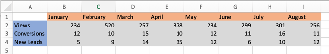
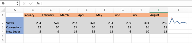
We'll utilise an example data table (shown below) that records views, conversions, and leads produced by a marketing campaign for this tutorial.
How to add a sparkline in excel online, 2016 and 2019
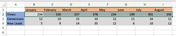
1. Choose the cells that should appear in your sparkline chart. In this illustration, I've chosen every cell between B2 and I2.
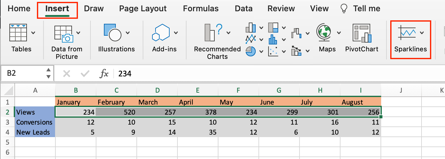
2. Choose Insert, then Sparklines, from the header toolbar.
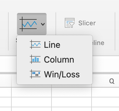
3. The type of sparkline chart you desire—line, column, or win-loss—should then be selectable from a dropdown menu. For this illustration, I chose a line.
4. A dialogue window will popup once you choose your favourite chart (as shown below). Enter the cell where you want the sparkline chart to appear in the text area labelled Select where you want to set the sparkline box.
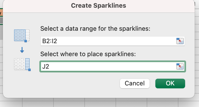
In order to achieve a complete representation and easily access your data, it is recommended practise to place the sparkline right next to the string of cells you are generating the chart for. I choose cell J2 for this illustration.
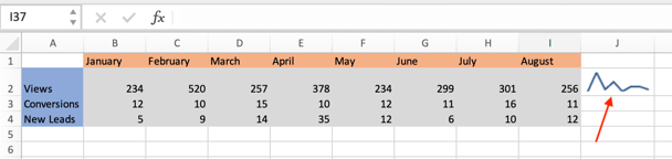
5. The cell you chose ought to display your sparkline chart. The sparkline for my sample data set can be seen in the figure below, which also depicts the trend in views over time for my marketing effort.
How to ungroup sparkline in excel
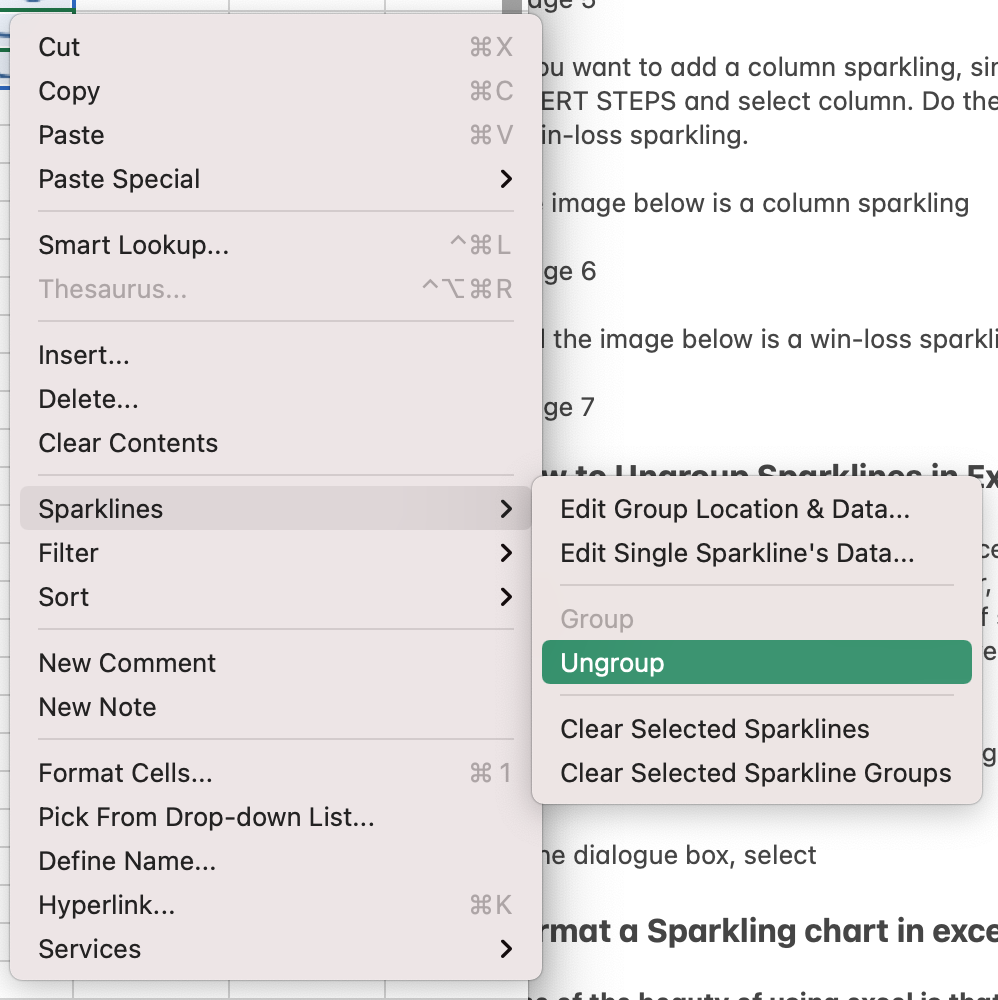
1. To ungroup a sparkline, use the right-click menu. I right-clicked column J3 for this illustration.
2. Select Sparklines, then Ungroup, from the popup menu.
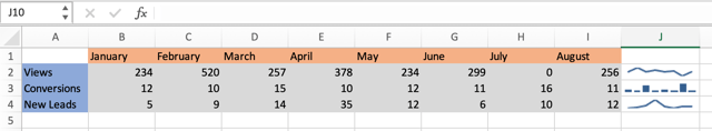
3. Select the chart by clicking on the sparkline you wish to modify, then go to the Sparkline header toolbar. Ungrouping sparklines and using different charts results in the appearance seen in the figure below.
How to mark data points in sparkline chart in excel
1. As illustrated in the figure below, choose the sparkline that you wish to alter, then go to the Sparkline header toolbar and choose your chosen data marker.
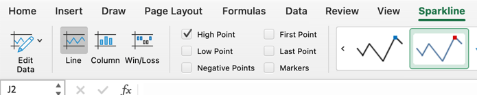
2. If I choose High Point, a marking on my related sparkline chart will show the month with the most views.
Note: This was an attempt to show you how to add a sparkline in excel online, 2016 and 2019 in both windows and mac.
To get the newest version of WPS Office, you must first access this operating interface.
You just need to have a little understanding of how and which way things work and you are good to go. With having this basic knowledge or information of how to use it, you can also access and use different other options on excel or spreadsheet. Also, it is very similar to Word or Document. So, in a way, if you learn one thing, like Excel, you can automatically learn how to use Word as well because both of them are very similar in so many ways. If you want to know more about WPS Office, you can download WPS Office to access, Word, Excel, PowerPoint for free.
Also Read:
- 1. How to add a second axis in excel charts (Step-by-Step)
- 2. How to add data labels in excel to graph or chart (Step-by-Step)
- 3. How to add a secondary axis in excel (Step-by-Step)
- 4. How to add times in excel automatically (Step-by-Step)
- 5. Add Developer Tab in Excel (Step-by-Step)
- 6. How to create a sparkline in WPS Spreadsheet.


15 years of office industry experience, tech lover and copywriter. Follow me for product reviews, comparisons, and recommendations for new apps and software.


