Free All-in-One Office Suite with PDF Editor

Edit Word, Excel, and PPT for FREE.
Read, edit, and convert PDFs with the powerful PDF toolkit.
Microsoft-like interface, easy to use.
Windows • MacOS • Linux • iOS • Android

Catalog
How to add line of best fit in excel on mac
A trendline, also known as a line of best fit, is a straight or curved line on a graph that depicts the data's overall pattern or direction. This analytical tool is frequently used to display data movement over time or a correlation between two variables.
How to add a line of best fit in excel online, 2016 and 2019
The procedure of adding the best fit line to your charts in newer software versions, such as Excel 2019, is pretty straightforward. To properly examine your data, you must first make a chart, after which you must add and edit the line. This will result in a best-fit line.
1. Open the Excel document to which the best fit line will be added. Check to see whether the worksheet already has data in it.
2. With the line of best fit, highlight the data you wish to examine. A chart will be created using the selected data.
3. Switch to the Insert tab using the Ribbon interface. Click the Insert Scatter (X, Y) or Bubble Chart icon in the Charts window, as illustrated in the figure below.
4. Select the first Scatter chart choice, as seen in the screenshot below. This will add a Scatter chart to your document, based on the data you marked before.
5. Right-click on any of the data points once the chart has been put into your worksheet. From the context menu, choose the Add Trendline option.
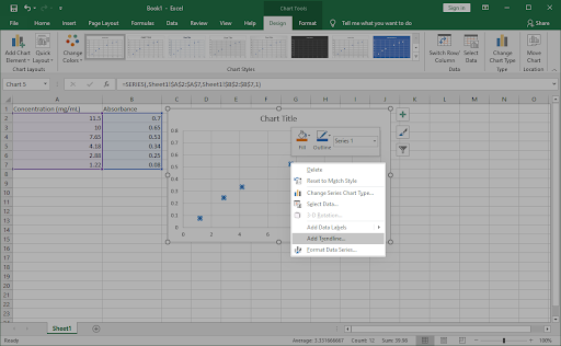
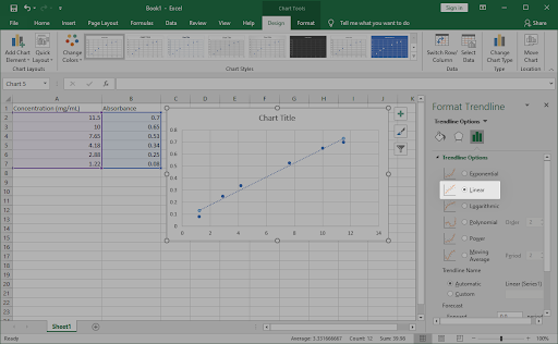
6. On the right side of the window, you should see a pane labelled Format Trendline open. Look for the Trendline Options tab and then choose Linear from the drop-down menu.
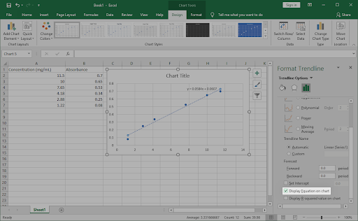
7. Make sure the checkbox next to Display Equation on Chart is enabled at the bottom of the Trendline Options section. The arithmetic calculations that were utilised to construct the best fit line are displayed below. (Optional)
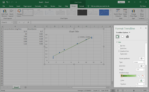
8. Switch to the Fill & Line and Effects tabs in the Format Trendline window to adjust how the line of best fit looks on the chart. You may completely adjust the appearance of the line, making it stand out from the rest of your chart.
9. To quit the Format Trendline window, click the X in the top-right corner. With your line of best fit entered into the chart, you should be able to work.
Tip: Customize the design and colours of your chart using the Design tab once it has been selected. You may design custom charts that are formatted exactly as you want them. Combine this with the trendline customisation tools to make your charts really unique.
How to choose the best trendline for your data in excel
Linear:
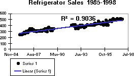
With basic linear data sets, a linear trendline is a best-fit straight line. If the pattern in your data points resembles a line, your data is linear. A linear trendline indicates that something is steadily rising or declining.
A linear trendline clearly indicates that refrigerator sales have continuously increased over a 13-year period in the following example. The R-squared score is 0.9036, indicating that the line is well-fitting to the data.
Logarithmic:
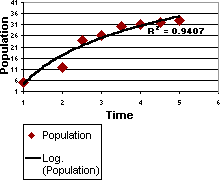
A logarithmic trendline is a best-fit curving line that is particularly effective when the rate of change in the data rapidly climbs or drops before levelling out. Negative and positive numbers can be used in a logarithmic trendline.
A logarithmic trendline is used in the following example to show expected population increase of animals in a fixed-space region, where population levelled out as animal space reduced. The R-squared score of 0.9407 indicates that the line fits the data rather well.
Note: Above written tutorial was an attempt to explain how to add line of best fit in excel on Windows and Mac and we have also shown how to choose the best trendline for your data in excel.
You just need to have a little understanding of how and which way things work and you are good to go. With having this basic knowledge or information of how to use it, you can also access and use different other options on excel or spreadsheet. Also, it is very similar to Word or Document. So, in a way, if you learn one thing, like Excel, you can automatically learn how to use Word as well because both of them are very similar in so many ways. If you want to know more about WPS Office, you can download WPS Office to access, Word, Excel, PowerPoint for free.
Introduction to WPS:
WPS stands for Writer Presentation Spreadsheet Office. A complete office suite, WPS Office comes with word processing, spreadsheet capabilities, and a presentation maker. It is well known for its free templates and suitability with Microsoft Office.
These templates cover various applications, including resumes, invitations, and formal corporate presentations. They give users access to pre-made editable formats that make creating different types of documents much more straightforward.
Visit the Template Store from the WPS Office program for more template options. To discover a template that meets your needs, select "Template" from the main interface, then "More Templates," and then look through the categories.
These different templates are available for download and can be used for several activities, simplifying and improving the look of your work. Below is the look of the WPS office.
When you click Sheets, it opens an Excel workbook where you can add your data, make graphs, tables, etc. Below is the image of the workbook.
How to Add the Best-Fit Line in WPS?
The initial phase in using a best-fit line within WPS Office is to choose a specific sheet in your workbook wherein the information is previously inputted. Through doing this, you give WPS Office permission to examine the data and graph it.
Step-by-Step Guide:
You can follow easy-to-understand and step-by-step guidelines with the graphical representation provided below.
Step 1: Open the Excel workbook in WPS Office
Step 2: Analyze the data in the worksheet. Check if the workbook already contains the data; add data to make a best-fit line. I added the data to the workbook. Below is the image of the data that I have added.
Step 3: Create a graph with the above data. Mark the data you wish to look at with the best-fit line. The chosen data is used to build the Chart. I have chosen the following data as shown in the picture of Excel and create the graph by using this.
Step 4: Select a suitable scatter plot. Using the ribbon interface tab, change to Insert. In the chart window, click the Insert Scatter Chart (X, Y) or Bubble Chart icon, as shown below, with a red area.
In the image that is shown below, you can choose the first scatter plot option. A scatter plot will be added to the document based on the data you previously labeled. It is shown in the form of dots.
Right-click any data point after inserting the Chart into the worksheet, or you can select the Chart element in WPS Office as represented in the red square to create a trendline; it shows you a trendline option, so you can choose it and make a trendline in your graph. Choose the Trendline option from the context menu, represented by the red square. Below is the image of these steps:
When you click on Trendline, A dialogue box shows Add Trendline. When you select the Speed column and Click on OK, it will add a trendline according to your graph, as shown in the image below:
By default, the trend line will be added in WPS. Below is the image of the Trendline.
Enter the Trend line to alter it, and a submenu with numerous options will appear. If any person wants to alter the shape or direction of the Trendline, you can select it according to your choice. Below is the image of the Trendline Options.
Step 5: If you want to customize it in Microsoft Excel, A window panel labeled "Format Trendline" should be shown on the window's right side. Select Linear from the drop-down box under the Trend Line Options tab. The image of this option is shown below.
Step 6: Activate the checkbox of Display equation on the Chart at the end of Format Trendline bar. By scrolling down to the Trendline Options section, Verify the following checkbox to show formulas on the Chart is selected. The following diagram illustrates the mathematical computations needed to create the best-fit line. Below is the image of the checkbox that you can select while adding the equation on the chart and display the R-squared value in the chart.
You can also select Display R-Squared value on the Chart, which helps you determine mathematical calculations.
Step 7: Switch to the proper tab. To change the appearance of the best line on the Chart, switch to the Fill & Line and Effects tabs in the Format Trendline box. You can change how it looks to make The line distinct from the others in the Chart.
Below is the image of the Fill & Line tab in MS Excel. You can edit the graph according to your choice.
The following image below is the Effect tab in MS Excel to change the effect of your graph like add color, presets, size, blur, glow settings, soft edges etc. It depends on you to change the shadow, Glow, and Soft Edges. You can change any settings of your graph if you want.
FAQ
What is the difference between linear and nonlinear regression?
A non-linear correlation between a dependent variable and a number of independent variables might take a variety of shapes, and this association is modeled by nonlinear regression, a method used in statistics. In contrast to linear regression, which assumes a linear association among the variables, nonlinear regression approaches enable a highly adaptable model that is capable of matching greater complexity of patterns in the information being analyzed. Different equations must be used in nonlinear regression as opposed to linear regression in order to calculate the variables that comprise the model and make estimates. Whenever a previous understanding of the data indicates that a linear model might not be proper, it is frequently used.
An Example of linear regression is the relationship between a person's weight and height is linear. Therefore, this demonstrates a linear link between a person's weight and height. This suggests that when we increase a person's height, their weight will follow suit.
An example of a nonlinear model is a random forest regression. Random forest models are ensemble learning techniques for regression that build a forest of regression trees before averaging the results. There is no mathematical formula for this.
How can I judge the accuracy of a model?
The most popular machine learning model technique for assessing classification issues is accuracy. Because of this, it's critical to comprehend what accuracy is, how to measure it, and what flaws it has in various machine-learning applications.
Several techniques can be used to assess a model's accuracy, including hypothesis testing (By using a representative sample of the target population, the hypothesis is tested to conclude that population. Additionally, to establish the connection between two data sets, the assumption is put to the test.), or by calculating coefficients of determination (When forecasting the result of an event, the coefficient of determination is a statistical measurement that looks at how changes in one variable may be explained by the difference in another one.
In other words, investors significantly rely on this coefficient, also known as r-square or r2, when performing trend analysis to determine how strong the linear relationship is between two variables). which assess how well the model interprets the observed data and calculates. So this represents the difference between actual observations and predicted values in the model. These techniques can evaluate the model's fit and prediction ability, or by calculating residuals which is
(The difference between actual and expected values is known as a residual. The remaining can be compared to a distance. So, our model performs better at making predictions the closer the residual gets to zero.).
Summary
The best-fit line in Excel is a line that illustrates the connection between two variables in a dataset. This article represents the detailed view to add the best fit line so that everyone can easily understand. WPS Office is a complete office suite with word processing, spreadsheet capabilities, and a presentation maker. It is well-known for its free templates and compatibility with Microsoft Office, offering a variety of features for easy presentation and document creation.
Also Read:
- 1. How to add strikethrough line in excel
- 2. How to make excel cells expand to fit text automatically in excel
- 3. How to Adjust Excel Cells to Fit Text
- 4. How to add vertical line to excel chart in excel graph
- 5. How to add trendline in excel line graph
- 6. Easy Shortcut: How to fit text to cell in Excel


15 years of office industry experience, tech lover and copywriter. Follow me for product reviews, comparisons, and recommendations for new apps and software.


