
'%3e%3cpath%20d='M8%200C12.4183%200%2016%203.58172%2016%208C16%2012.4183%2012.4183%2016%208%2016C3.58172%2016%200%2012.4183%200%208C0%203.58172%203.58172%200%208%200ZM11.6162%204.38379C11.2257%203.99337%2010.5927%203.99338%2010.2021%204.38379L8%206.58594L5.79785%204.38379C5.40732%203.99334%204.77429%203.99329%204.38379%204.38379C3.99331%204.77429%203.99335%205.40733%204.38379%205.79785L6.58594%208L4.38379%2010.2021C3.99348%2010.5927%203.99341%2011.2257%204.38379%2011.6162C4.77426%2012.0066%205.40734%2012.0065%205.79785%2011.6162L8%209.41406L10.2021%2011.6162C10.5927%2012.0066%2011.2257%2012.0067%2011.6162%2011.6162C12.0067%2011.2257%2012.0066%2010.5927%2011.6162%2010.2021L9.41406%208L11.6162%205.79785C12.0066%205.40735%2012.0066%204.77429%2011.6162%204.38379Z'%20fill='%23080E17'%20fill-opacity='0.46'/%3e%3c/g%3e%3cdefs%3e%3cclipPath%20id='clip0_3761_713'%3e%3crect%20width='16'%20height='16'%20fill='white'/%3e%3c/clipPath%3e%3c/defs%3e%3c/svg%3e)


'%3e%3cpath%20fill-rule='evenodd'%20clip-rule='evenodd'%20d='M21.4999%2010.9993C21.4999%205.20009%2016.7986%200.498901%2010.9993%200.498901C5.19994%200.498901%200.498657%205.20009%200.498657%2010.9993C0.498657%2016.2404%204.33858%2020.5844%209.35855%2021.3722V14.0346H6.69238V10.9993H9.35855V8.68594C9.35855%206.05427%2010.9262%204.60062%2013.3248%204.60062C14.4736%204.60062%2015.6753%204.80571%2015.6753%204.80571V7.38979H14.3512C13.0468%207.38979%2012.64%208.19921%2012.64%209.0296V10.9993H15.5523L15.0867%2014.0346H12.64V21.3722C17.66%2020.5844%2021.4999%2016.2404%2021.4999%2010.9993Z'%20fill='%231568EA'/%3e%3c/g%3e%3c/svg%3e)


Right from the start, Microsoft Office's new default font is now Aptos, replacing Calibri. While you can discern a clear contrast between the older font and the new one, pinpointing the precise differences and understanding their impact on your writing is crucial. In this article, we'll look into the distinctions between Calibri and Aptos to shed light on how they influence your writing experience.

What’s Aptos Font and Calibri Font?
Aptos
Aptos, formerly known as Bierstadt, is a modern sans-serif typeface developed by Steve Matteson. Released in 2023, Aptos replaces Calibri as the default font in the Microsoft Office suite. It offers a range of styles including Light, Regular, Semibold, Bold, Extrabold, Black, and their corresponding italics. It includes Aptos Display, Aptos Narrow, Aptos Mono, and Aptos Serif.
Calibri
Calibri, a digital sans-serif typeface family, was designed by Luc(as) de Groot and released in 2007 as the default font for Microsoft Office. It features a subtly rounded design and is part of the ClearType Font Collection. Calibri replaced Times New Roman in Word and Arial in PowerPoint, Excel, Outlook, and WordPad. However, in January 2024, Microsoft introduced Aptos as the new default font for Office, marking the end of Calibri's 17-year reign.
Microsoft's decision to replace Calibri with Aptos marks a significant shift in typography within the Office ecosystem. While Calibri has been a familiar presence for over a decade, Aptos brings a fresh and contemporary feel to documents, presentations, and spreadsheets. With its clean lines and modern aesthetic, Aptos offers users a new canvas to express their ideas effectively.
Despite the change, Calibri's legacy remains strong, with many users still preferring its familiar appearance and readability. For those who have grown accustomed to Calibri's warmth and softness, the transition to Aptos may require some adjustment. However, Microsoft's thoughtful consideration in selecting Aptos ensures that users can expect a seamless experience, whether they choose to utilize the new default font or stick with the trusted familiarity of Calibri.
What Are the Characteristics of Aptos and Calibri?
Below are characteristics of both the font’s that will help distinguish between Calibri vs Aptos better:
Characteristics of Aptos Font:
Horizontal and vertical stroke endings inspired by Helvetica.
Removal of the distinctive tail of the lowercase "a" and addition to the "l" to prevent confusion with "I".
Slightly irregular shapes of uppercase "O" and "R" and lowercase "a".
Double-story lowercase "g" with an angled stem and rounded uppercase "G".
Swing tail of uppercase "R".
Wide contours for lowercase "b", "c", "p" and uppercase "C".
Circular dots in punctuation marks, diacritics, and lowercase "i" and "j".
Curved top flag of numeral "1" based on Arial.
Curved tail of uppercase "Q" meeting its bowl.
Characteristics of Calibri Font:
Subtly rounded stems and corners visible at larger sizes.
"True italic" sloped form with handwriting influences.
Characters from Latin, Latin extended, Greek, Cyrillic, and Hebrew scripts.
Extensive use of OpenType formatting, including ligatures, lining and text figures, and alternate f and g.
Unsupported features in Office include true small caps, all-caps spacing, superscript and subscript glyphs, and arbitrary fractions.
Potential source of confusion with visible homoglyphs, particularly the indistinguishability of lowercase "l" and uppercase "i".
Similarities to de Groot's TheSans family and humanist fonts.
Desire to add Bulgarian alphabet variant letterforms in the future.
How to Change the Default Font in Microsoft Office?
Microsoft Office applications now feature Aptos as the default font. However, users have the flexibility to personalize their font preferences individually for each application. Let's delve into the steps to modify the default font in Word, Excel, PowerPoint, and Outlook.
Microsoft Outlook
Step 1: Head over to the File menu, it's in the top left corner of your Outlook window.

Step 2: Click on Options. This will open a settings window.

Step 3: Look for the Mail tab, click on it to switch to the email settings.
Step 4: Time to find the font controls! Click on the button labeled "Stationery and Fonts".

Step 5: We can change the font for new emails and replies separately. Choose which one you want to adjust first (New Mail messages or Replying or Forwarding messages).
Step 6: Click the "Font" button, this will open a new window with all sorts of font options.

Step 7: Now, simply pick a new font from the "Font" list. You can also change the size and style if you like.
Step 8: Once you're happy with your choice, click "OK" to close the Font window.

Step 9: Don't forget to save your changes! Click "OK" again in the Stationery and Fonts window.
Microsoft Word
Step 1: Open up a brand new document in Microsoft Word. Take a moment to notice the font being used – it's probably Aptos by default.

Step 2: Click the tiny arrow next to the font name on the Home tab, this will open a box full of font options.

Step 3: In the "Font" dialog box, find a font that suits your style. Maybe Calibri catches your eye? Choose your favorite from the "Fonts" list.

Step 4: Want to make this your go-to font for all future documents? Click the button labeled "Set As Default" in the bottom left corner.

Step 5: Here's the important part! You'll be asked where you want to apply this change. Since you want this font for everything you write from now on, choose "All documents based on the Normal Template" and click "OK".

Step 6: Now, whenever you open a new document in Word, your chosen font will be waiting for you.

Microsoft Excel
Step 1: Go ahead and create a brand new workbook in Excel.
Step 2: You might notice the default font is currently set to Aptos Narrow.

Step 3: Click on the "File" tab in the top left corner of your screen.

Step 4: On the left-hand side, you'll see a button called "More". Click on that, and then select "Options" from the menu that appears.

Step 5: In the "Options" menu, we're looking for the "General" section. Navigate over to that tab, and then find the section titled "When creating new workbooks".
Step 6: In the "Use this font as the default font" field, you can choose any font that you want as your go to font. Don't forget to click "OK" to save your selection.

Step 7: Excel might pop up a message asking you to restart the program so the changes can take effect. Press “OK” and restart Excel, to make sure the font settings are effective.

Microsoft PowerPoint
Step 1: Open PowerPoint and create a brand new presentation.
Step 2: Click on the "View" tab at the top of the window. Then, locate and choose the option labeled "Slide Master". This will open a special view that controls the overall design elements of your slides.

Step 3: Within the Slide Master view, look for the "Font" option on the ribbon. Click the dropdown menu next to Font option and choose the font you want to become the new default for all your presentations.

Step 4: Once you've selected your desired font, click the button labeled "Close Master View" to return to your main presentation view.

Step 5: Saving the Template: Navigate to the "File" tab located at the top left corner of the window.

Step 6: From the dropdown menu, select the option "Save As".
Step 7: In the "Save As" window, there's a dropdown menu for "Save as type". Change the selection from the default to "PowerPoint Template (*.potx)".

Step 8: Click on the button labeled "More options" to reveal additional settings for saving the file.

Step 9: In the "More options" window, adjust the save location to "C:\Users[Your Username]\AppData\Roaming\Microsoft\Templates", ensuring to substitute "[Your Username]" with your PC's name.
Step 10: In the "File name" section of the "Save As" window, rename the file to "Blank". This specific name tells PowerPoint to use this file as the default template for all new presentations.
Step 11: Click the "Save" button to confirm and finalize the changes you've made.

Why Aptos Replaces Calibri as Microsoft Office's New Default Font?
User Feedback: Numerous users expressed a desire for a change in default font, signaling a need for a refreshing update.
Modernization: Aptos represents a contemporary design choice, aligning with current trends and user preferences.
Enhanced Readability: Aptos offers improved legibility and readability, enhancing the overall user experience.
Increased Compatibility: Aptos ensures seamless compatibility across various platforms and devices, catering to the diverse needs of users worldwide.
Freshness: After 17 years of Calibri's dominance, the introduction of Aptos brings a sense of novelty and freshness to the Microsoft Office suite, revitalizing the user interface.
Design Consistency: The transition to Aptos allows for greater design consistency within the Microsoft Office ecosystem, promoting a cohesive and unified visual identity.
Technological Advancements: Aptos leverages advancements in font technology, ensuring optimal rendering and performance across different screen resolutions and devices.
Response to User Engagement: Microsoft's decision to replace Calibri with Aptos reflects a proactive response to user engagement and feedback, demonstrating a commitment to meeting user needs and preferences.
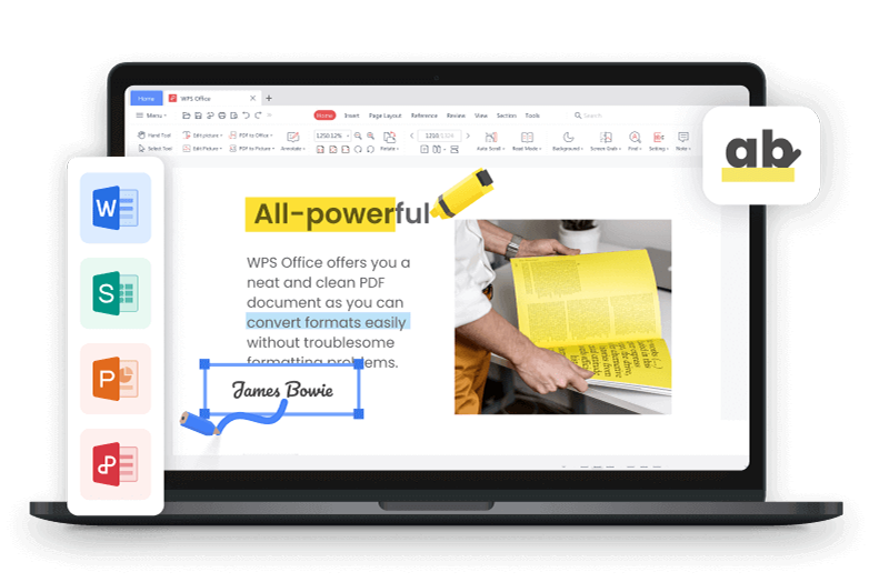
Best Alternative to Microsoft Office - WPS Office
WPS Office competes strongly with Microsoft Office, offering a comprehensive suite of tools including Writer, Presentation, and Spreadsheet. With seamless compatibility across operating systems such as Mac, Windows, and Linux, users can effortlessly create, share, and view documents anytime, anywhere. However, the recent switch in Microsoft Office's default font from Calibri to Aptos has stirred mixed emotions among users. WPS Office provides a convenient solution by allowing users to continue their documentation using the familiar Calibri font, eliminating the need for constant font adjustments.

FAQs
1. Can you explain the difference between serif and sans-serif fonts?
Serif and sans-serif are two common classifications of fonts. The key distinction lies in the presence or absence of small decorative strokes attached to the ends of letters.
Serif fonts: These fonts have little extensions, sometimes called "feet" or "tails." Examples include Times New Roman, Garamond, and Georgia. Serif fonts are often perceived as classic, elegant, or formal due to their traditional design.
Sans-serif fonts: These fonts lack the decorative strokes, resulting in a clean and modern look. Common examples include Arial, Helvetica, and Calibri. Sans-serif fonts are often described as simple, minimalist, or casual.
2. When should I use Calibri over Aptos Display?
Calibri is a versatile sans-serif font that's a good choice for a variety of uses, including presentations, documents, and emails. It's clear, readable, and works well in both large and small sizes. Calibri might be a better option than Aptos Display when you need a font that's easy to read for extended periods or for presentations with a lot of text. Calibri can also be a good choice if you want a more neutral font that won't overpower the content of your presentation.
3. Is Aptos a good font to work with?
Aptos can be a good font, but it depends on what you're using it for. Here's a breakdown of its strengths and weaknesses:
Strengths:
Modern and professional: Aptos has a clean, geometric design that conveys a modern and professional feel.
Versatility: It can be used for a variety of purposes, including documents, presentations, and marketing materials.
Readability on screens: Aptos is designed to be sharp and clear on high-resolution screens, making it suitable for digital content.
Wide language support: While the font itself doesn't directly impact language support, Aptos characters are designed to accommodate a broad range of languages.
Weaknesses:
Readability for large text blocks: The condensed spacing and lack of stroke contrast can make Aptos slightly less readable for lengthy passages of text.
Emphasis on headlines: Due to its bold nature, Aptos might be better suited for headlines and titles where you want to grab attention.
Embracing Font Diversity: Finding Your Perfect Fit in Office Suites
At this point, you likely recognize the distinct disparity between Aptos Vs Calibri fonts. However, it's important to acknowledge that regardless of the change, it's worthwhile to explore the plethora of fonts available across various office suites. Find the one that resonates with your style, effectively communicates your message, and suits your specific needs. If the recent transition has been bothersome, consider downloading WPS Office, where seamlessly working with your documents in Calibri is effortlessly simple.

'%3e%3cpath%20d='M19.9911%204.11386V6.471H18.5894C18.0775%206.471%2017.7322%206.57814%2017.5536%206.79243C17.3751%207.00671%2017.2858%207.32814%2017.2858%207.75671V9.44421H19.9019L19.5536%2012.0871H17.2858V18.8639H14.5536V12.0871H12.2769V9.44421H14.5536V7.49779C14.5536%206.39064%2014.8632%205.53201%2015.4822%204.92189C16.1013%204.31177%2016.9257%204.00671%2017.9554%204.00671C18.8304%204.00671%2019.509%204.04243%2019.9911%204.11386Z'%20fill='%23333333'/%3e%3c/g%3e%3cdefs%3e%3cclipPath%20id='clip0_2938_8199'%3e%3crect%20width='16'%20height='16'%20fill='white'%20transform='translate(8%204.00671)'/%3e%3c/clipPath%3e%3c/defs%3e%3c/svg%3e)
'%3e%3cpath%20d='M17.5237%2010.7813L23.4811%204H22.0699L16.8949%209.88693L12.7648%204H8L14.2469%2012.9029L8%2020.0133H9.4112L14.8725%2013.7952L19.2352%2020.0133H24M9.92053%205.04213H12.0885L22.0688%2019.0224H19.9003'%20fill='%23333333'/%3e%3c/g%3e%3cdefs%3e%3cclipPath%20id='clip0_2938_8200'%3e%3crect%20width='16'%20height='16.0134'%20fill='white'%20transform='translate(8%204)'/%3e%3c/clipPath%3e%3c/defs%3e%3c/svg%3e)


