
'%3e%3cpath%20d='M8%200C12.4183%200%2016%203.58172%2016%208C16%2012.4183%2012.4183%2016%208%2016C3.58172%2016%200%2012.4183%200%208C0%203.58172%203.58172%200%208%200ZM11.6162%204.38379C11.2257%203.99337%2010.5927%203.99338%2010.2021%204.38379L8%206.58594L5.79785%204.38379C5.40732%203.99334%204.77429%203.99329%204.38379%204.38379C3.99331%204.77429%203.99335%205.40733%204.38379%205.79785L6.58594%208L4.38379%2010.2021C3.99348%2010.5927%203.99341%2011.2257%204.38379%2011.6162C4.77426%2012.0066%205.40734%2012.0065%205.79785%2011.6162L8%209.41406L10.2021%2011.6162C10.5927%2012.0066%2011.2257%2012.0067%2011.6162%2011.6162C12.0067%2011.2257%2012.0066%2010.5927%2011.6162%2010.2021L9.41406%208L11.6162%205.79785C12.0066%205.40735%2012.0066%204.77429%2011.6162%204.38379Z'%20fill='%23080E17'%20fill-opacity='0.46'/%3e%3c/g%3e%3cdefs%3e%3cclipPath%20id='clip0_3761_713'%3e%3crect%20width='16'%20height='16'%20fill='white'/%3e%3c/clipPath%3e%3c/defs%3e%3c/svg%3e)


'%3e%3cpath%20fill-rule='evenodd'%20clip-rule='evenodd'%20d='M21.4999%2010.9993C21.4999%205.20009%2016.7986%200.498901%2010.9993%200.498901C5.19994%200.498901%200.498657%205.20009%200.498657%2010.9993C0.498657%2016.2404%204.33858%2020.5844%209.35855%2021.3722V14.0346H6.69238V10.9993H9.35855V8.68594C9.35855%206.05427%2010.9262%204.60062%2013.3248%204.60062C14.4736%204.60062%2015.6753%204.80571%2015.6753%204.80571V7.38979H14.3512C13.0468%207.38979%2012.64%208.19921%2012.64%209.0296V10.9993H15.5523L15.0867%2014.0346H12.64V21.3722C17.66%2020.5844%2021.4999%2016.2404%2021.4999%2010.9993Z'%20fill='%231568EA'/%3e%3c/g%3e%3c/svg%3e)


Charts help you to create a visual representation of your data, so you can create maximum impact on your readers. Whether you're a student, a professional, or just someone looking to know ins and outs of data representation, this guide will take you step-by-step through the process of creating various chart types in Excel.
Charts in Excel come in different styles, including bar charts, line graphs, pie charts, scatter plots, and more. They enable you to see patterns, trends, and relationships within your data, making it simpler to draw meaningful insights and communicate your findings effectively.
In this guide, we will tell you what are the types of Excel charts and how to create them using your data.
Part 1: What are the Excel Graph and Chart Types?
Excel offers a variety of graph and chart types to help users visualize and present data in different ways. These chart types are available in Microsoft Excel and can help you visualize and organize your data in the best way possible.
Here are some common Excel graph and chart types:
1. Line Graph

Function:
Line graphs display data points connected by straight lines, making them ideal for showing trends and changes over time or other continuous data. They are effective at illustrating how data values evolve and provide a clear visual representation of data trends.
Use Cases:
Tracking trends: Use line graphs to monitor changes in data over a specific time period, such as sales figures, stock prices, or temperature fluctuations.
Comparing multiple trends: When you have multiple data series that you want to compare, a line graph can help visualize how they evolve relative to each other.
Visualizing continuous data: Line graphs are suitable for any dataset with continuous data, such as scientific experiments, population growth, or survey responses over time.
2. Column Graph or Bar Graph
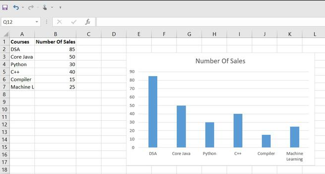
Function:
Column graphs (also known as bar graphs) use vertical or horizontal bars to represent data values, making them effective for visual comparisons between different categories or discrete data points.
Use Cases:
Comparing categories: Use column graphs to compare data across different categories, such as sales by region, student grades by subject, or monthly expenses by category.
Ranking data: Column graphs can effectively display rankings, showing which categories have the highest or lowest values.
Showing discrete data: When data points represent distinct items or events, a column graph can provide a clear visual representation of the differences between them.
3. Pie Graph or Chart
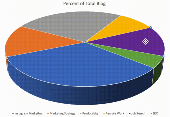
Function:
Pie charts use slices of a circular pie to represent data proportions, highlighting the percentage of each category relative to the whole. However, unlike bar and line charts, you can’t track changes in a pie graph over a certain period of time.
Use Cases:
Displaying proportions: Pie charts are ideal for illustrating how individual categories contribute to the whole, especially when you want to emphasize the relative size of each part.
Comparing a few categories: Pie charts work best when you have a small number of categories to display, as too many slices can make the chart difficult to read.
Presenting percentages: If your data represents percentages of a total, a pie chart can make it easy to visualize the distribution.
4. Combo Chart
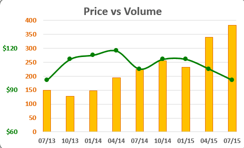
Function:
Combo charts combine two or more different chart types in a single chart, allowing you to display multiple data series effectively.
Use Cases:
Comparing different data types: Combo charts are useful when you have data of different scales or units that you want to display together. For example, you can combine a column chart to show sales figures and a line chart to display the sales trend over time.
Highlighting relationships: You can use a combo chart to visualize how two variables are related, such as comparing temperature and rainfall data for a specific region.
5. Area Chart
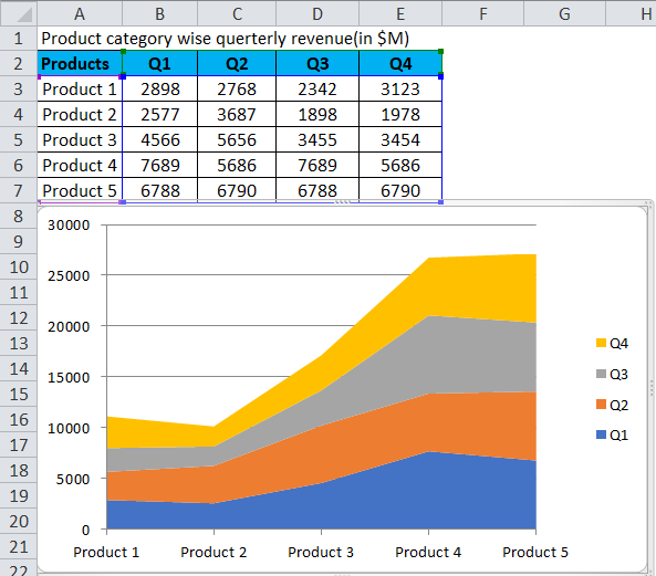
Function:
Area charts are similar to line graphs but with the area below the line filled, making them useful for showing cumulative totals or proportions.
Use Cases:
Showing accumulated data: Area charts are effective when you want to visualize how data accumulates or changes over time. For instance, you can use them to display the growth of a company's revenue over the years.
Comparing multiple data series: Area charts can be used to compare trends of different data series, as the filled areas make it easy to see the relative proportions.
6. Scatter Plot Chart
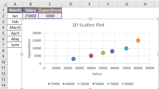
Function:
Scatter plots use points to represent individual data values, which are then plotted on the X and Y axes to analyze the relationship between two variables.
Use Cases:
Identifying correlations: Scatter plots are excellent for identifying relationships and correlations between two variables. For example, you can use a scatter plot to determine if there is a connection between study time and exam scores.
Outlier detection: Scatter plots can help identify outliers or anomalies in data, which are data points that significantly deviate from the overall pattern.
Data clustering: Scatter plots can reveal patterns or clusters in data when certain data points tend to group together.
Now that you have read and understood about all types of charts available in Microsoft Excel, it’s time you learn about how to create a chart in Excel. However, the type of chart will depend on the data you want to present and the insights you want to convey to your audience. Using the right chart type will help you communicate your data effectively and make it easier for your audience to interpret and understand the information.


Part 2: Easy Way to Create a Chart in Excel?
If you are looking to create your own chart in Excel, it’s pretty simple. All you have to do is read the below-mentioned steps and follow along to create your own chart from scratch. Let’s start!
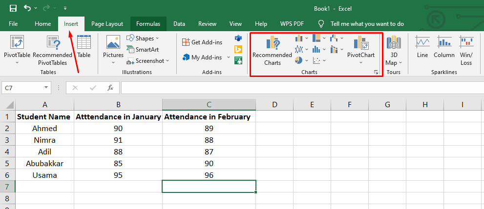
Step 1: Go to the MS Excel on your PC or MacBook and create a new file or open an already-available file with data on your PC. In this case, we will open a new file from scratch.
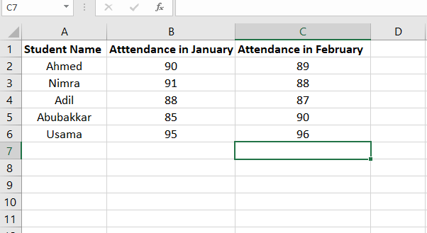
Step 2: Create a new file and enter the data you want to work with. In this case, we have 5 students with their monthly percentage of attendance in the months of January and February. We will then create a chart based on this data.
Step 3: Once you have entered the data in your desired rows and columns, it is time to go to the “Insert” tab on the upper menu in Excel and select the type of graph you want to create from the available data. There are all types of charts available as we have learned above.
In our case, we will select the bar graph to represent our data.
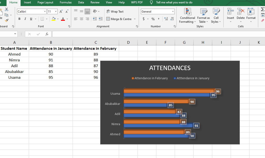
Step 4: Select the whole data on your Excel sheet and click on the type of graph you want to produce. We have created a 3D bar graph to show the attendance percentage of students.
Part 3: Best Free Alternative - WPS Office
In the above example, we have used Microsoft Excel to create a bar graph. But one downside of Microsoft Excel is that you will have to pay a one-time or monthly subscription fee to use Microsoft Office Suite on your PC. On the other hand, there’s another great alternative to Microsoft Office Suite, that is WPS Office.
WPS Office is a complete suite of application software that comes with all the products Microsoft Office has to offer. It has a Word editor, spreadsheet editor, and a presentation editor just like Microsoft Office. Along with free access, it also offers multiple features, including a PDF editor and convertor and multiple free templates from the online library.
The best part about the WPS Office suite is its strong compatibility with every OS and device, including Windows, Mac, Android, and iOS. You can use WPS Office on any device with utmost ease, and it is absolutely free to download on any device.
Part 4: How to Create a Chart in WPS Excel? (Basic usage methods and steps)
The method to create charts and graphs in WPS Excel is quite similar to that of Microsoft Excel. You will have to create a new file or go to an already existing file with numerical data and follow the steps mentioned below:
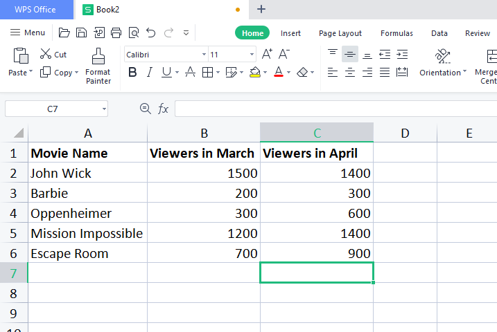
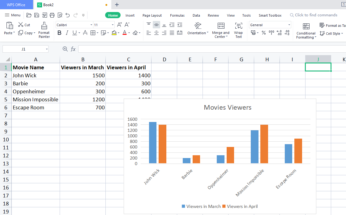
Step 1: Once you have opened a new file in your WPS Excel, it’s time to insert data in it as you wish. For example, in our case, we have used the data for the viewership of movies recently released. See the below screenshot.
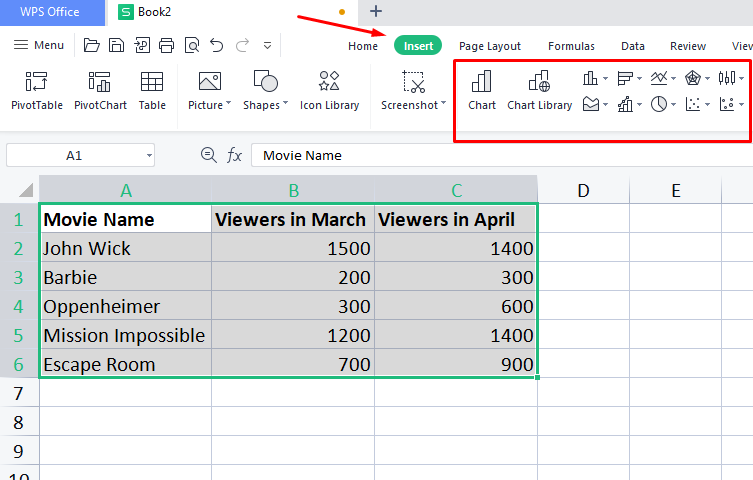
Step 2: Select the whole data in your sheet and go to the insert tab in your WPS Excel window. Here you will find graph options in the form of vector images. Select any type of graph you want to create and click on it.
Step 3: As soon as you click on the chart type, the WPS Excel will create a graph for you based on the available data. In this example, we have created a bar graph with varied colors for two months.
FAQs:
1. Can I create multiple charts in one Excel worksheet?
Yes, you can create multiple charts on the same worksheet or on different sheets within the same workbook. Excel provides the flexibility to work with multiple charts simultaneously.
2. Can I change the chart type after creating it?
Absolutely! Using Excel, you can change the chart type at any time. All you have to do is simply select the chart and use the "Change Chart Type" option to switch to a different chart type.
Summing it all Up
We have so far learned about how to create a chart in Excel using multiple methods. We read about multiple types of charts and their functions, and then we read about how to create a chart in Excel using WPS Office. WPS proved to be a great alternative to Microsoft Office Excel as it has the same features and functionalities to offer without paying a single penny as the subscription fee.
You can use the WPS Office suite to edit Word, spreadsheet, PDF, and presentation documents with utmost efficiency and ease of use. The software suite is quite user-friendly, with the same features as Microsoft Office.

'%3e%3cpath%20d='M19.9911%204.11386V6.471H18.5894C18.0775%206.471%2017.7322%206.57814%2017.5536%206.79243C17.3751%207.00671%2017.2858%207.32814%2017.2858%207.75671V9.44421H19.9019L19.5536%2012.0871H17.2858V18.8639H14.5536V12.0871H12.2769V9.44421H14.5536V7.49779C14.5536%206.39064%2014.8632%205.53201%2015.4822%204.92189C16.1013%204.31177%2016.9257%204.00671%2017.9554%204.00671C18.8304%204.00671%2019.509%204.04243%2019.9911%204.11386Z'%20fill='%23333333'/%3e%3c/g%3e%3cdefs%3e%3cclipPath%20id='clip0_2938_8199'%3e%3crect%20width='16'%20height='16'%20fill='white'%20transform='translate(8%204.00671)'/%3e%3c/clipPath%3e%3c/defs%3e%3c/svg%3e)
'%3e%3cpath%20d='M17.5237%2010.7813L23.4811%204H22.0699L16.8949%209.88693L12.7648%204H8L14.2469%2012.9029L8%2020.0133H9.4112L14.8725%2013.7952L19.2352%2020.0133H24M9.92053%205.04213H12.0885L22.0688%2019.0224H19.9003'%20fill='%23333333'/%3e%3c/g%3e%3cdefs%3e%3cclipPath%20id='clip0_2938_8200'%3e%3crect%20width='16'%20height='16.0134'%20fill='white'%20transform='translate(8%204)'/%3e%3c/clipPath%3e%3c/defs%3e%3c/svg%3e)


