
'%3e%3cpath%20d='M8%200C12.4183%200%2016%203.58172%2016%208C16%2012.4183%2012.4183%2016%208%2016C3.58172%2016%200%2012.4183%200%208C0%203.58172%203.58172%200%208%200ZM11.6162%204.38379C11.2257%203.99337%2010.5927%203.99338%2010.2021%204.38379L8%206.58594L5.79785%204.38379C5.40732%203.99334%204.77429%203.99329%204.38379%204.38379C3.99331%204.77429%203.99335%205.40733%204.38379%205.79785L6.58594%208L4.38379%2010.2021C3.99348%2010.5927%203.99341%2011.2257%204.38379%2011.6162C4.77426%2012.0066%205.40734%2012.0065%205.79785%2011.6162L8%209.41406L10.2021%2011.6162C10.5927%2012.0066%2011.2257%2012.0067%2011.6162%2011.6162C12.0067%2011.2257%2012.0066%2010.5927%2011.6162%2010.2021L9.41406%208L11.6162%205.79785C12.0066%205.40735%2012.0066%204.77429%2011.6162%204.38379Z'%20fill='%23080E17'%20fill-opacity='0.46'/%3e%3c/g%3e%3cdefs%3e%3cclipPath%20id='clip0_3761_713'%3e%3crect%20width='16'%20height='16'%20fill='white'/%3e%3c/clipPath%3e%3c/defs%3e%3c/svg%3e)


'%3e%3cpath%20fill-rule='evenodd'%20clip-rule='evenodd'%20d='M21.4999%2010.9993C21.4999%205.20009%2016.7986%200.498901%2010.9993%200.498901C5.19994%200.498901%200.498657%205.20009%200.498657%2010.9993C0.498657%2016.2404%204.33858%2020.5844%209.35855%2021.3722V14.0346H6.69238V10.9993H9.35855V8.68594C9.35855%206.05427%2010.9262%204.60062%2013.3248%204.60062C14.4736%204.60062%2015.6753%204.80571%2015.6753%204.80571V7.38979H14.3512C13.0468%207.38979%2012.64%208.19921%2012.64%209.0296V10.9993H15.5523L15.0867%2014.0346H12.64V21.3722C17.66%2020.5844%2021.4999%2016.2404%2021.4999%2010.9993Z'%20fill='%231568EA'/%3e%3c/g%3e%3c/svg%3e)


Frequency tables are a great way to organize and analyze data in Excel, but they can be tricky to create if you're not sure how. This article will provide you with a step-by-step guide on how to create a frequency table in Excel, as well as some easy tips to make the process even simpler.
Part 1. How to Create a Frequency Table in Excel
Method 1: Using Pivot Table
Step 1: Select the entire dataset containing the values you want to create a frequency table for.

Step 2: Go to the "Insert" tab in the Excel ribbon.
Step 3: From the "Tables" group, choose "PivotTable."

Step 4: In the "Create PivotTable" dialog box, ensure that the correct range is selected in the "Table/Range" field (e.g., B4 to D19).
Choose the option to place the PivotTable on a new worksheet.Click "OK" to create the PivotTable.

Step 5: In the PivotTable Fields pane, drag the field you want to analyze (e.g., "Sales") into the "Values" section.

Step 6: By default, it may show the sum of sales. Right-click on any cell in the "Sum of Sales" column, select "Value Field Settings," and change the calculation to "Count."

Step 9: It will count each occurrence of values.

Step 10: To create groups or bins, right-click on any cell in the "Sales" column, select "Group," and specify the grouping criteria (e.g., grouping by 500).

Step 11: Go to the "Insert" tab, choose "Recommended Charts," and select a column chart to visualize the frequency distribution.

I find this method efficient for summarizing data quickly, making it valuable for data analysis in Excel. If you're already comfortable with Pivot Tables, it's a solid choice.
Method 2: Utilizing FREQUENCY Function
Step 1: Create two columns for lower and upper range values based on your dataset.

Step 2: In an empty cell (e.g., G5), enter the formula =FREQUENCY(C5:C16, F5:F14) where C5:C16 is your data range, and F5:F14 are the bin values.

Step 3: Press "Ctrl+Shift+Enter" to apply the array formula. Excel will generate frequency counts for each bin.

This method is excellent for straightforward frequency tables, especially for beginners. Pressing Ctrl+Shift+Enter takes a bit to get used to, but it's worth it.
Method 3: Applying COUNTIFS Function
Step 1: Create a lower range and an upper range for your bins.

Step 2: In cell G5, enter the formula =COUNTIFS(C5:C16, "<=10") to="" count="" values="" less="" than="" or="" equal="" 10.="">

Step 3: Press "Enter" to apply the formula.
Step 4: In cell G6, enter the formula =COUNTIFS($C$5:$C$16, ">10", $C$5:$C$16, "<=20") 10="" to="" count="" values="" greater="" than="" and="" less="" or="" equal="" 20.="">

Step 5: Press "Enter" to apply the formula.
Step 6: Repeat steps 3-4 for other cells to count values in different ranges.

This method is the most balanced choice for beginners.
Method 4: Use of Data Analysis Tool
Step 1: Enable the Data Analysis Toolpak (File > Options > Add-Ins > Analysis Toolpak).


Step 2: Create a bin range based on your dataset.

Step 3: Go to the "Data" tab in the Excel ribbon.
Step 4: Click on "Data Analysis" in the "Analysis" group.

Step 5: In the "Data Analysis" dialog box, choose "Histogram" from the list of tools.

Step 6: Select the input range (e.g., Sales) and the bin range.
Choose the output options (e.g., "New Worksheet" for results, "Cumulative Percentage," and "Chart Output").
Click "OK" to generate the frequency table and histogram chart.


While setup might take a few extra minutes, the Data Analysis Toolpak is user-friendly and provides excellent frequency tables and histograms. Great for beginners seeking visualization.
Using Pivot Table: Quick and user-friendly, suitable for most users.
Utilizing FREQUENCY Function: Involves formulas, better for those familiar with Excel functions.
Applying COUNTIFS Function: Beginner-friendly and straightforward.
Use of Data Analysis Tool: Offers advanced options for in-depth analysis, better for experienced users.
Part 2 The Importance of Frequency Tables on Data Analysis in Excel
Frequency tables play a crucial role in data analysis using Excel for several reasons:
Summarize Large Amounts of Data Quickly: Excel's frequency tables allow you to efficiently condense extensive datasets. Instead of sifting through rows of raw data, you can instantly see the distribution of values, making it easier to understand the data's overall characteristics.
Identify Patterns and Trends: Frequency tables provide a structured view of data, making it simpler to identify patterns, trends, and outliers. By visualizing the distribution of values, analysts can spot recurring themes or irregularities that might go unnoticed when examining raw data.
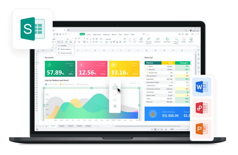
Part 3.Best Alternative——WPS Office

WPS Office is a robust office software suite known for its stability and modern design. It offers a wide range of features and advantages that make it an excellent alternative for various office tasks. Some key features and advantages of WPS Office include:
Text Processing: WPS Office provides powerful text processing capabilities, making it easy to create, edit, and format documents with efficiency.
Table Production: The software offers tools for creating and managing tables, allowing users to organize data effectively.
Slide Production: WPS Office includes a comprehensive set of features for designing and presenting slides, making it a valuable tool for creating visually appealing presentations.
Graphic Image Processing: Users can work with graphics and images within WPS Office, enhancing the visual aspects of their documents and presentations.
Simple Database Processing: WPS Office provides basic database processing functionality, allowing users to manage data conveniently.
One significant advantage of WPS Office is its stability, ensuring a reliable and smooth user experience. Additionally, it excels in handling Excel files, making it a trustworthy choice for users who rely on Excel's capabilities.
How to download WPS Office for free?
Step 1: Visit the official WPS Office website by going to https://www.wps.com/download/.
Step 2: Choose the version of WPS Office that you want to download, depending on your operating system (Windows, Mac, Linux, Android, or iOS).

Step 3: Click on the "Free Download" button.
Step 4: The download will start, and you'll receive the installation file for WPS Office.

Step 5: Once the download finishes, find the downloaded file on your computer or mobile device.
Step 6: Open the downloaded file and follow the on-screen instructions to install WPS Office on your system.


FAQs
How to Calculate Standard Deviation of a Frequency Distribution in Excel?
Calculating standard deviation for a frequency distribution in Excel involves finding the mean, then computing the squared differences for each value from the mean, taking into account their frequencies. Finally, sum these squared differences, divide by the total frequency minus 1, and take the square root to get the standard deviation.
How to Calculate Cumulative Relative Frequency in Excel?
To calculate cumulative relative frequency in Excel, organize your data, add a column for relative frequencies, and another for cumulative relative frequencies. For each row, sum the relative frequencies from the first row to the current one to compute the cumulative relative frequency. Excel functions like SUM or SUMIFS can assist in these calculations, helping you analyze data distribution over a range.
Summary
In 2023, creating frequency tables in Excel has become easier than ever. The step-by-step guide outlines various methods, catering to different user preferences. Using Pivot Table stands out as an efficient way to summarize data quickly. For beginners, the FREQUENCY function offers a straightforward approach. COUNTIFS function strikes a balanced choice for simplicity and effectiveness. The Data Analysis Toolpak is user-friendly, providing excellent frequency tables and histograms, making it great for visualization.
While all methods have their merits, it's worth noting that WPS Office is an excellent alternative for various office tasks. It offers a stable and modern design, making it a reliable choice for those who rely on Excel's capabilities. Downloading WPS Office for free is straightforward and can be done through their official website.

'%3e%3cpath%20d='M19.9911%204.11386V6.471H18.5894C18.0775%206.471%2017.7322%206.57814%2017.5536%206.79243C17.3751%207.00671%2017.2858%207.32814%2017.2858%207.75671V9.44421H19.9019L19.5536%2012.0871H17.2858V18.8639H14.5536V12.0871H12.2769V9.44421H14.5536V7.49779C14.5536%206.39064%2014.8632%205.53201%2015.4822%204.92189C16.1013%204.31177%2016.9257%204.00671%2017.9554%204.00671C18.8304%204.00671%2019.509%204.04243%2019.9911%204.11386Z'%20fill='%23333333'/%3e%3c/g%3e%3cdefs%3e%3cclipPath%20id='clip0_2938_8199'%3e%3crect%20width='16'%20height='16'%20fill='white'%20transform='translate(8%204.00671)'/%3e%3c/clipPath%3e%3c/defs%3e%3c/svg%3e)
'%3e%3cpath%20d='M17.5237%2010.7813L23.4811%204H22.0699L16.8949%209.88693L12.7648%204H8L14.2469%2012.9029L8%2020.0133H9.4112L14.8725%2013.7952L19.2352%2020.0133H24M9.92053%205.04213H12.0885L22.0688%2019.0224H19.9003'%20fill='%23333333'/%3e%3c/g%3e%3cdefs%3e%3cclipPath%20id='clip0_2938_8200'%3e%3crect%20width='16'%20height='16.0134'%20fill='white'%20transform='translate(8%204)'/%3e%3c/clipPath%3e%3c/defs%3e%3c/svg%3e)


