
'%3e%3cpath%20d='M8%200C12.4183%200%2016%203.58172%2016%208C16%2012.4183%2012.4183%2016%208%2016C3.58172%2016%200%2012.4183%200%208C0%203.58172%203.58172%200%208%200ZM11.6162%204.38379C11.2257%203.99337%2010.5927%203.99338%2010.2021%204.38379L8%206.58594L5.79785%204.38379C5.40732%203.99334%204.77429%203.99329%204.38379%204.38379C3.99331%204.77429%203.99335%205.40733%204.38379%205.79785L6.58594%208L4.38379%2010.2021C3.99348%2010.5927%203.99341%2011.2257%204.38379%2011.6162C4.77426%2012.0066%205.40734%2012.0065%205.79785%2011.6162L8%209.41406L10.2021%2011.6162C10.5927%2012.0066%2011.2257%2012.0067%2011.6162%2011.6162C12.0067%2011.2257%2012.0066%2010.5927%2011.6162%2010.2021L9.41406%208L11.6162%205.79785C12.0066%205.40735%2012.0066%204.77429%2011.6162%204.38379Z'%20fill='%23080E17'%20fill-opacity='0.46'/%3e%3c/g%3e%3cdefs%3e%3cclipPath%20id='clip0_3761_713'%3e%3crect%20width='16'%20height='16'%20fill='white'/%3e%3c/clipPath%3e%3c/defs%3e%3c/svg%3e)


'%3e%3cpath%20fill-rule='evenodd'%20clip-rule='evenodd'%20d='M21.4999%2010.9993C21.4999%205.20009%2016.7986%200.498901%2010.9993%200.498901C5.19994%200.498901%200.498657%205.20009%200.498657%2010.9993C0.498657%2016.2404%204.33858%2020.5844%209.35855%2021.3722V14.0346H6.69238V10.9993H9.35855V8.68594C9.35855%206.05427%2010.9262%204.60062%2013.3248%204.60062C14.4736%204.60062%2015.6753%204.80571%2015.6753%204.80571V7.38979H14.3512C13.0468%207.38979%2012.64%208.19921%2012.64%209.0296V10.9993H15.5523L15.0867%2014.0346H12.64V21.3722C17.66%2020.5844%2021.4999%2016.2404%2021.4999%2010.9993Z'%20fill='%231568EA'/%3e%3c/g%3e%3c/svg%3e)


Unlock the power of data visualization in Microsoft Excel by mastering the art of adding axis titles to your charts. Clarity and comprehension are essential, and this article aims to resolve the common conflict of not knowing how to achieve this effectively. Join us on this journey as we provide a step-by-step guide, empowering you to create visually appealing and easily understandable data presentations.
Part 1. The Importance of Axis Titles
Axis titles play a crucial role in data visualization and presentation in Microsoft Excel charts. These titles are labels that provide essential context and information about the data displayed on the chart axes. They contribute to the overall clarity and comprehension of the chart, making it easier for viewers to interpret and understand the data. Axis titles serve as a guide, helping users identify what each axis represents and how the data is scaled.
Advantages of Axis Titles:
Clarity: Axis titles provide clear labels, ensuring viewers can quickly grasp the meaning and significance of the data points.
Context: By labeling the axes, axis titles offer context to the data, enabling users to understand the variables and units being presented.
Interpretation: The presence of axis titles facilitates data interpretation, helping users
arance of the presentation or report.
Presentation: When sharing charts with others, axis titles ensure that the message and information remain clear even without additional explanations.
Part 2. How to Add Axis Titles in Excel?
Adding axis titles to your Excel charts is a simple and straightforward process. Follow these step-by-step instructions to include axis titles:
Step 1: Begin by selecting the chart to which you want to add an axis title.
Step 2: Look for the Chart Elements button located on the right side of the chart.

Step 3: Click on the Chart Elements button and then choose "Axis Titles."
 ’
’
Step 4: From the Axis Titles dropdown, select the type of title you wish to add (Primary Horizontal, Primary Vertical, Secondary Horizontal, or Secondary Vertical).

Step 5: A text box will appear. Enter your desired title into the text box.

Part 3: Tips for Creating Axis Titles without Mistakes
Tips for Creating Clear and Effective Axis Titles:
Keep it concise and descriptive.
Use units of measurement in your titles.
Avoid using abbreviations.
Choose clear fonts and font sizes for easy readability.
Consider your audience and provide additional context if needed.
Ensure the axis title accurately reflects the presented data and update it when necessary.
Common Mistakes to Avoid When Adding Axis Titles in Excel:
Using vague or unclear titles that can cause confusion.
Forgetting to include units of measurement, making data interpretation challenging.
Choosing the wrong type of title for the chart type.
Using long and complicated titles, cluttering the chart and making it difficult to read.
Inconsistent formatting of axis titles with the rest of the chart.
Troubleshooting Common Issues When Adding Axis Titles in Excel:
Verify the correct chart type selection.
Ensure the right axis is chosen when adding titles.
Check for changes in font size, color, or alignment.
Remember to add titles to all axes, including the secondary axis, in charts with multiple axes for clarity.


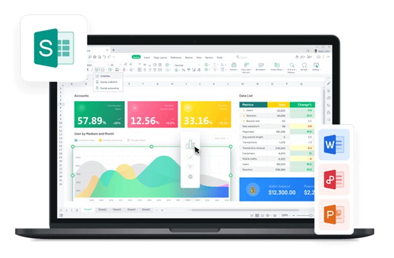
Part 4. Best Free Alternative to Microsoft Office - WPS Office

WPS Office is a powerful and versatile office suite that offers a comprehensive set of tools for word processing, spreadsheets, and presentations. It is a free alternative to Microsoft Office, providing users with a wide range of services without the need for a paid subscription. With a user-friendly interface and seamless compatibility with Microsoft Office formats, WPS Office allows users to create, edit, and share documents with ease.
Features:
All-in-One Office Software: WPS Office is a versatile free suite that combines essential office functions - writer, spreadsheet, presentation, and PDF tools - in a single package.
PDF Editing: Basic PDF functions like reading, annotation, and conversion are free.
Additional Utilities: WPS Office extends its offerings beyond the basics with features like a resume assistant, smart forms, screen recording, and file repair.
Compatibility: WPS Office excels in opening and preserving various document formats, preventing issues like garbled text and incorrect formulas.
Price:
Free Core Tools: Enjoy the writer, spreadsheet, and presentation tools without any cost, ads, or registration.
PDF Editor Subscription: For advanced PDF editing features, such as editing and scanning, a yearly subscription fee of $29 is applicable. This pricing is notably competitive in comparison to other PDF editor products.
How to Add Axis Titles in Excel in WPS Office
Are you a new user of WPS Office and wondering how to add axis titles to your Excel charts? Fear not, as this simple step-by-step tutorial will guide you through the process:
Step 1: Open WPS Office and locate the chart you want to modify.
Step 2 Head to the Chart Tools

Step 3 Click the "Add Chart Element" dropdown arrow, then hover over "Axis Titles."

Step 4 In the pop-up menu, choose "Primary Horizontal Axis", " Primary Vertical Axis," or both, depending on the axis you want to title.

For Windows users, the "Chart Element" icon on the right of the chart is another way to access axis titles.

FAQs
1. How do I make my axis title not overlap?
To prevent label overlap on your chart, follow a quick and straightforward fix. Right-click on the Axis you wish to adjust and select "Format Axis." Then, navigate to the "Labels" dropdown and modify the "Label Position" to 'Low.'
2. How can I customize the appearance of axis titles?
After adding an axis title, click on the title to select it. In the top toolbar, you'll find various formatting options. You can change the font style, size, color, and even add effects like bold or italics to match your chart's aesthetics.
3. Can I add axis titles to 3D charts?
Yes, you can add axis titles to 3D charts. When you have a 3D chart selected, follow the same steps mentioned earlier to add axis titles. The titles will appear on the corresponding axes and improve data interpretation, even in the three-dimensional view.
Summary
In summary, adding axis titles in Microsoft Excel charts enhances data clarity and comprehension. The step-by-step guide ensures effortless inclusion of titles, while WPS Office emerges as a powerful and free alternative to Microsoft Office, enabling seamless document creation and sharing. With these tools, users can create visually appealing and informative data presentations, conveying their insights effectively.

'%3e%3cpath%20d='M19.9911%204.11386V6.471H18.5894C18.0775%206.471%2017.7322%206.57814%2017.5536%206.79243C17.3751%207.00671%2017.2858%207.32814%2017.2858%207.75671V9.44421H19.9019L19.5536%2012.0871H17.2858V18.8639H14.5536V12.0871H12.2769V9.44421H14.5536V7.49779C14.5536%206.39064%2014.8632%205.53201%2015.4822%204.92189C16.1013%204.31177%2016.9257%204.00671%2017.9554%204.00671C18.8304%204.00671%2019.509%204.04243%2019.9911%204.11386Z'%20fill='%23333333'/%3e%3c/g%3e%3cdefs%3e%3cclipPath%20id='clip0_2938_8199'%3e%3crect%20width='16'%20height='16'%20fill='white'%20transform='translate(8%204.00671)'/%3e%3c/clipPath%3e%3c/defs%3e%3c/svg%3e)
'%3e%3cpath%20d='M17.5237%2010.7813L23.4811%204H22.0699L16.8949%209.88693L12.7648%204H8L14.2469%2012.9029L8%2020.0133H9.4112L14.8725%2013.7952L19.2352%2020.0133H24M9.92053%205.04213H12.0885L22.0688%2019.0224H19.9003'%20fill='%23333333'/%3e%3c/g%3e%3cdefs%3e%3cclipPath%20id='clip0_2938_8200'%3e%3crect%20width='16'%20height='16.0134'%20fill='white'%20transform='translate(8%204)'/%3e%3c/clipPath%3e%3c/defs%3e%3c/svg%3e)


