
'%3e%3cpath%20d='M8%200C12.4183%200%2016%203.58172%2016%208C16%2012.4183%2012.4183%2016%208%2016C3.58172%2016%200%2012.4183%200%208C0%203.58172%203.58172%200%208%200ZM11.6162%204.38379C11.2257%203.99337%2010.5927%203.99338%2010.2021%204.38379L8%206.58594L5.79785%204.38379C5.40732%203.99334%204.77429%203.99329%204.38379%204.38379C3.99331%204.77429%203.99335%205.40733%204.38379%205.79785L6.58594%208L4.38379%2010.2021C3.99348%2010.5927%203.99341%2011.2257%204.38379%2011.6162C4.77426%2012.0066%205.40734%2012.0065%205.79785%2011.6162L8%209.41406L10.2021%2011.6162C10.5927%2012.0066%2011.2257%2012.0067%2011.6162%2011.6162C12.0067%2011.2257%2012.0066%2010.5927%2011.6162%2010.2021L9.41406%208L11.6162%205.79785C12.0066%205.40735%2012.0066%204.77429%2011.6162%204.38379Z'%20fill='%23080E17'%20fill-opacity='0.46'/%3e%3c/g%3e%3cdefs%3e%3cclipPath%20id='clip0_3761_713'%3e%3crect%20width='16'%20height='16'%20fill='white'/%3e%3c/clipPath%3e%3c/defs%3e%3c/svg%3e)


'%3e%3cpath%20fill-rule='evenodd'%20clip-rule='evenodd'%20d='M21.4999%2010.9993C21.4999%205.20009%2016.7986%200.498901%2010.9993%200.498901C5.19994%200.498901%200.498657%205.20009%200.498657%2010.9993C0.498657%2016.2404%204.33858%2020.5844%209.35855%2021.3722V14.0346H6.69238V10.9993H9.35855V8.68594C9.35855%206.05427%2010.9262%204.60062%2013.3248%204.60062C14.4736%204.60062%2015.6753%204.80571%2015.6753%204.80571V7.38979H14.3512C13.0468%207.38979%2012.64%208.19921%2012.64%209.0296V10.9993H15.5523L15.0867%2014.0346H12.64V21.3722C17.66%2020.5844%2021.4999%2016.2404%2021.4999%2010.9993Z'%20fill='%231568EA'/%3e%3c/g%3e%3c/svg%3e)


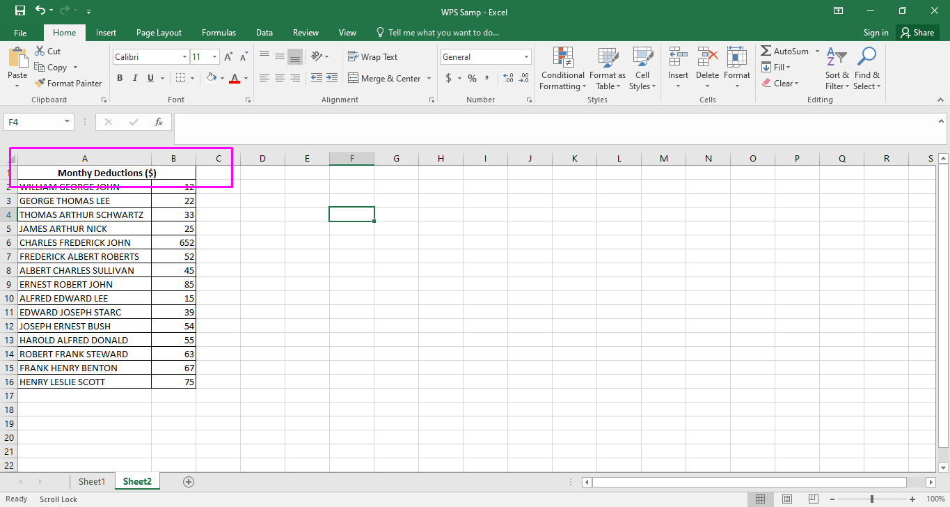
The more organized look of numeric data can make it easier for every user to save their time and energy. Whether you are dealing with noting frequencies or taking temperature changes in, you may also be looking for a way to organize your data.
It can be tricky to deal with numeric data when it is all over the place. The best way to do so is to learn how to make a bar graph in Excel, but making bar charts can be challenging for beginners.
This article can walk you through the process of making bar charts on Excel.
Part1: Types of Excel Bar Chart
Learning to learn how to make a bar graph in Excel can be tricky for starters. However, understanding the different types of bar charts can make it easier for you to understand your options. Here are some options that can fit the needs as per your requirements.
Clustered Bar Charts
You can explore 2-D and 3-D bar charts in Excel. The vertical axis (Y axis) is generally used to mention the categories, and the values can be arranged on the horizontal axis (X axis).
The clustered charts provide enough space between the clusters. This way, the data is represented in an easily readable way for easier comparisons.
Stacked Bar Charts
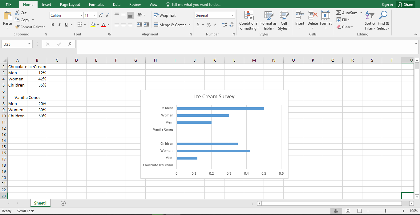
Stacked bar graphs are very useful for users who want to learn how to make a bar graph in Excel. These graphs can be used to define the proportions of an item to the collective data. You can draw them in a 2-D or 3-D format.
You can see and comprehend data in an easier way as compared to other formats.
100% Stacked Bar Charts
There is not much difference between stacked and 100% stacked bar charts. However, the added benefit is that this type of chart shows percentages in Excel. This way, your data can be more detailed.
As you learn how to make a bar graph in Excel, understanding 100% stacked bar charts can be very beneficial in the long run.
Cylinder, Cone, and Pyramid Charts
The cylinder, cone, and pyramid charts are a great way to express your creativity with charts. There is not a lot of difference in the function. However, the only thing worth noting is that you can give you more options for representation.
There are options available in cylinders, cones, and pyramids. Hence, you will not remain stuck with the boring rectangles.

Part 2: How to Make a Bar Graph in Excel? (In easy steps)
It is very easy to make bar graphs on Excel. Once you learn how to make one type of bar graph in Excel, it will not take long for you to excel the other types as well. Here is a step-by-step guide for you to learn how to make a bar graph in Excel.
Step 1: Find “Excel” application in the search Option.

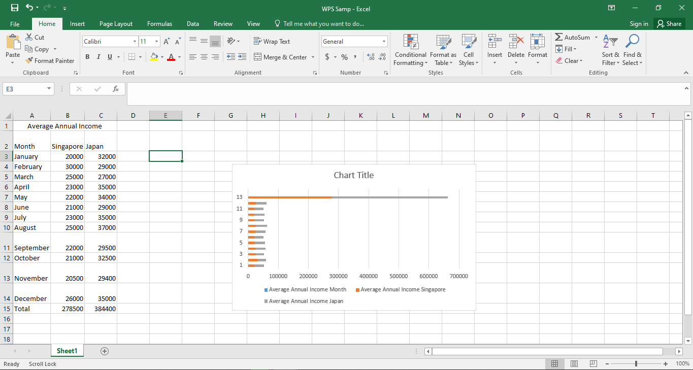
Step 2: Create the Data for Axes
Every graph needs data for X and Y axes. You can decide the components of your data and create the needed columns. These components can create an effective bar chart.
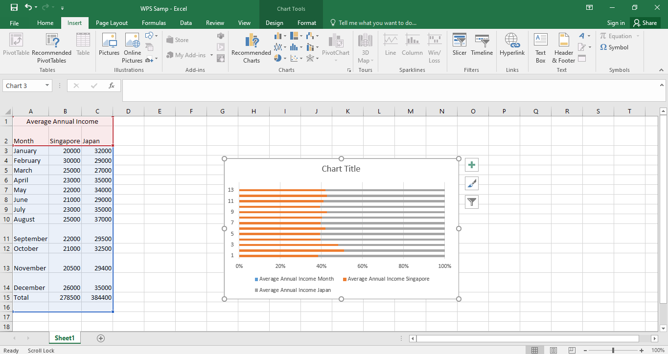
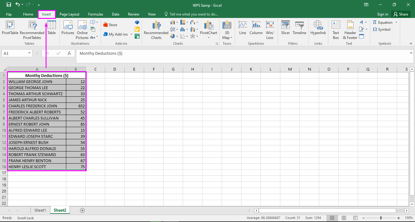
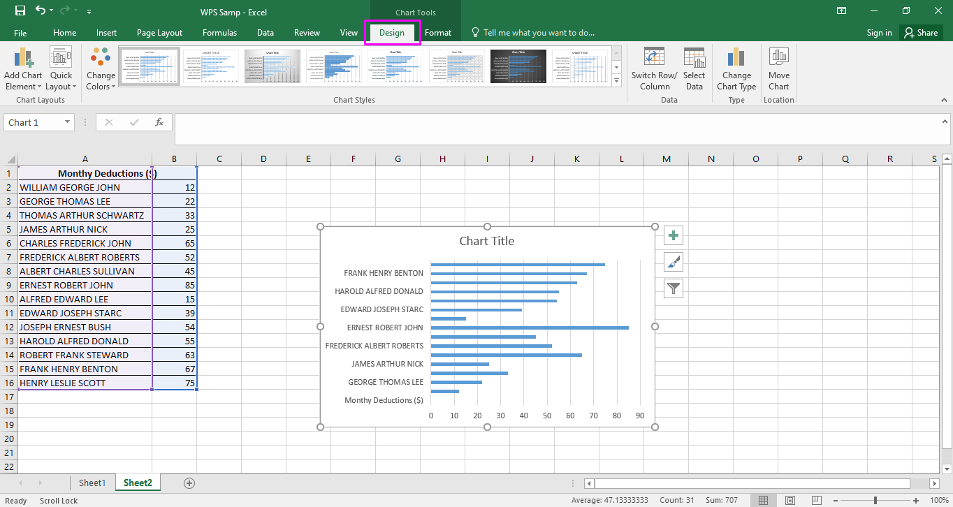
Step 3: Select all your data and go to the “Insert” options. Make sure that all the entries are selected so that you do not miss out anything important in your chart.
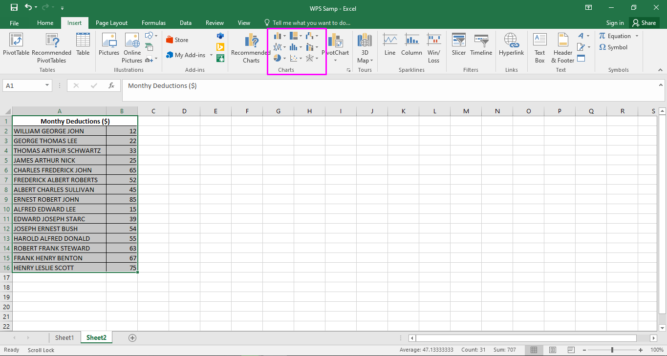
Step 4: Select the type of chart you want to arrange your data in. Every type can be used in different circumstances and varying types of data.
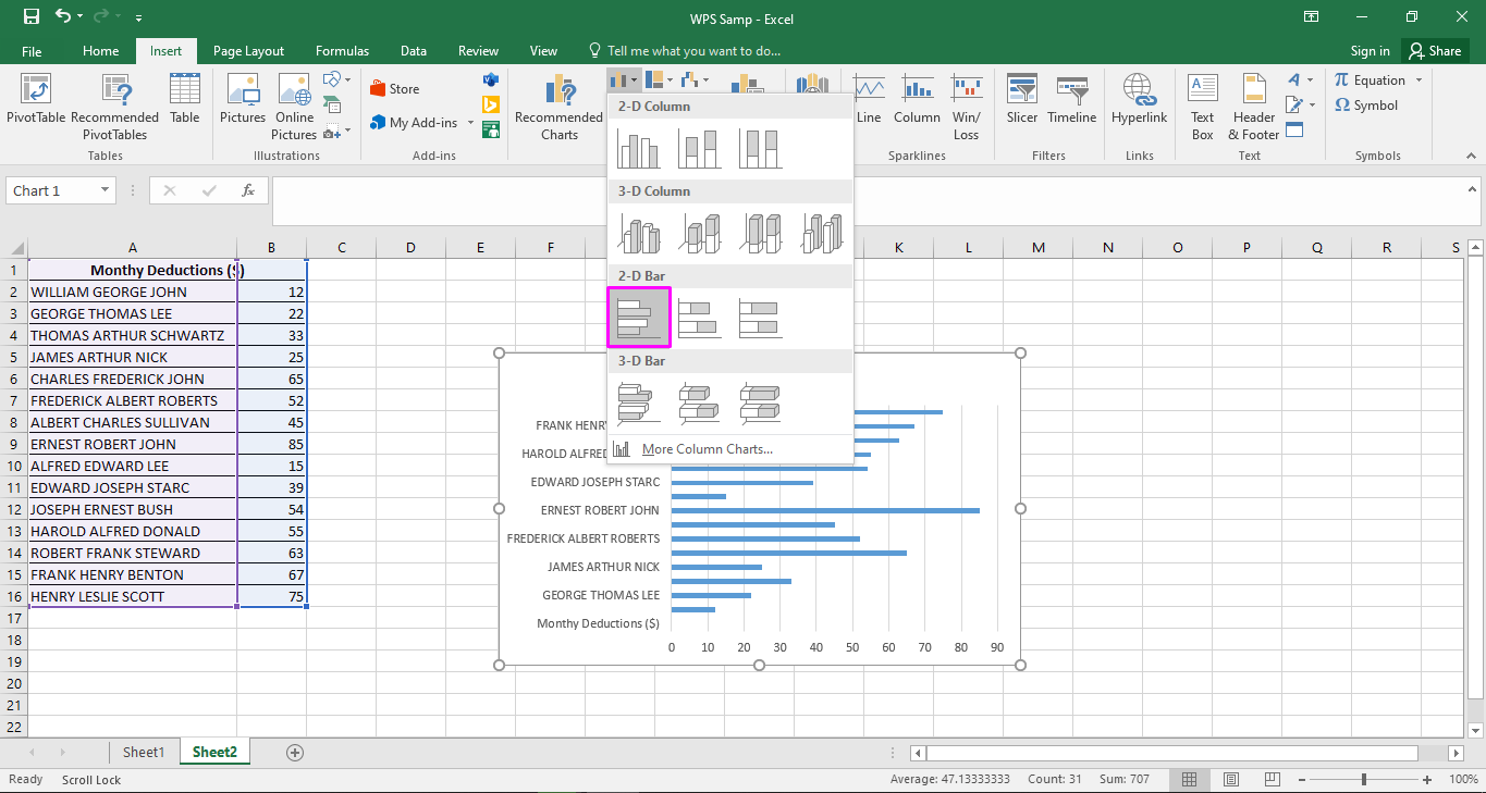
Step 5: Apply the wanted style to your data. You can choose the 2-D or 3-D options as needed.
Step 6: Insert the chart and explore several design options. You can change the color of bars and the overall presentation of your graph with a few small steps..


Part 3: Best Alternative - WPS Office
One can spend days learning how to make a bar graph in Excel. However, it can be agreed that it is not the easiest journey to learn using it. There are so many options and settings that can overwhelm a new user.
In such circumstances, one is always on the lookout for an alternative that is effective and easy to use. WPS Office is an ideal option worth exploring. It also gives easy options to keep your data safe and easily retrievable.
Here are some advantages of using WPS Office worth noting.
Free and easy download options for all users
Multiple functions on one platform
Advanced usage of several other functions
Here is how you can make a bar graph easily using WPS Excel.
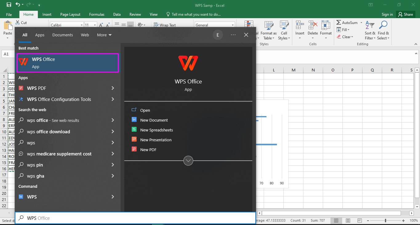
Step 1: Look for “WPS Office” by searching in the start bar. Click the icon to launch the platform.
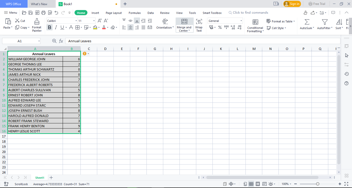
Step 2: Write and select the data you need to convert into bar charts. Make sure that all entries are selected so that you do not miss out on any important data.
Step 3: Go to the “Insert” options and explore several options for bar charts. You can choose any type of bar graph to best arrange your data. These selections can differ on the basis of type of data.

Step 4: Create a bar by choosing any type suitable for your needs and style. There are different styles you can try, so make sure you explore your options before you pick a bar graph style.

Step 5: Explore different style options in the navigation bar. You can choose from several color and shape options. These options can help you take control of the way your work is presented.

FAQs:
Here are some answers to frequently asked questions that trouble people while learning how to make a bar graph in Excel.
1. Can I change the order of the bars in my graph?
It is fairly easy to change the order of bars in your bar graph. Here are some steps that can help you change the order of bars.
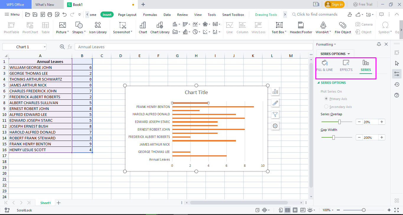
Step 1: Right-click on a bar and press “Format Data Series.” You will see a drop-down menu with several options.
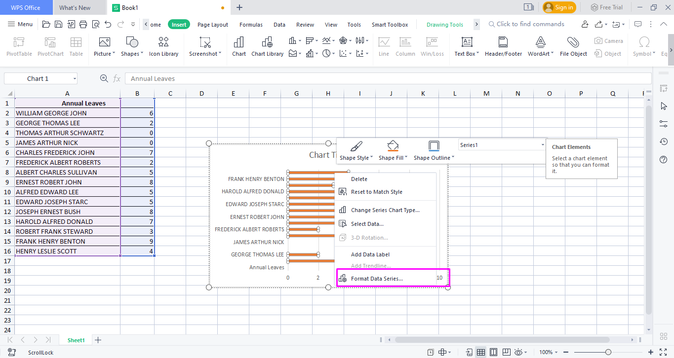
Step 2: Go to series options and use the “Series Overlap” and “Gap Width” options to change the order of your series. You can increase or decrease the gap width of your bar graph depending on your comfort.

2. Can I customize the appearance of individual bars in my graph?
Changing the appearance of individual parts is possible according to your preferences. You can use different colors to add ease for distinction in your data or to increase the visual appeal of your data.
Here is a step-by-step guide on how you can customize bars individually.
Step 1: Select the bar you want to change. You can do this for each bar one by one or select multiple bars at the same time.

Step 2: Select “Format Data Point” from the drop-down menu.

Step 3: Make the needed changes from the given options.You can change colors, effects, and other specifications as per your needs.
3. Can I update my bar graph automatically when I change the underlying data?
You do not have to worry if the data is changed after the bar graph has been created if your data is linked to the graph. Every change you will make to the data automatically shows in your bar graph.
It is best to ensure that all items you want to be included in a bar graph are selected so that anything important is not missed out.
Summary
This article discusses several useful methods that can help you make a bar graph easily in Excel. Of course, it can be challenging to use Excel. Hence, it is concluded that it is better to use a reliable option such as WPS Office.
The best part is that WPS Office is beginner-friendly and free to use. It is an ideal alternative to Excel. You can also use the WPS suite to edit PDF files, create safe spreadsheets, and make presentations.
Millions of users are benefiting from free services on WPS Office on a daily basis. You can also explore the wonders of WPS Office by downloading it for free today.

'%3e%3cpath%20d='M19.9911%204.11386V6.471H18.5894C18.0775%206.471%2017.7322%206.57814%2017.5536%206.79243C17.3751%207.00671%2017.2858%207.32814%2017.2858%207.75671V9.44421H19.9019L19.5536%2012.0871H17.2858V18.8639H14.5536V12.0871H12.2769V9.44421H14.5536V7.49779C14.5536%206.39064%2014.8632%205.53201%2015.4822%204.92189C16.1013%204.31177%2016.9257%204.00671%2017.9554%204.00671C18.8304%204.00671%2019.509%204.04243%2019.9911%204.11386Z'%20fill='%23333333'/%3e%3c/g%3e%3cdefs%3e%3cclipPath%20id='clip0_2938_8199'%3e%3crect%20width='16'%20height='16'%20fill='white'%20transform='translate(8%204.00671)'/%3e%3c/clipPath%3e%3c/defs%3e%3c/svg%3e)
'%3e%3cpath%20d='M17.5237%2010.7813L23.4811%204H22.0699L16.8949%209.88693L12.7648%204H8L14.2469%2012.9029L8%2020.0133H9.4112L14.8725%2013.7952L19.2352%2020.0133H24M9.92053%205.04213H12.0885L22.0688%2019.0224H19.9003'%20fill='%23333333'/%3e%3c/g%3e%3cdefs%3e%3cclipPath%20id='clip0_2938_8200'%3e%3crect%20width='16'%20height='16.0134'%20fill='white'%20transform='translate(8%204)'/%3e%3c/clipPath%3e%3c/defs%3e%3c/svg%3e)


