
'%3e%3cpath%20d='M8%200C12.4183%200%2016%203.58172%2016%208C16%2012.4183%2012.4183%2016%208%2016C3.58172%2016%200%2012.4183%200%208C0%203.58172%203.58172%200%208%200ZM11.6162%204.38379C11.2257%203.99337%2010.5927%203.99338%2010.2021%204.38379L8%206.58594L5.79785%204.38379C5.40732%203.99334%204.77429%203.99329%204.38379%204.38379C3.99331%204.77429%203.99335%205.40733%204.38379%205.79785L6.58594%208L4.38379%2010.2021C3.99348%2010.5927%203.99341%2011.2257%204.38379%2011.6162C4.77426%2012.0066%205.40734%2012.0065%205.79785%2011.6162L8%209.41406L10.2021%2011.6162C10.5927%2012.0066%2011.2257%2012.0067%2011.6162%2011.6162C12.0067%2011.2257%2012.0066%2010.5927%2011.6162%2010.2021L9.41406%208L11.6162%205.79785C12.0066%205.40735%2012.0066%204.77429%2011.6162%204.38379Z'%20fill='%23080E17'%20fill-opacity='0.46'/%3e%3c/g%3e%3cdefs%3e%3cclipPath%20id='clip0_3761_713'%3e%3crect%20width='16'%20height='16'%20fill='white'/%3e%3c/clipPath%3e%3c/defs%3e%3c/svg%3e)


'%3e%3cpath%20fill-rule='evenodd'%20clip-rule='evenodd'%20d='M21.4999%2010.9993C21.4999%205.20009%2016.7986%200.498901%2010.9993%200.498901C5.19994%200.498901%200.498657%205.20009%200.498657%2010.9993C0.498657%2016.2404%204.33858%2020.5844%209.35855%2021.3722V14.0346H6.69238V10.9993H9.35855V8.68594C9.35855%206.05427%2010.9262%204.60062%2013.3248%204.60062C14.4736%204.60062%2015.6753%204.80571%2015.6753%204.80571V7.38979H14.3512C13.0468%207.38979%2012.64%208.19921%2012.64%209.0296V10.9993H15.5523L15.0867%2014.0346H12.64V21.3722C17.66%2020.5844%2021.4999%2016.2404%2021.4999%2010.9993Z'%20fill='%231568EA'/%3e%3c/g%3e%3c/svg%3e)


Creating graphs in Word is crucial for effective data visualization, yet users often face challenges in choosing the right type or interpreting results accurately. How can users navigate these issues and optimize their writing experience in Microsoft Word? This article delivers a detailed, user-friendly tutorial on crafting various graphs, ensuring precision and visual appeal.
1. Download Customizable Graph Templates Online
Gantt Chart Template:
Gantt charts are widely used in project management to visualize project timelines.
The template may include customizable elements such as task names, start and end dates, and progress indicators.
It helps in tracking project progress and dependencies.
Organizational Chart Template:
Ideal for creating hierarchical structures within an organization.
Allows you to add and edit employee names, positions, and reporting relationships.
Can be customized to match the specific organizational structure of your company.
Line Chart Template:
Perfect for displaying trends over time, making it suitable for data analysis.
Customizable axes, labels, and data points.
Easily insert your dataset to create a professional-looking line chart.
To find these templates, you can visit the official Microsoft Office template website or use the link provided: Microsoft Office 365 Templates
2. How to Create a Graph in Microsoft Word on Windows
Creating a graph in Microsoft Word on Windows is a straightforward process. Follow these step-by-step instructions:
Step 1: Open a document in Microsoft Word.
Step 2: Navigate to the “Insert” tab and click “Chart.”

Step 3: Choose your desired chart type and double-click to select.
The three fundamental chart types are Column, Line, and Pie.
Column and Bar Charts: Ideal for comparing distinct sets of data, these charts provide a clear visual comparison.
Line and Area Charts: Perfect for showcasing trends over time, these charts offer a dynamic representation of data evolution.
Pie Charts: Representing categories as parts of a whole, Pie charts provide a concise overview of proportional relationships within a dataset. Choose the right chart to amplify your data storytelling.

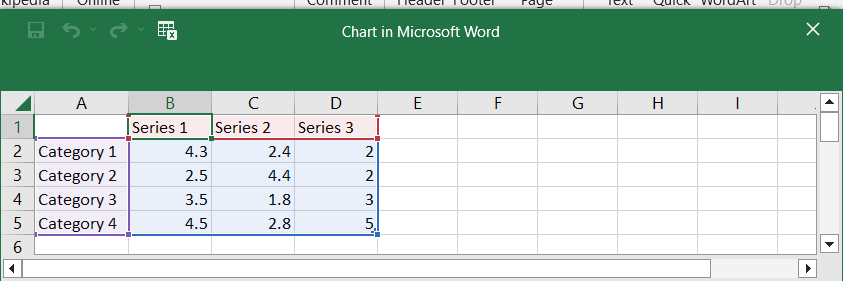
Step 4: Easily input your data over the default spreadsheet values.
Step 5: Once finished, click the “X” in the upper right corner of the spreadsheet.
3. How to Format and Edit a Graph in Word on Windows
Adjusting your graphs in Word is easy. Hover over your graph, and buttons appear in the right corner:
1Chart Elements Button:

Hide, show, or format data labels and axis titles with a simple click.
2. Chart Styles Button:

Switch up your chart style or color scheme seamlessly for a fresh look.
3. Chart Filters Button:

Toggle visibility for data and access advanced features effortlessly.
4. Layout Options Button:

Tailor how your chart interacts with the document text to enhance presentation. Proper word layout ensures that charts, tables, and text coexist harmoniously, making your document visually appealing and easy to read.”
Additionally, for a more in-depth customization experience, hover over the graph. Buttons will appear in the right-hand corner, providing quick access to these controls. Right-click on the graph and select "Edit Data" for on-the-fly adjustments to the displayed information.

4. How to Create a Graph in Microsoft Word on a Mobile Device
While the iPhone's Word app lacks direct graph creation, seamlessly integrate one from Excel using these steps:
Step 1: Launch the Excel app.
Step 2: Choose the workbook housing your graph.

Step 3: Highlight the graph by tapping anywhere on it.
Step 4: Copy the graph.

Step 5: Switch to the Word app.
Step 6: Open a document and paste the graph.

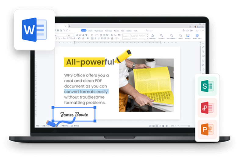
5. Best Free Alternative to Microsoft Word – WPS Office

If you're seeking a free alternative to Microsoft Word, consider WPS Office. This application provides a complimentary version with essential features, offering users a viable option for document creation without the need for a subscription. WPS Office offers a free version, providing essential features and compatibility with Microsoft Word functionalities, formulas, and macros.
Advantage of WPS Office
Compatibility: Easily works with Microsoft Word files, so you can share and edit documents without any fuss.
Free Version: You get essential features for free, making it perfect for basic document tasks.
User-Friendly: Simple and easy to use, whether you're a beginner or an experienced user.
Works Everywhere: You can use it on different devices and operating systems, providing flexibility.
Collaboration Tools: Tools like track changes and real-time editing make working together a breeze.


FAQs
1. Can I create interactive graphs directly within Microsoft Word?
Microsoft Word does not support the creation of interactive graphs natively. It primarily focuses on static data visualization. For interactive graphs, users typically turn to specialized software like Microsoft Excel, PowerPoint, or dedicated data visualization tools. Stay updated on any new features in Microsoft Word to see if this functionality evolves.
2. How can I update graphs automatically when the data changes in Microsoft Word?
To achieve automatic updates, create the graph in Microsoft Word using Excel as an embedded object. Modify the data in Excel, and the graph in Word will update accordingly. Simply double-click the graph in Word to access and modify the underlying data in Excel, and changes will reflect in the graph upon closing Excel.
3. Which graph type is best for comparing different categories of data?
For comparing different categories of data, a bar graph is highly effective. It displays data in rectangular bars, with each bar representing a category and its height indicating the value. Bar graphs are particularly suitable for visualizing discrete data and facilitating easy comparisons between different categories.
Summary
In conclusion, our guide simplifies the process of graph creation in Microsoft Word, offering downloadable templates, step-by-step instructions. This comprehensive resource ensures your graphs not only convey data accurately but also enhance the visual appeal of your documents.
But what if you're looking for a free alternative to Microsoft Word? Enter WPS Office, a feature-packed option that maintains full compatibility with Word, ensuring a smooth transition for your documents. We delve into its key features and compatibility, making it a compelling choice for those seeking a reliable and free document creation tool.

'%3e%3cpath%20d='M19.9911%204.11386V6.471H18.5894C18.0775%206.471%2017.7322%206.57814%2017.5536%206.79243C17.3751%207.00671%2017.2858%207.32814%2017.2858%207.75671V9.44421H19.9019L19.5536%2012.0871H17.2858V18.8639H14.5536V12.0871H12.2769V9.44421H14.5536V7.49779C14.5536%206.39064%2014.8632%205.53201%2015.4822%204.92189C16.1013%204.31177%2016.9257%204.00671%2017.9554%204.00671C18.8304%204.00671%2019.509%204.04243%2019.9911%204.11386Z'%20fill='%23333333'/%3e%3c/g%3e%3cdefs%3e%3cclipPath%20id='clip0_2938_8199'%3e%3crect%20width='16'%20height='16'%20fill='white'%20transform='translate(8%204.00671)'/%3e%3c/clipPath%3e%3c/defs%3e%3c/svg%3e)
'%3e%3cpath%20d='M17.5237%2010.7813L23.4811%204H22.0699L16.8949%209.88693L12.7648%204H8L14.2469%2012.9029L8%2020.0133H9.4112L14.8725%2013.7952L19.2352%2020.0133H24M9.92053%205.04213H12.0885L22.0688%2019.0224H19.9003'%20fill='%23333333'/%3e%3c/g%3e%3cdefs%3e%3cclipPath%20id='clip0_2938_8200'%3e%3crect%20width='16'%20height='16.0134'%20fill='white'%20transform='translate(8%204)'/%3e%3c/clipPath%3e%3c/defs%3e%3c/svg%3e)


