
'%3e%3cpath%20d='M8%200C12.4183%200%2016%203.58172%2016%208C16%2012.4183%2012.4183%2016%208%2016C3.58172%2016%200%2012.4183%200%208C0%203.58172%203.58172%200%208%200ZM11.6162%204.38379C11.2257%203.99337%2010.5927%203.99338%2010.2021%204.38379L8%206.58594L5.79785%204.38379C5.40732%203.99334%204.77429%203.99329%204.38379%204.38379C3.99331%204.77429%203.99335%205.40733%204.38379%205.79785L6.58594%208L4.38379%2010.2021C3.99348%2010.5927%203.99341%2011.2257%204.38379%2011.6162C4.77426%2012.0066%205.40734%2012.0065%205.79785%2011.6162L8%209.41406L10.2021%2011.6162C10.5927%2012.0066%2011.2257%2012.0067%2011.6162%2011.6162C12.0067%2011.2257%2012.0066%2010.5927%2011.6162%2010.2021L9.41406%208L11.6162%205.79785C12.0066%205.40735%2012.0066%204.77429%2011.6162%204.38379Z'%20fill='%23080E17'%20fill-opacity='0.46'/%3e%3c/g%3e%3cdefs%3e%3cclipPath%20id='clip0_3761_713'%3e%3crect%20width='16'%20height='16'%20fill='white'/%3e%3c/clipPath%3e%3c/defs%3e%3c/svg%3e)


'%3e%3cpath%20fill-rule='evenodd'%20clip-rule='evenodd'%20d='M21.4999%2010.9993C21.4999%205.20009%2016.7986%200.498901%2010.9993%200.498901C5.19994%200.498901%200.498657%205.20009%200.498657%2010.9993C0.498657%2016.2404%204.33858%2020.5844%209.35855%2021.3722V14.0346H6.69238V10.9993H9.35855V8.68594C9.35855%206.05427%2010.9262%204.60062%2013.3248%204.60062C14.4736%204.60062%2015.6753%204.80571%2015.6753%204.80571V7.38979H14.3512C13.0468%207.38979%2012.64%208.19921%2012.64%209.0296V10.9993H15.5523L15.0867%2014.0346H12.64V21.3722C17.66%2020.5844%2021.4999%2016.2404%2021.4999%2010.9993Z'%20fill='%231568EA'/%3e%3c/g%3e%3c/svg%3e)


In today's data-driven world, whether you're using Excel, WPS, or Google Forms, heat maps provide a powerful way to analyze complex information. However, creating a tailored heat map can be a challenge, especially when selecting the right format and template. In this guide, we'll delve into the step-by-step process of crafting an impactful heat map that suits your needs perfectly.
What is Excel Heat Map

Before we dive into the details, let's understand what a heat map is. Among the various charts in Excel, heat maps stand out for their simplicity in visualizing data patterns. In essence, A heat map in Excel is a visual representation of data where individual values are represented by colors. The colors are typically assigned based on a scale, with higher values being represented by brighter colors and lower values being represented by darker colors. This makes it easy to see the distribution of data and identify patterns.
Heat maps can be used to visualize a variety of data, including:
Sales data
Financial data
Survey data
Product usage data
Website traffic data
Customer satisfaction data
Download Free Heat Maps Template Online

When it comes to visualizing complex data, a well-designed heat map can be your secret weapon. And the best part? You don't have to start from scratch. You can find a plethora of free heat map templates online that will jumpstart your data analysis journey.
If you're looking for a head start, consider using heat map templates. WPS offers a collection of templates designed to streamline the process. Check out the available options here: WPS Heat Map Excel Templates.
How to Create a Heat Map in Excel
A heat map is a visual representation of data where individual values are represented by colors. The colors are typically assigned based on a scale, with higher values being represented by brighter colors and lower values being represented by darker colors. This makes it easy to see the distribution of data and identify patterns.
To create a heat map in Excel, follow these steps:
Step 1: Enter your data. The data you want to visualize should be in a range of cells.
Step 2: Select the range of cells. The range of cells should include all of the data you want to visualize.

Step 3: Apply conditional formatting. On the Home tab, in the Styles group, click Conditional Formatting.

Step 4: Select Color Scales. In the Color Scales section, select a color scale.

The color scale will be applied to the selected range of cells. The higher the value in a cell, the brighter the color will be.
Here are some additional tips for creating heat maps in Excel:
You can customize the color scale to use your own colors or to create a custom gradient.
You can use conditional formatting rules to create different heat maps for different values. For example, you could create a heat map that shows sales data for each month, or a heat map that shows customer satisfaction data for each product.
You can also create heat maps using pivot tables.
How to Customize Heat Map Appearance
You can also customize the other properties of the heat map, such as the size of the cells, the font size, and the gridlines.
Step 1: Select the cells that contain the heat map.

Step 2: Click on the Conditional Formatting button in the Styles group on the Home tab.

Step 3: Click on Color Scales.
Step 4: Choose the customization options that you want.

You can customize the following aspects of the heat map:
The color scale: This determines the range of colors that are used to represent different values in the data.
The palette: This determines the specific colors that are used in the color scale.
The number of colors: This determines the granularity of the heat map.
The minimum and maximum values: These determine the range of values that are represented by the color scale.
The cell size: This determines the size of the individual cells in the heat map.
The font size: This determines the size of the text in the heat map.
The gridlines: These can be used to add structure to the heat map.
How to Create Categorical Heat Maps
A categorical heat map is a heat map that visualizes the relationship between two categorical variables. For example, you could create a categorical heat map to show the relationship between the gender of a customer and their satisfaction with a product.
To create a categorical heat map, you can use the following steps:
Step 1: Create a pivot table.

Step 2: In the pivot table, select the fields that you want to visualize.

Step 3: On the PivotTable Analyze tab, in the Tools group, click Heatmap.

The pivot table will be converted into a heat map.

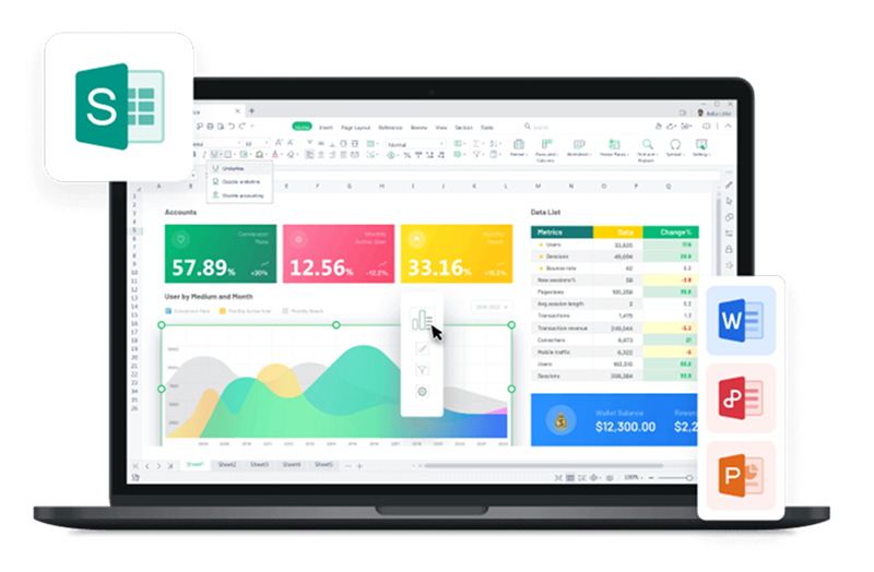
Best Alternative to Microsoft Excel - WPS Office.

Looking for an alternative to Microsoft Excel? Consider WPS Office, a powerful solution that offers a range of benefits. While the following methods apply to both Microsoft Excel and WPS Office, we highly recommend downloading and utilizing WPS Office for the following reasons:
Price: WPS Office provides a cost-effective solution without compromising on features. You can enjoy robust capabilities without breaking the bank.
Compatibility: WPS Office ensures seamless compatibility with various file formats, ensuring your work transitions effortlessly across different platforms.
Convenience: Experience enhanced convenience with WPS Office's user-friendly interface and intuitive tools, streamlining your workflow.
Younger Style: WPS Office boasts a fresh and modern design that appeals to a younger generation of users, enhancing your productivity and engagement.
Aspect | WPS Office | Microsoft Office (Microsoft 365) |
Price | Free version available, affordable premium | Subscription-based plans with tiers |
Compatibility | Compatible with Microsoft Office formats | Industry standard for file compatibility |
Interface | Modern and user-friendly design | Familiar interface with continuity |
Features | Comprehensive set of essential features | Extensive range, advanced tools |
Mobility | Mobile apps for Android and iOS devices | Mobile apps for Android and iOS devices |
Collaboration | Supports real-time collaboration | Extensive collaboration tools |
To download WPS Office, go to the WPS Office website: https://www.wps.com/ and click on the "Download" button. You can choose to download the installer for your specific operating system.


FAQs about Heat Maps in Excel
Can I create a 3D Heat Map in Excel?
Absolutely, you can create a 3D Heat Map in Excel to add an extra dimension to your data visualization. A 3D Heat Map combines the concepts of a traditional heat map with depth, allowing you to showcase data variations across three axes.
How can I interpret the color gradients in a Heat Map?
Interpreting color gradients in a heat map is about understanding the color scale: cool colors (blue) for lower values, warm colors (red) for higher values. Look for hotspots (warm colors, high values) and coldspots (cool colors, low values). Gradients show gradual changes, with darker shades indicating higher values. Compare adjacent areas for trends, patterns, and context matters. Always cross-reference with data values to avoid misinterpretation.
Is it possible to automate Heat Map generation in Excel?
Yes, you can automate heat map generation in Excel using conditional formatting. This feature applies colors based on data values, creating a visual representation without manual work. Changes in data update the heat map automatically. It's efficient, consistent, and user-friendly.
Summary
In this article, we explored the world of heat maps in Excel, uncovering how to create, interpret, and automate these visualizations. We discussed the importance of understanding color gradients and how they convey data intensity. Furthermore, we highlighted the ability to automate heat map generation using Excel's conditional formatting, saving time and ensuring real-time updates.
Throughout the article, we emphasized the value of using WPS Office for creating heat maps. Its templates, compatibility, and convenience provide an ideal platform for crafting effective data visualizations. Whether you're a seasoned analyst or new to data visualization, WPS Office offers the tools to enhance your insights and decision-making through heat maps.

'%3e%3cpath%20d='M19.9911%204.11386V6.471H18.5894C18.0775%206.471%2017.7322%206.57814%2017.5536%206.79243C17.3751%207.00671%2017.2858%207.32814%2017.2858%207.75671V9.44421H19.9019L19.5536%2012.0871H17.2858V18.8639H14.5536V12.0871H12.2769V9.44421H14.5536V7.49779C14.5536%206.39064%2014.8632%205.53201%2015.4822%204.92189C16.1013%204.31177%2016.9257%204.00671%2017.9554%204.00671C18.8304%204.00671%2019.509%204.04243%2019.9911%204.11386Z'%20fill='%23333333'/%3e%3c/g%3e%3cdefs%3e%3cclipPath%20id='clip0_2938_8199'%3e%3crect%20width='16'%20height='16'%20fill='white'%20transform='translate(8%204.00671)'/%3e%3c/clipPath%3e%3c/defs%3e%3c/svg%3e)
'%3e%3cpath%20d='M17.5237%2010.7813L23.4811%204H22.0699L16.8949%209.88693L12.7648%204H8L14.2469%2012.9029L8%2020.0133H9.4112L14.8725%2013.7952L19.2352%2020.0133H24M9.92053%205.04213H12.0885L22.0688%2019.0224H19.9003'%20fill='%23333333'/%3e%3c/g%3e%3cdefs%3e%3cclipPath%20id='clip0_2938_8200'%3e%3crect%20width='16'%20height='16.0134'%20fill='white'%20transform='translate(8%204)'/%3e%3c/clipPath%3e%3c/defs%3e%3c/svg%3e)


