Free All-in-One Office Suite with PDF Editor

Edit Word, Excel, and PPT for FREE.
Read, edit, and convert PDFs with the powerful PDF toolkit.
Microsoft-like interface, easy to use.
Windows • MacOS • Linux • iOS • Android

Catalog
How to add sd bars in excel on mac
Error bars are a valuable feature in Excel charts for representing data variability and measurement precision. In other words, error bars can show you how far the real numbers differ from the reported ones. Error bars can be added to 2-D bars, columns, line and area graphs, XY (scatter) plots, and bubble charts in Microsoft Excel. Vertical and horizontal error bars can be presented in scatter plots and bubble charts.
How to add sd/error bars in excel online, 2016 and 2019
1.Click anywhere on your graph.
2. Select the chart elements button to the right of the chart.
3. Select the desired option by clicking the arrow next to Error Bars:
Standard Error - gives the standard error of the mean for all values, indicating how far the sample mean differs from the population mean.
Percentage - Error bars are added with a default value of 5%, but you may change this by selecting More Options.
Standard Deviation - displays how much variability there is in the data, or how near it is to the average. By default, all data points are graphed with one standard deviation.

1. For fixed value, percentage, and standard deviation error bars, provide your own values.
2. Choose your ending style and direction (positive, negative, or both) (cap, no cap).
3. Create your own error bars using your own values.
4. Error bars can be changed in appearance.

How to add custom error/sd bars in excel:
1. Click on the chart elements button.
2. Select More Options... from the arrow next to Error Bars.
3. Switch to the Error Bars Options tab in the Format Error Bars window (the last one). Select Custom under Error Amount and then click the Specify Value button.
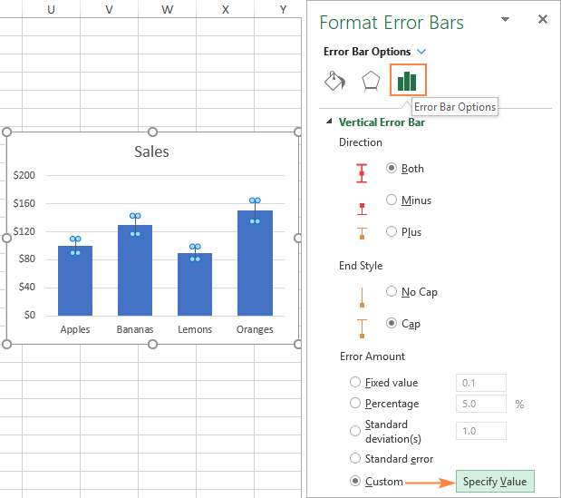
4. A little Custom Error Bars dialogue box displays, with two fields, each of which contains one array member, such as =1. You may now type your own values into the boxes (without the equal sign or curly brackets; Excel will do it for you) and click OK.

How to make error bars for a specific data series in excel:
Adding error bars to all data series in a chart might make it appear cluttered and untidy at times. In a combo chart, for example, it's common to merely display error bars on one series. This may be accomplished by following the steps below:
1. Select the data series to which you wish to add error bars in your chart.
2. Click on the chart elements button.
3. Select the preferred kind by clicking the arrow next to Error Bars. Done!
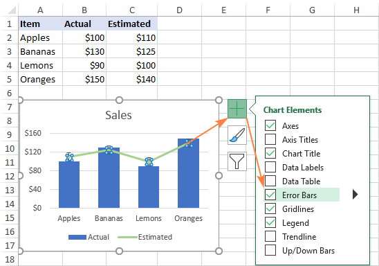
4. As a consequence, only the Estimated data series that we picked receives standard error bars.

Factors Affecting
Precision is paramount when working with error bars in Excel on a Mac. Several critical factors influence the accuracy of error values and demand your careful attention.
Excel Version:
Different versions of Excel for Mac may have subtle differences in user interface and feature availability. These differences can affect how you access and apply error bars. Excel's interface and menu structure can evolve with updates, leading to changes in the location of specific options. When using guides or tutorials to add error bars, make sure they are relevant to your Excel version.
It is essential to account for version-specific variations to avoid confusion or inaccuracies in adding error bars. Staying informed about your Excel version ensures you follow the correct steps and utilise the available tools effectively.
Chart Type:
The type of chart you're working with plays a significant role in displaying error bars. Different chart types have varying options for representing error bars, as the interpretation of uncertainty may differ depending on the visual context. For instance, bar charts, line charts, and scatter plots have unique conventions for displaying error bars. Some chart types might offer additional customization options for error bars, allowing you to fine-tune their appearance and alignment. Ignoring the nuances of chart type can result in error bars that misrepresent the underlying data or fail to communicate the degree of variability effectively.
Attention to these factors ensures that your error bars accurately reflect the data's uncertainty and variability. Awareness of version-specific adjustments and chart-type distinctions helps you tailor your error bar settings accordingly. It is vital when analysing data for research, decision-making, or communication. Inaccurate error bars can lead to flawed interpretations and miscommunication of findings.
To master the art of adding error bars, invest time in understanding your Excel version's features and the intricacies of your chosen chart type. Consulting official documentation, user guides, or tutorials specific to your Excel version can provide valuable insights. By approaching error bar integration with a meticulous mindset, you'll produce visualisations that enhance the clarity and reliability of your data representation, regardless of the Excel version or chart type you're working with.
Best Free Alternative - WPS Office
In the dynamic world of spreadsheet software, two giants have stood the test of time: Microsoft Excel and WPS Office Spreadsheet. Both offer an array of features tailored to data management and analysis. However, while these methods apply to both platforms, there are compelling reasons why choosing WPS Office might be the best decision for your needs.
Price
Undoubtedly, cost is a factor that significantly influences software decisions. While Microsoft Excel comes bundled with the Office 365 suite, which involves recurring subscription costs, WPS Office presents an attractive alternative with its cost-effective approach. WPS Office offers a comprehensive spreadsheet application without the hefty price tag. This affordability makes it an appealing option for individuals, small businesses, students, and anyone looking to manage their data and budgets without the financial burden.
Compatibility
In today's interconnected landscape, seamless data exchange is paramount. WPS Office recognizes this need and ensures its spreadsheet application is compatible with Microsoft Excel and its proprietary formats. This compatibility reduces friction when sharing files with users who prefer Excel. By choosing WPS Office, you're gaining access to its unique features and ensuring smooth collaboration across different software preferences. This adaptability makes the transition between platforms effortless and streamlines workflows.
Features
WPS Office's feature set competes head-to-head with that of Microsoft Excel, making it a contender worth considering. From basic calculations to complex data analyses, WPS Office provides an extensive toolkit. Financial modelling, statistical analysis, and data visualisation through graphs and charts are all within its capabilities. By opting for WPS Office, you're not sacrificing features; you're gaining access to a comprehensive suite that caters to various data-handling needs.
User-friendly Interface
User experience is paramount in software adoption. Here, WPS Office excels with its intuitive user interface. Its layout and menus are user-friendly, making it easy for individuals of all proficiency levels to navigate and operate the software. Whether a novice or a seasoned spreadsheet user, WPS Office's interface ensures a smooth learning curve, allowing you to dive into your data tasks without grappling with complex navigation.
Additional Benefits
Beyond the core attributes, WPS Office brings additional perks that enhance its appeal. Regular updates keep the software current, introducing new features and optimizations. Moreover, WPS Office's cloud integration empowers users to store, access, and collaborate on spreadsheets from anywhere with an internet connection. This flexibility is a boon for those who require constant access to their data while on the move or collaborating remotely.


FAQs
How do you draw error bars?
Open your chart or create a new one with your data.
Pick the data points you want to add error bars.
Right-click the data series and choose "Add Error Bars."
Select the error bar type – "Standard Error," "Standard Deviation," etc.
Input error values based on the chosen type.
Customise error bars' appearance – colour, style, thickness.
Attach labels to error bars for clarity.
Double-check settings for accuracy.
Confirm changes to see error bars in the chart.
Steps may vary in Excel, WPS Office, etc. Check help resources.
Error bars clarify data variability for better insights.
What can you conclude when two error bars overlap (or don't)?
if the Error Bars are overlapping, it means
No significant difference between data points.
Variability likely within expected measurement error.
Doesn't imply data points are equal, just that their ranges overlap.
if the error bars are Non-overlapping, it means
Suggests potential significant differences between data points.
Variability suggests meaningful distinction.
Statistical tests are needed for robust conclusions.
Summary
This guide equips users with the expertise to integrate error bars into their charts effectively. The Guide covers chart creation, error bar customization, and interpreting error bars for precise data analysis. It emphasises the importance of accuracy and variability representation. Specific steps for adding error bars, selecting their type, defining values, and customising appearance are detailed. The article highlights version-specific Excel adjustments and chart-type considerations for accurate error bar integration.
Additionally, it introduces WPS Office as a cost-effective, compatible, feature-rich, and user-friendly alternative. The Guide enhances data interpretation, supporting individuals across scientific, business, and academic domains.


15 years of office industry experience, tech lover and copywriter. Follow me for product reviews, comparisons, and recommendations for new apps and software.


