

'%3e%3cpath%20d='M8%200C12.4183%200%2016%203.58172%2016%208C16%2012.4183%2012.4183%2016%208%2016C3.58172%2016%200%2012.4183%200%208C0%203.58172%203.58172%200%208%200ZM11.6162%204.38379C11.2257%203.99337%2010.5927%203.99338%2010.2021%204.38379L8%206.58594L5.79785%204.38379C5.40732%203.99334%204.77429%203.99329%204.38379%204.38379C3.99331%204.77429%203.99335%205.40733%204.38379%205.79785L6.58594%208L4.38379%2010.2021C3.99348%2010.5927%203.99341%2011.2257%204.38379%2011.6162C4.77426%2012.0066%205.40734%2012.0065%205.79785%2011.6162L8%209.41406L10.2021%2011.6162C10.5927%2012.0066%2011.2257%2012.0067%2011.6162%2011.6162C12.0067%2011.2257%2012.0066%2010.5927%2011.6162%2010.2021L9.41406%208L11.6162%205.79785C12.0066%205.40735%2012.0066%204.77429%2011.6162%204.38379Z'%20fill='%23080E17'%20fill-opacity='0.46'/%3e%3c/g%3e%3cdefs%3e%3cclipPath%20id='clip0_3761_713'%3e%3crect%20width='16'%20height='16'%20fill='white'/%3e%3c/clipPath%3e%3c/defs%3e%3c/svg%3e)




'%3e%3cpath%20fill-rule='evenodd'%20clip-rule='evenodd'%20d='M21.4999%2010.9993C21.4999%205.20009%2016.7986%200.498901%2010.9993%200.498901C5.19994%200.498901%200.498657%205.20009%200.498657%2010.9993C0.498657%2016.2404%204.33858%2020.5844%209.35855%2021.3722V14.0346H6.69238V10.9993H9.35855V8.68594C9.35855%206.05427%2010.9262%204.60062%2013.3248%204.60062C14.4736%204.60062%2015.6753%204.80571%2015.6753%204.80571V7.38979H14.3512C13.0468%207.38979%2012.64%208.19921%2012.64%209.0296V10.9993H15.5523L15.0867%2014.0346H12.64V21.3722C17.66%2020.5844%2021.4999%2016.2404%2021.4999%2010.9993Z'%20fill='%231568EA'/%3e%3c/g%3e%3c/svg%3e)


'%3e%3cpath%20d='M2.42045%2022.1876H6.31818V12.7217L0.75%208.54553V20.5171C0.75%2021.4414%201.49892%2022.1876%202.42045%2022.1876Z'%20fill='%234285F4'/%3e%3cpath%20d='M19.682%2022.1876H23.5797C24.5041%2022.1876%2025.2502%2021.4387%2025.2502%2020.5171V8.54553L19.682%2012.7217'%20fill='%2334A853'/%3e%3cpath%20d='M19.682%205.48293V12.7216L25.2502%208.54543V6.31816C25.2502%204.25236%2022.8921%203.07469%2021.2411%204.31361'%20fill='%23FBBC04'/%3e%3cpath%20d='M6.31824%2012.7217V5.48303L13.0001%2010.4944L19.6819%205.48303V12.7217L13.0001%2017.733'%20fill='%23EA4335'/%3e%3cpath%20d='M0.75%206.31816V8.54543L6.31818%2012.7216V5.48293L4.75909%204.31361C3.10534%203.07469%200.75%204.25236%200.75%206.31816Z'%20fill='%23C5221F'/%3e%3c/g%3e%3cdefs%3e%3cclipPath%20id='clip0_2954_7305'%3e%3crect%20width='24.5'%20height='18.375'%20fill='white'%20transform='translate(0.75%203.8125)'/%3e%3c/clipPath%3e%3c/defs%3e%3c/svg%3e)


A scatter chart hides its own data: you can see an outlier data point, but the chart does not tell you which row produced it, and Excel will not let you click one dot and recolor it. The fix is to identify the value behind that data point, then add the single row as its own chart series so you can highlight and label it.
Data Points in Excel: How to Find, Label, and Highlight One
Find the Data Points Behind a Chart Value
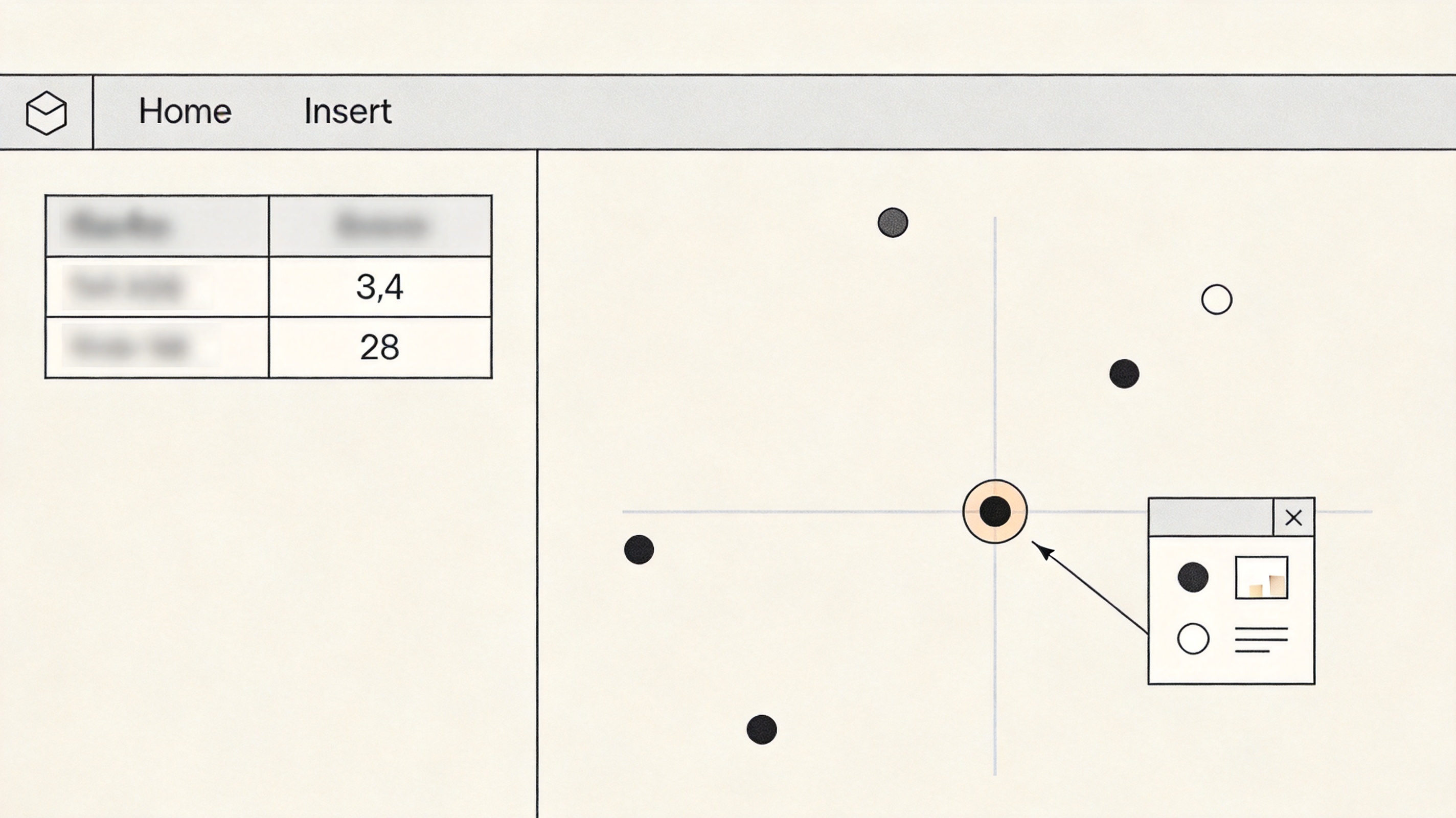
Start by getting the exact x and y numbers of the dot you care about, then match them back to the source table.
Hover the data point in WPS Spreadsheet or Excel and read the tooltip, or note the tick labels on both axes.
Right-click the chart and choose Select Data to confirm which columns feed the X values and Y values ranges.
In a blank cell, look the row up with XLOOKUP or a two-column FILTER on those ranges — for example =FILTER(A2:B20,(A2:A20=x)*(B2:B20=y)) — to return the label that belongs to that data point.
Find the data point behind a chart value


Highlight a Single Data Point in an Excel Scatter Chart
Once you know the values, give that row its own series. A new series is drawn last, so it sits on top of the cloud of dots and can be colored freely.
In two helper cells, type the x value and the y value of the data point you want to single out.
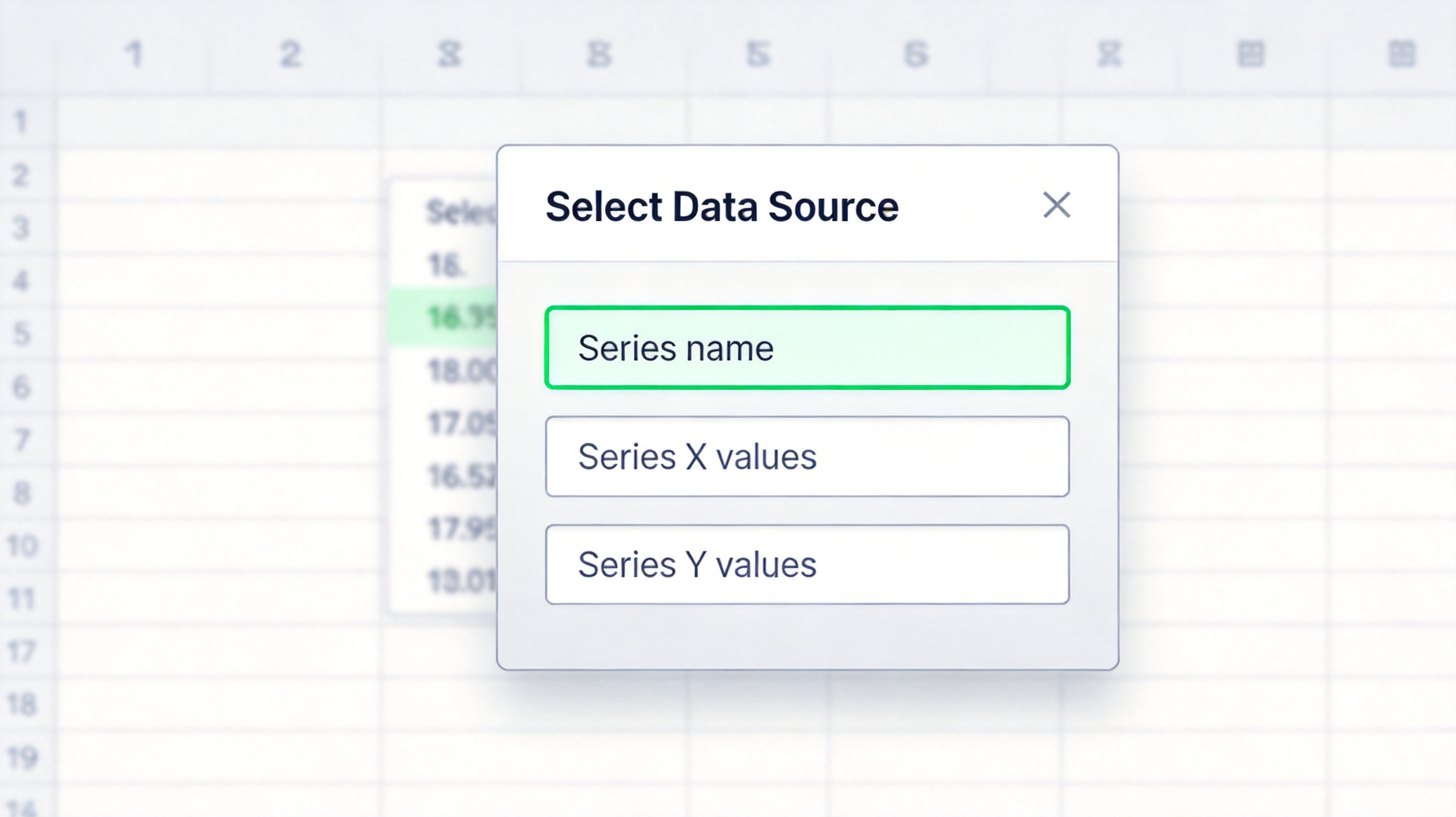
Right-click the chart, choose Select Data, then click Add.
Set Series name to the label, and point Series X values and Series Y values at the two helper cells.
Click the new marker, open Format Data Point, and pick a contrasting fill plus a larger marker size. Add error bars set to 100% in the minus direction to drop a thin guide line to the axis.
Add a single data point as its own series
Label a Data Point by Name or Value
A colored dot still needs a caption so readers know which product, month, or branch it represents.
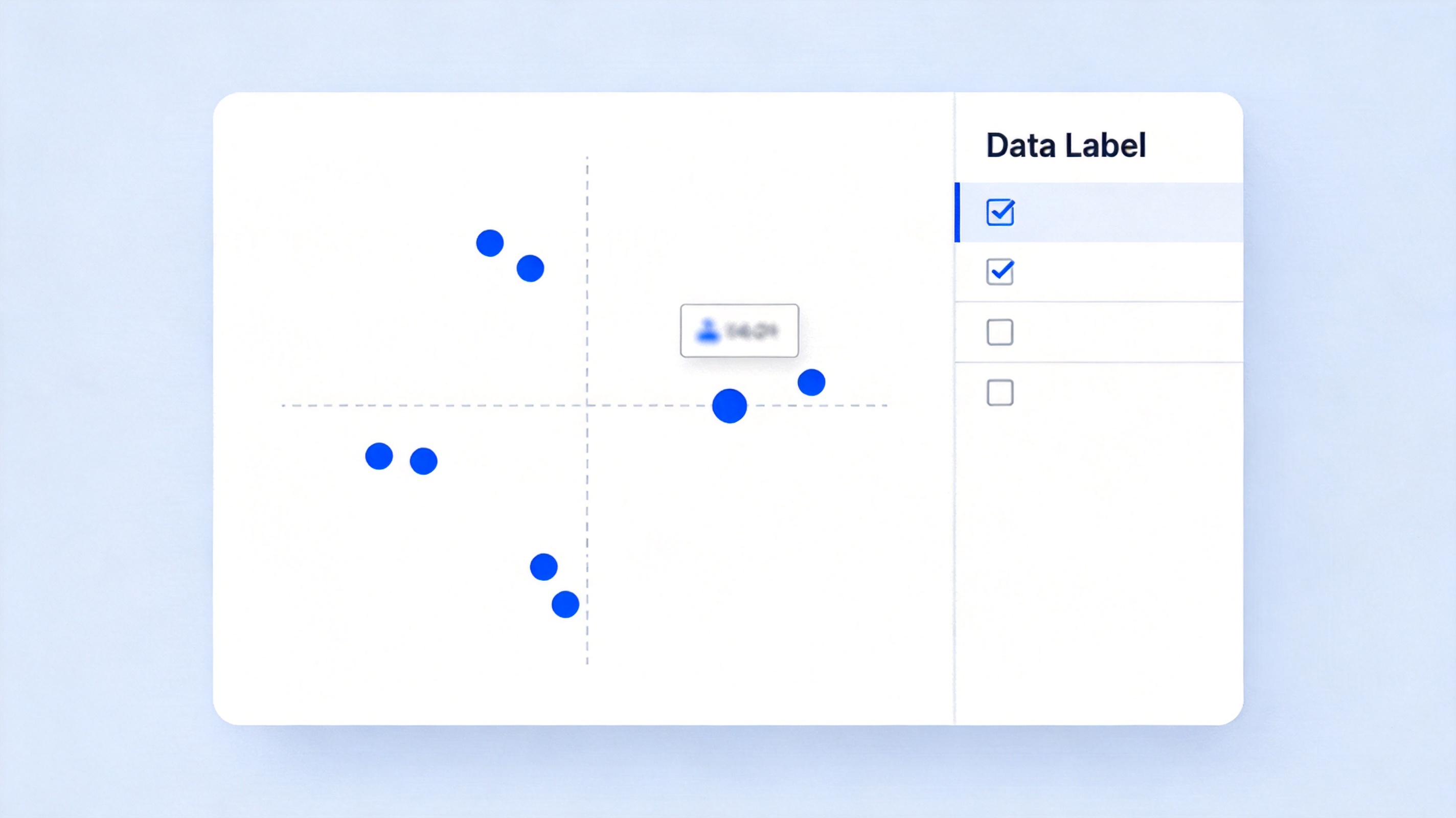
Click the highlighted marker, then open Chart Elements > Data Labels.
Tick Value From Cells and select the column that holds the readable names.
Set the label position above the point, then turn data labels off for the original series so only the one data point is annotated.
Label a data point with its name
The Best Free Alternative: WPS Office
Excel needs a Microsoft 365 licence before you can even add a chart series on some plans. WPS Spreadsheet ships the same chart tools — Select Data, Format Data Point, Value From Cells — in a free download that opens your existing .xlsx files unchanged.
| What you need | WPS Spreadsheet | Microsoft Excel |
|---|---|---|
| Add a data point as its own series | Included | Included |
| Value From Cells labels | Included | 365 only on some builds |
| Opening .xlsx files | Full compatibility | Full compatibility |
| Cost | Free for everyday use | Subscription |
Faster chart edits: the chart tools stay in the same ribbon, so you do not switch apps between the table and the graph.
One file, every device: the highlighted data point looks the same on Windows, macOS, Android, and iOS.
Free formulas: XLOOKUP, FILTER, and AVERAGE work the same, so the helper cells behind your chart keep working.
Keep the file: save as .xlsx and Microsoft Excel opens the chart with the new series intact.
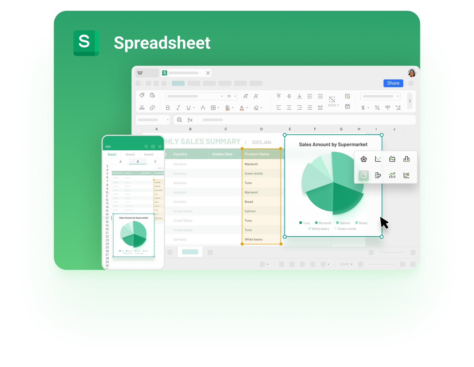
WPS Spreadsheet charts and data points
FAQs
How do I select a single data point in an Excel chart?
Click the series once so every marker is selected, then click again on the one dot you want. If you need it to stand out permanently, add its row as a separate series instead.
Why can I not see which row a data point comes from?
A chart only stores the x and y values, not the row labels. Right-click the chart, open Select Data, and read the ranges, then look those values up in the source table with XLOOKUP or FILTER.
Can I label only one data point?
Yes. Turn data labels on for the new single-point series only, use Value From Cells to show a name, and leave labels off for the main series.
How do I show an average or target as a data point?
Calculate the average x and average y in two cells with AVERAGE, add them as another series, and format that marker as a hollow ring or a different color.
Does the chart keep my changes when I save as .xlsx?
Yes. The extra series, labels, and marker formatting are stored in the workbook and stay in place when the file is reopened in WPS Spreadsheet or Excel.


'%3e%3cpath%20d='M19.9911%204.11386V6.471H18.5894C18.0775%206.471%2017.7322%206.57814%2017.5536%206.79243C17.3751%207.00671%2017.2858%207.32814%2017.2858%207.75671V9.44421H19.9019L19.5536%2012.0871H17.2858V18.8639H14.5536V12.0871H12.2769V9.44421H14.5536V7.49779C14.5536%206.39064%2014.8632%205.53201%2015.4822%204.92189C16.1013%204.31177%2016.9257%204.00671%2017.9554%204.00671C18.8304%204.00671%2019.509%204.04243%2019.9911%204.11386Z'%20fill='%23333333'/%3e%3c/g%3e%3cdefs%3e%3cclipPath%20id='clip0_2938_8199'%3e%3crect%20width='16'%20height='16'%20fill='white'%20transform='translate(8%204.00671)'/%3e%3c/clipPath%3e%3c/defs%3e%3c/svg%3e)
'%3e%3cpath%20d='M17.5237%2010.7813L23.4811%204H22.0699L16.8949%209.88693L12.7648%204H8L14.2469%2012.9029L8%2020.0133H9.4112L14.8725%2013.7952L19.2352%2020.0133H24M9.92053%205.04213H12.0885L22.0688%2019.0224H19.9003'%20fill='%23333333'/%3e%3c/g%3e%3cdefs%3e%3cclipPath%20id='clip0_2938_8200'%3e%3crect%20width='16'%20height='16.0134'%20fill='white'%20transform='translate(8%204)'/%3e%3c/clipPath%3e%3c/defs%3e%3c/svg%3e)


