

'%3e%3cpath%20d='M8%200C12.4183%200%2016%203.58172%2016%208C16%2012.4183%2012.4183%2016%208%2016C3.58172%2016%200%2012.4183%200%208C0%203.58172%203.58172%200%208%200ZM11.6162%204.38379C11.2257%203.99337%2010.5927%203.99338%2010.2021%204.38379L8%206.58594L5.79785%204.38379C5.40732%203.99334%204.77429%203.99329%204.38379%204.38379C3.99331%204.77429%203.99335%205.40733%204.38379%205.79785L6.58594%208L4.38379%2010.2021C3.99348%2010.5927%203.99341%2011.2257%204.38379%2011.6162C4.77426%2012.0066%205.40734%2012.0065%205.79785%2011.6162L8%209.41406L10.2021%2011.6162C10.5927%2012.0066%2011.2257%2012.0067%2011.6162%2011.6162C12.0067%2011.2257%2012.0066%2010.5927%2011.6162%2010.2021L9.41406%208L11.6162%205.79785C12.0066%205.40735%2012.0066%204.77429%2011.6162%204.38379Z'%20fill='%23080E17'%20fill-opacity='0.46'/%3e%3c/g%3e%3cdefs%3e%3cclipPath%20id='clip0_3761_713'%3e%3crect%20width='16'%20height='16'%20fill='white'/%3e%3c/clipPath%3e%3c/defs%3e%3c/svg%3e)



'%3e%3cpath%20fill-rule='evenodd'%20clip-rule='evenodd'%20d='M21.4999%2010.9993C21.4999%205.20009%2016.7986%200.498901%2010.9993%200.498901C5.19994%200.498901%200.498657%205.20009%200.498657%2010.9993C0.498657%2016.2404%204.33858%2020.5844%209.35855%2021.3722V14.0346H6.69238V10.9993H9.35855V8.68594C9.35855%206.05427%2010.9262%204.60062%2013.3248%204.60062C14.4736%204.60062%2015.6753%204.80571%2015.6753%204.80571V7.38979H14.3512C13.0468%207.38979%2012.64%208.19921%2012.64%209.0296V10.9993H15.5523L15.0867%2014.0346H12.64V21.3722C17.66%2020.5844%2021.4999%2016.2404%2021.4999%2010.9993Z'%20fill='%231568EA'/%3e%3c/g%3e%3c/svg%3e)


'%3e%3cpath%20d='M2.42045%2022.1876H6.31818V12.7217L0.75%208.54553V20.5171C0.75%2021.4414%201.49892%2022.1876%202.42045%2022.1876Z'%20fill='%234285F4'/%3e%3cpath%20d='M19.682%2022.1876H23.5797C24.5041%2022.1876%2025.2502%2021.4387%2025.2502%2020.5171V8.54553L19.682%2012.7217'%20fill='%2334A853'/%3e%3cpath%20d='M19.682%205.48293V12.7216L25.2502%208.54543V6.31816C25.2502%204.25236%2022.8921%203.07469%2021.2411%204.31361'%20fill='%23FBBC04'/%3e%3cpath%20d='M6.31824%2012.7217V5.48303L13.0001%2010.4944L19.6819%205.48303V12.7217L13.0001%2017.733'%20fill='%23EA4335'/%3e%3cpath%20d='M0.75%206.31816V8.54543L6.31818%2012.7216V5.48293L4.75909%204.31361C3.10534%203.07469%200.75%204.25236%200.75%206.31816Z'%20fill='%23C5221F'/%3e%3c/g%3e%3cdefs%3e%3cclipPath%20id='clip0_2954_7305'%3e%3crect%20width='24.5'%20height='18.375'%20fill='white'%20transform='translate(0.75%203.8125)'/%3e%3c/clipPath%3e%3c/defs%3e%3c/svg%3e)


If you can describe a trend in one sentence — sales are rising about 8% a quarter — you can have Excel calculate it instead of eyeballing the chart. The TREND function fits a straight line to your existing numbers and returns the fitted values, and with one extra argument it also returns the values you have not recorded yet.
Trend Analysis in Excel: Use the TREND Function (With Examples)
Add a Trend Analysis Column with the TREND Function
TREND uses simple linear regression, so it answers "if the current direction continues, what should each period be?"
The syntax is =TREND(known_y's, [known_x's], [new_x's], [const]) — only the first argument is required.
Put your measured values in one column (for example sales in B2:B13) and the matching periods in the column to its left (A2:A13).
In C2 enter =TREND(B2:B13,A2:A13). Modern versions spill the fitted values down the column; in older builds select the range first and confirm with Ctrl + Shift + Enter.
Select the new column and add a second data series to the chart so you can see the recorded values and the trend side by side.
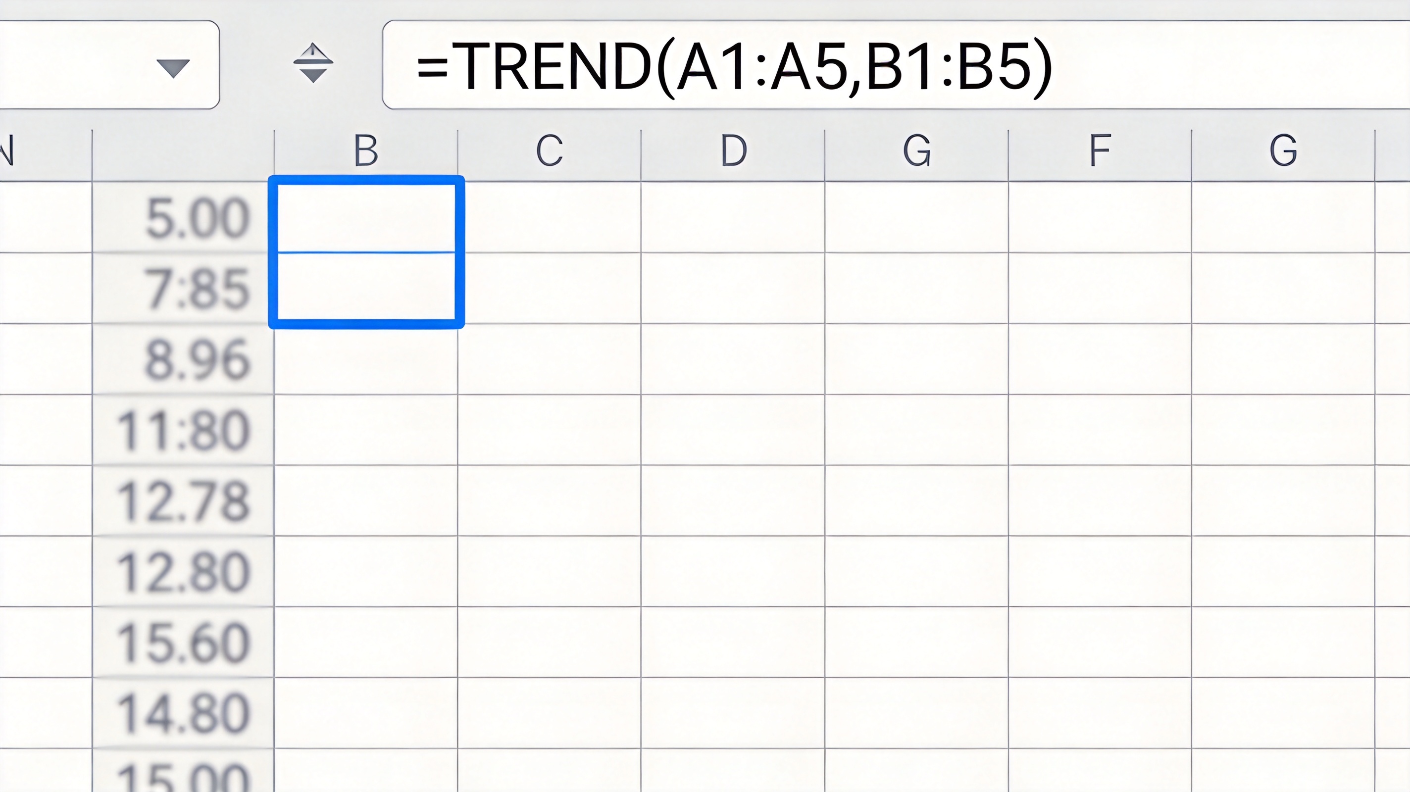
TREND function creates a trend analysis column


Project Future Values and Compare TREND with FORECAST
Add the periods you want to predict as a third argument and TREND returns the projected values.
Type the next four periods into A14:A17, then in C14 enter =TREND(B2:B13,A2:A13,A14:A17).
If you have a second explanatory column, pass both ranges as known_x's — =TREND(D2:D13,B2:C13) — and TREND fits the line against both variables at once.
Choose between the two functions by shape: FORECAST.LINEAR returns a single value for a single new x, while TREND returns a whole range and handles multiple x variables.
Remember the output is a straight line. If your data swings with the season, add a moving average or a seasonal forecast instead of trusting the linear fit.
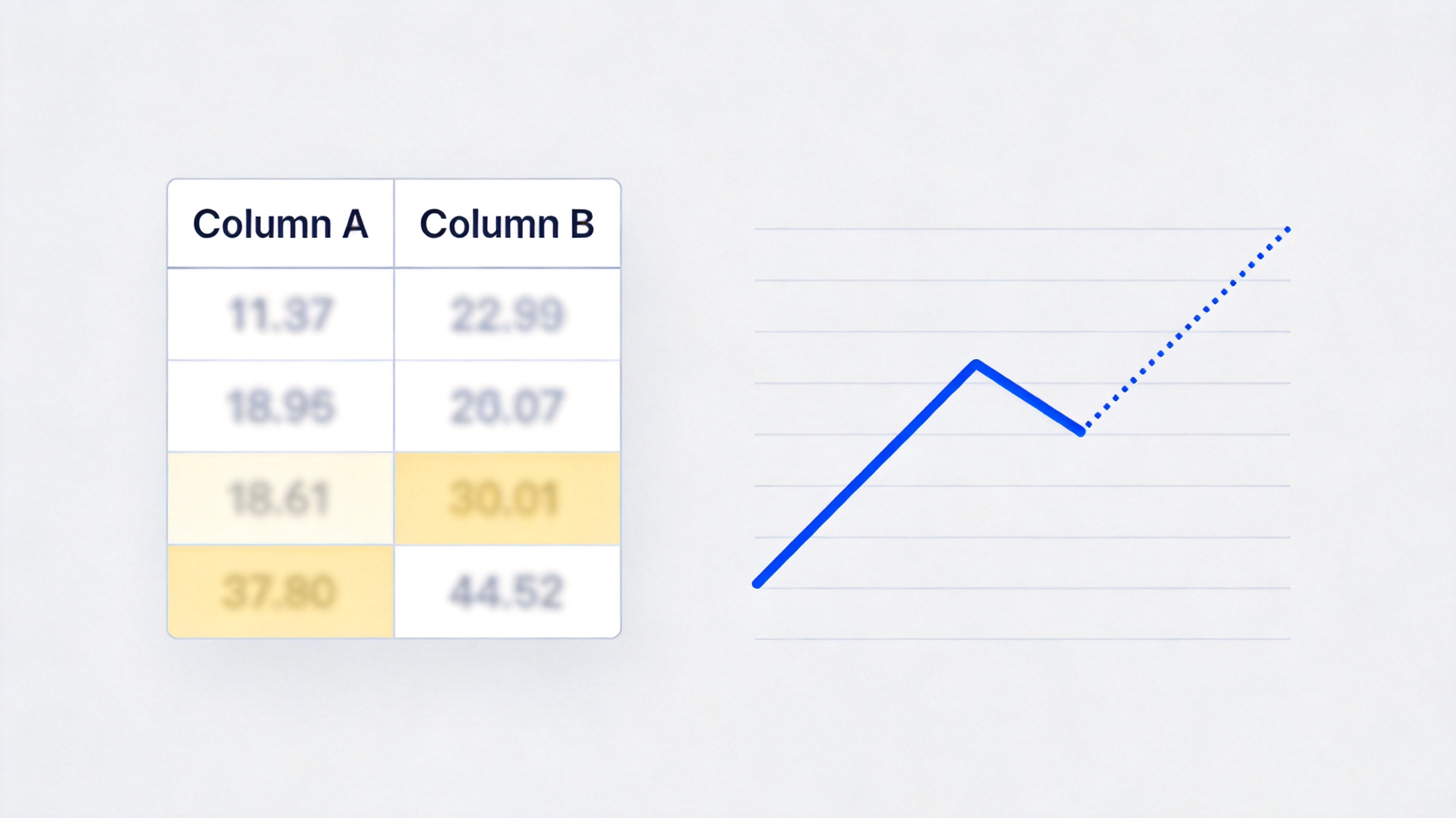
Project future trend values from your data
Add a Trendline and Moving Average to the Chart
A chart trendline reaches the same conclusion visually and is easier to show to someone else.
Click a data series, right-click it, and choose Add Trendline.
In the options panel keep Linear for a steady rise or fall, then tick Display Equation on chart and Display R-squared value.
Read R² as the share of variation the line explains; a value well below 0.5 means a straight line is a poor description of the trend.
To smooth noise instead, switch the trendline type to Moving Average and set a period of two to four points.
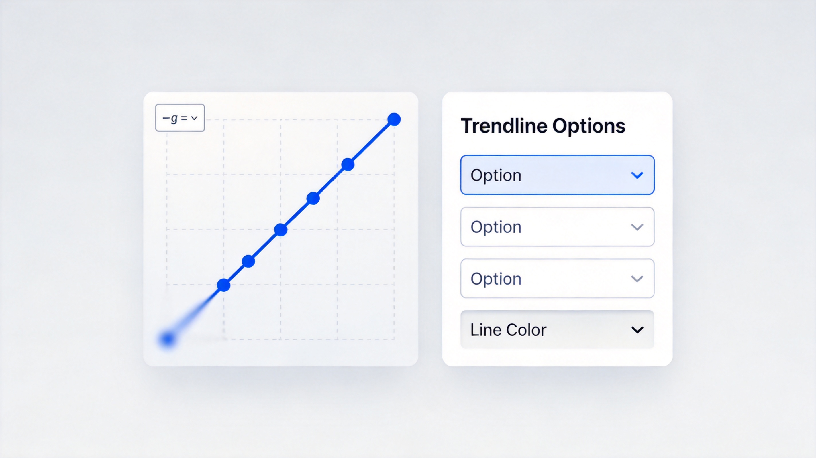
Trendline options for trend analysis in a chart
The Best Free Alternative: WPS Office
TREND, FORECAST.LINEAR, and chart trendlines behave the same in WPS Spreadsheet as in Microsoft Excel, so the analysis you build keeps working when the file changes hands.
| What you need | WPS Spreadsheet | Microsoft Excel |
|---|---|---|
| TREND and FORECAST functions | Identical results | Identical results |
| Trendline with equation and R² | Included | Included |
| Opening .xlsx workbooks | Full compatibility | Full compatibility |
| Cost | Free for everyday use | Subscription |
No licence wall: trendlines and R² are free, so the forecast is not locked behind a plan.
Familiar shortcuts: Ctrl + Shift + Enter for array TREND works the same way.
One window: build the table, the trend column, and the chart without switching apps.
Free templates: start from a ready-made sales or budget dashboard instead of a blank sheet.
WPS Spreadsheet for trend analysis
FAQs
What does the TREND function actually calculate?
It fits the least-squares straight line through your known data and returns the y values that line predicts — for the existing x values, and for any new ones you supply.
Why does TREND return several numbers?
Because it returns one value per period. Modern versions spill them automatically; in older versions you select the target range and press Ctrl + Shift + Enter.
Is TREND the same as a chart trendline?
They use the same linear regression. A trendline draws the result on the chart, while TREND puts the numbers into cells so you can reuse them in other formulas.
When should I use FORECAST instead of TREND?
Use FORECAST.LINEAR when you need a single predicted value for a single new x. Use TREND when you want a range of predictions or more than one explanatory variable.
Can TREND handle seasonal data?
Not well. TREND only draws a straight line, so for repeating seasonal peaks use a seasonal forecast function or compare a moving average with the raw series.


'%3e%3cpath%20d='M19.9911%204.11386V6.471H18.5894C18.0775%206.471%2017.7322%206.57814%2017.5536%206.79243C17.3751%207.00671%2017.2858%207.32814%2017.2858%207.75671V9.44421H19.9019L19.5536%2012.0871H17.2858V18.8639H14.5536V12.0871H12.2769V9.44421H14.5536V7.49779C14.5536%206.39064%2014.8632%205.53201%2015.4822%204.92189C16.1013%204.31177%2016.9257%204.00671%2017.9554%204.00671C18.8304%204.00671%2019.509%204.04243%2019.9911%204.11386Z'%20fill='%23333333'/%3e%3c/g%3e%3cdefs%3e%3cclipPath%20id='clip0_2938_8199'%3e%3crect%20width='16'%20height='16'%20fill='white'%20transform='translate(8%204.00671)'/%3e%3c/clipPath%3e%3c/defs%3e%3c/svg%3e)
'%3e%3cpath%20d='M17.5237%2010.7813L23.4811%204H22.0699L16.8949%209.88693L12.7648%204H8L14.2469%2012.9029L8%2020.0133H9.4112L14.8725%2013.7952L19.2352%2020.0133H24M9.92053%205.04213H12.0885L22.0688%2019.0224H19.9003'%20fill='%23333333'/%3e%3c/g%3e%3cdefs%3e%3cclipPath%20id='clip0_2938_8200'%3e%3crect%20width='16'%20height='16.0134'%20fill='white'%20transform='translate(8%204)'/%3e%3c/clipPath%3e%3c/defs%3e%3c/svg%3e)


