How to Create Charts in Excel
Learn the chart types Excel offers, then follow a simple step-by-step workflow to turn raw data into bar, line, pie, combo, area, or scatter visuals that are easier to read and present.
What Excel chart types are best for your data
Excel includes several chart formats for different kinds of analysis. Choosing the right one makes patterns, proportions, and relationships much easier to understand.
Line graph
Best for showing change over time and spotting a specific price pattern or trend across continuous data.
Column or bar graph
Useful for comparing categories, ranking values, and showing clear differences between discrete items.
Pie chart
Ideal for showing proportions of a whole when you only have a small number of categories.
Combo chart
Combines chart types so you can compare different data series or scales in one view.
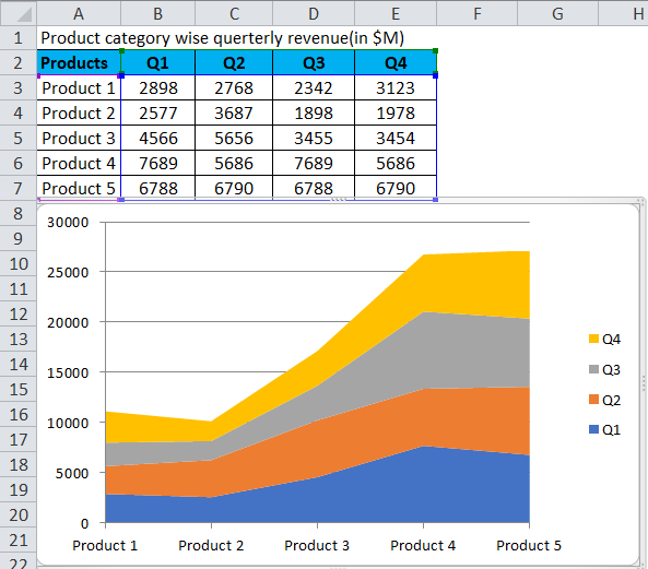
Area chart
Helpful for cumulative totals and comparing how values build over time.
Scatter plot
Great for finding correlations, outliers, and clusters between two variables.

Line graph
- Shows data points connected by straight lines.
- Useful for trends like sales, stock prices, or temperature changes.
Column or bar graph
- Uses bars to compare categories clearly.
- Works well for rankings, subjects, regions, or expense categories.
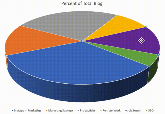
Pie chart
- Shows percentages and proportions of a whole.
- Best when the number of slices stays small and readable.
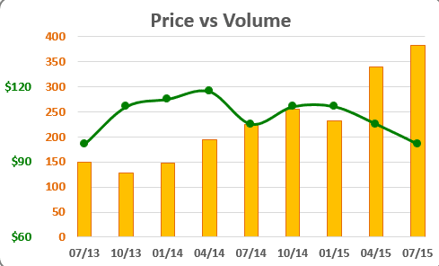
Combo chart
- Mixes two or more chart types in one graphic.
- Useful when series have different units or scales.
Area chart
- Fills the space below the line to show accumulation.
- Useful for revenue growth and relative proportions over time.
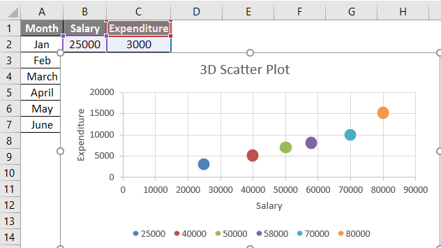
Scatter plot
- Plots values on X and Y axes to reveal relationships.
- Helpful for correlation checks, outliers, and clustering.
A quick chart-type comparison
The right chart depends on whether you want to show trends, categories, proportions, or relationships.
| Chart type | Main function | Best use case |
|---|---|---|
| Line graph | Shows change over time | Trends, continuous data, multiple time-based series |
| Column or bar graph | Compares categories | Rankings, regions, subjects, category totals |
| Pie chart | Shows proportions of a whole | Percent shares with only a few categories |
| Combo chart | Combines chart types | Mixed scales or two related measures |
| Area chart | Shows cumulative change | Growth, totals over time, proportion shifts |
| Scatter plot | Analyzes two-variable relationships | Correlations, outliers, clustering |
- Use the chart type that matches the insight you want your audience to notice first.
- For more examples, browse the Excel charts resource.
- Use Word, Excel, and PPT for FREE, No Ads.
- Same Excel Formula as Microsoft. Perfectly compatible with MS format.
- Microsoft-like interface. Easy to learn. 100% Compatibility.
- Boost your productivity with WPS's abundant free Word, Excel, PPT, and CV templates.
Easy way to create a chart in Excel
Creating a chart in Excel is straightforward once your data is ready. Follow these four steps in order to build a chart from scratch.
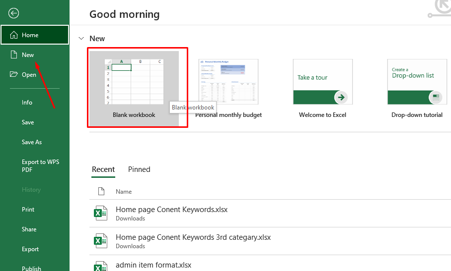
Open Excel and start a workbook
Go to Microsoft Excel on your PC or MacBook. Then create a new file or open an existing file that already contains data.
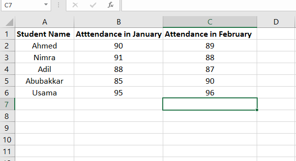
Enter the data you want to visualize
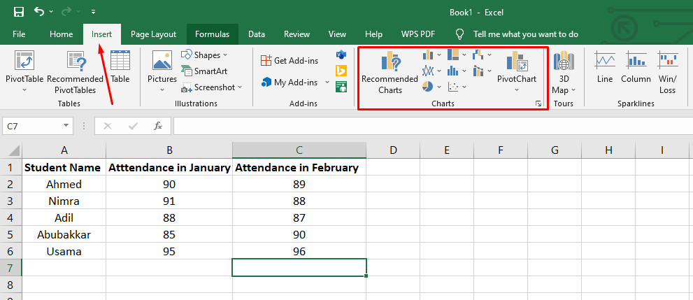
Create your table and add the values you want to chart. In the example, five students and their attendance percentages for January and February are entered first.
Choose a chart from the Insert tab
After entering your data, go to the Insert tab in Excel and pick the graph type that fits your dataset. In this example, a bar graph is selected.
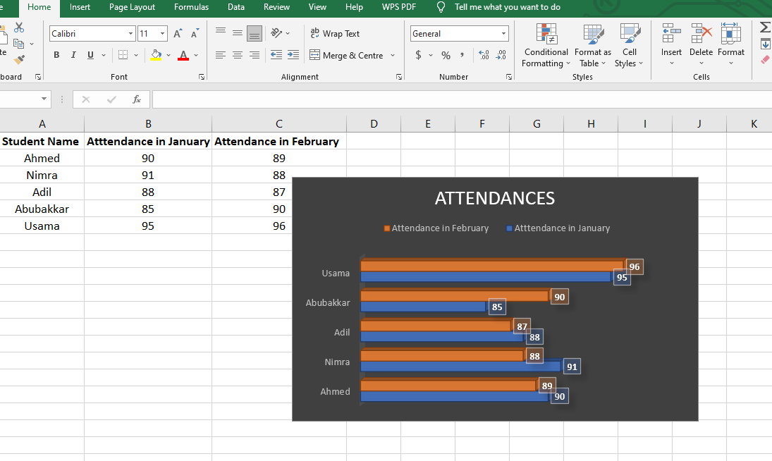
Select the full range and create the chart
Highlight the complete dataset and click the chart type you want to produce. The sample result is a 3D bar graph showing student attendance percentages.
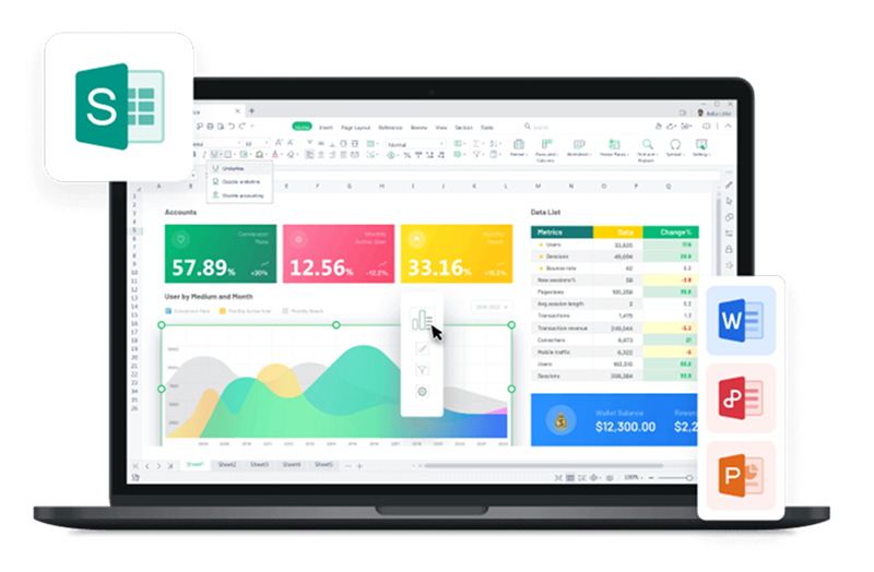
Best free alternative: WPS Office
Microsoft Excel works well for charts, but the source points out a cost downside. WPS Office offers a similar spreadsheet experience with extra tools and free access across devices.
What WPS includes
- Word editor, spreadsheet editor, and presentation editor similar to Microsoft Office.
- Also includes a PDF editor, convertor, and free templates from the online library.
Why it stands out
- Strong compatibility across Windows, Mac, Android, and iOS.
- Free to download and easy to use on different devices.
Pricing and access at a glance
The source explicitly contrasts Microsoft Office subscription costs with WPS Office's free download model, so here is that difference in a clear table.
| Product | Cost signal from source | What you get | Platform support |
|---|---|---|---|
| Microsoft Office / Excel | Requires a one-time or monthly subscription fee | Excel used in the example for chart creation | PC and MacBook mentioned in the tutorial |
| WPS Office | Absolutely free to download | Word, Spreadsheet, Presentation, PDF tools, convertor, templates | Windows, Mac, Android, iOS |
How to create a chart in WPS Spreadsheet
The process in WPS Excel is very similar to Microsoft Excel. Open a file with numerical data, then follow these three steps to generate the chart.
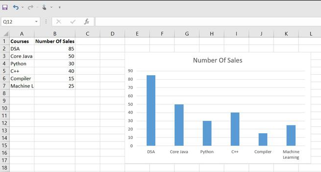
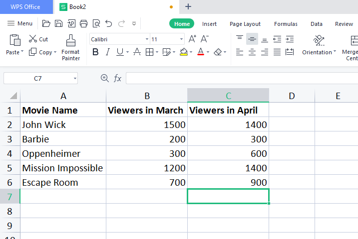
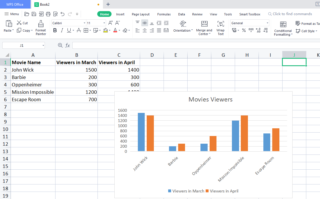
Enter your data in a new WPS file
Open a new WPS Spreadsheet file and add the data you want to chart. The example uses recent movie viewership data.
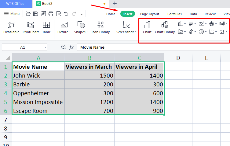
Select the data and open Insert chart options
Highlight the full dataset, go to the Insert tab, and choose the graph style you want from the vector-style chart options.
Click the chart type to generate the graph
As soon as you choose a chart type, WPS creates the chart from the selected data. The example result is a colored bar graph for two months.
Frequently asked questions
These quick answers cover the most common follow-up questions from the tutorial.
Summing it all up
What you learned
- How different Excel chart types work and when to use them.
- How to create a chart in Excel step by step from a simple dataset.
- How to repeat a similar chart workflow inside WPS Spreadsheet.
Why WPS is highlighted
- WPS is presented as a strong alternative to Microsoft Office without a subscription fee.
- It supports Word, spreadsheets, PDFs, and presentations with a familiar interface.
- It is designed for efficient editing across desktop and mobile platforms.
The easiest path is simple data first, then the right chart
If your goal is to create charts quickly, Excel and WPS follow nearly the same logic: prepare clean data, select it, choose the right chart type, and let the spreadsheet build the visual. WPS adds a free, cross-device option without changing the basic workflow.
Create spreadsheets, charts, and reports with WPS Office
Use a familiar spreadsheet interface, strong file compatibility, and free tools for documents, presentations, and PDFs in one suite.