

'%3e%3cpath%20d='M8%200C12.4183%200%2016%203.58172%2016%208C16%2012.4183%2012.4183%2016%208%2016C3.58172%2016%200%2012.4183%200%208C0%203.58172%203.58172%200%208%200ZM11.6162%204.38379C11.2257%203.99337%2010.5927%203.99338%2010.2021%204.38379L8%206.58594L5.79785%204.38379C5.40732%203.99334%204.77429%203.99329%204.38379%204.38379C3.99331%204.77429%203.99335%205.40733%204.38379%205.79785L6.58594%208L4.38379%2010.2021C3.99348%2010.5927%203.99341%2011.2257%204.38379%2011.6162C4.77426%2012.0066%205.40734%2012.0065%205.79785%2011.6162L8%209.41406L10.2021%2011.6162C10.5927%2012.0066%2011.2257%2012.0067%2011.6162%2011.6162C12.0067%2011.2257%2012.0066%2010.5927%2011.6162%2010.2021L9.41406%208L11.6162%205.79785C12.0066%205.40735%2012.0066%204.77429%2011.6162%204.38379Z'%20fill='%23080E17'%20fill-opacity='0.46'/%3e%3c/g%3e%3cdefs%3e%3cclipPath%20id='clip0_3761_713'%3e%3crect%20width='16'%20height='16'%20fill='white'/%3e%3c/clipPath%3e%3c/defs%3e%3c/svg%3e)



'%3e%3cpath%20fill-rule='evenodd'%20clip-rule='evenodd'%20d='M21.4999%2010.9993C21.4999%205.20009%2016.7986%200.498901%2010.9993%200.498901C5.19994%200.498901%200.498657%205.20009%200.498657%2010.9993C0.498657%2016.2404%204.33858%2020.5844%209.35855%2021.3722V14.0346H6.69238V10.9993H9.35855V8.68594C9.35855%206.05427%2010.9262%204.60062%2013.3248%204.60062C14.4736%204.60062%2015.6753%204.80571%2015.6753%204.80571V7.38979H14.3512C13.0468%207.38979%2012.64%208.19921%2012.64%209.0296V10.9993H15.5523L15.0867%2014.0346H12.64V21.3722C17.66%2020.5844%2021.4999%2016.2404%2021.4999%2010.9993Z'%20fill='%231568EA'/%3e%3c/g%3e%3c/svg%3e)


'%3e%3cpath%20d='M2.42045%2022.1876H6.31818V12.7217L0.75%208.54553V20.5171C0.75%2021.4414%201.49892%2022.1876%202.42045%2022.1876Z'%20fill='%234285F4'/%3e%3cpath%20d='M19.682%2022.1876H23.5797C24.5041%2022.1876%2025.2502%2021.4387%2025.2502%2020.5171V8.54553L19.682%2012.7217'%20fill='%2334A853'/%3e%3cpath%20d='M19.682%205.48293V12.7216L25.2502%208.54543V6.31816C25.2502%204.25236%2022.8921%203.07469%2021.2411%204.31361'%20fill='%23FBBC04'/%3e%3cpath%20d='M6.31824%2012.7217V5.48303L13.0001%2010.4944L19.6819%205.48303V12.7217L13.0001%2017.733'%20fill='%23EA4335'/%3e%3cpath%20d='M0.75%206.31816V8.54543L6.31818%2012.7216V5.48293L4.75909%204.31361C3.10534%203.07469%200.75%204.25236%200.75%206.31816Z'%20fill='%23C5221F'/%3e%3c/g%3e%3cdefs%3e%3cclipPath%20id='clip0_2954_7305'%3e%3crect%20width='24.5'%20height='18.375'%20fill='white'%20transform='translate(0.75%203.8125)'/%3e%3c/clipPath%3e%3c/defs%3e%3c/svg%3e)


We've all been there. A presentation starts with good intentions, but as the slides keep coming, the room gradually gets quieter—not because everyone is deeply engaged, but because attention is slowly fading away. Dense paragraphs, endless bullet points, tiny charts, and speakers reading directly from the screen can turn even the most interesting topic into an exhausting experience.
This is what people often call Death by PowerPoint.
The problem isn't PowerPoint itself—it's how presentations are designed and delivered. In this guide, I'll explain what Death by PowerPoint really means, why it happens, and share practical techniques inspired by one of the most popular TED Talks on presentation design. I'll also show how I apply these ideas in WPS Presentation to build clearer, more engaging slides with far less effort.
What Is Death by PowerPoint?
Death by PowerPoint describes presentations that overwhelm rather than engage their audience. Instead of helping people understand an idea, the slides become a wall of text, cluttered graphics, and unnecessary information that makes it difficult to follow the speaker.
The phrase became popular in workplaces because almost everyone has experienced it. You attend a meeting expecting useful insights, but twenty minutes later you're reading emails, checking your phone, or wondering how many slides are left.
Today, "Death by PowerPoint" is no longer just an office joke—it's widely discussed in education, business, and presentation design because effective communication has become more important than ever.
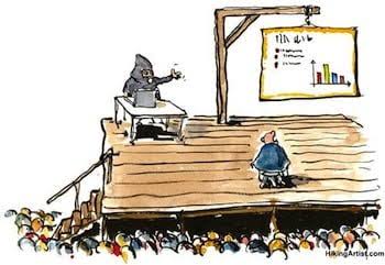
For many people, Death by PowerPoint simply means a boring meeting. However, the consequences of poor presentation design can sometimes be much more serious.
One of the most frequently cited examples is the 2003 Columbia Space Shuttle disaster. During the investigation, experts found that important engineering concerns had been summarized in complex PowerPoint slides where critical safety information was buried beneath dense text and unclear visual hierarchy. While the slides were not the sole cause of the tragedy, they became a powerful example of how poor communication can contribute to costly misunderstandings.
The same problem appears in everyday situations as well:
In every case, the issue isn't the software—it's the way information is organized and presented.
What May Cause Death by PowerPoint?
If you've ever wondered whether your presentation suffers from Death by PowerPoint, these are some of the most common warning signs.
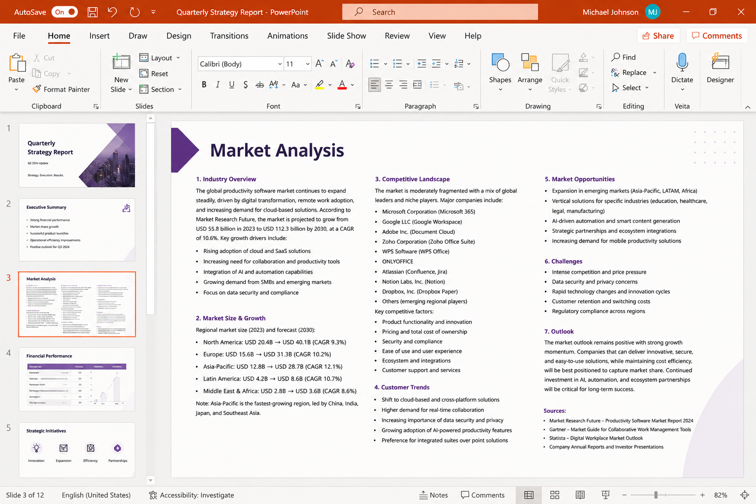
1. Slides Are Filled With Too Much Text
The biggest mistake is treating slides like documents. When every slide contains long paragraphs, your audience starts reading instead of listening. Before you finish speaking, they've already lost track of your main point.
2. Endless Bullet Lists
Bullet points are useful for summarizing ideas, but they're often overused. A slide with ten bullet points doesn't help people focus—it forces them to search for what's actually important.
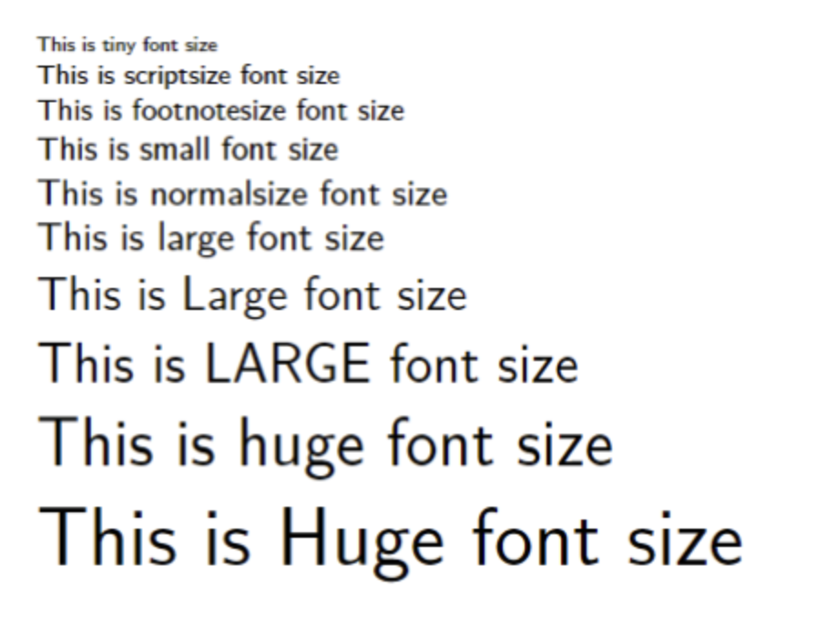
3. Fonts Are Too Small to Read
Trying to fit more content onto one slide usually means shrinking the font size. If people in the back of the room need to squint, the slide already contains too much information.
4. Every Chart, Table, and Icon Competes for Attention
Many presenters assume more visuals automatically make a better presentation. In reality, too many charts, diagrams, icons, and decorative elements simply compete for attention, leaving the audience unsure where to look first.
5. There's No Clear Visual Hierarchy
Sometimes the title is enormous while the key insight is buried in tiny text. Other times every element has the same size and color, making nothing stand out. Without a clear visual hierarchy, viewers spend valuable time figuring out what matters instead of understanding the message.
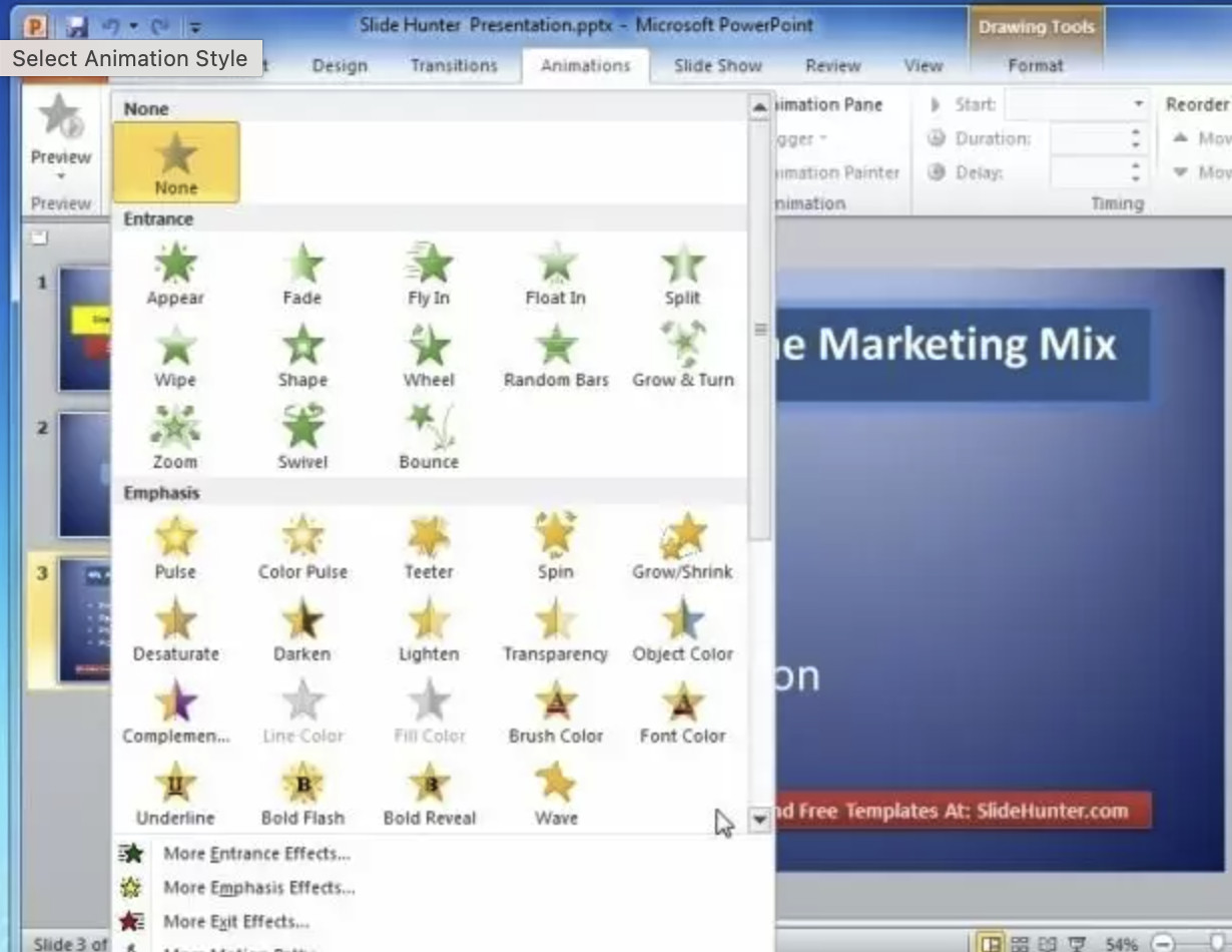
6. Animations Become the Main Attraction
Animations should reinforce a story—not become the story themselves. Excessive transitions, flying text, and distracting effects may look impressive at first, but they often pull attention away from what the presenter is actually saying.
7. The Presenter Simply Reads Every Slide
This is usually the final symptom of all the problems above. When slides contain every sentence of the presentation, speakers naturally begin reading them aloud. At that point, the audience no longer needs a presenter—they only need the slides, and even those aren't enjoyable to read.
12 Practical Ways to Avoid Death by PowerPoint
After creating and redesigning presentations for work over the years, I've found that engaging slides usually have one thing in common—they're surprisingly simple. People can only process a limited amount of information at one time. When a slide is filled with paragraphs, charts, icons, and animations all competing for attention, your audience spends more energy figuring out the slide than understanding your message.
The easiest way to create better presentations isn't adding more—it's removing everything that doesn't support your main point. Here are the techniques I rely on most.


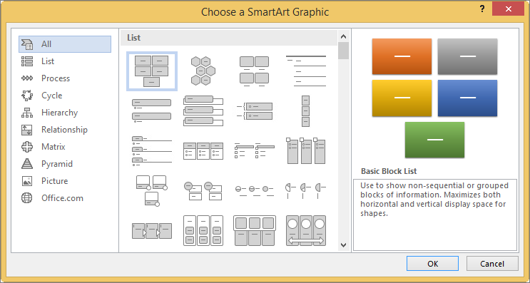
1. Focus on One Message Per Slide
Every slide should communicate one clear takeaway.
If you're trying to explain three different ideas at once, your audience will likely remember none of them. Splitting one crowded slide into two or three simpler slides almost always improves clarity, even if it increases the total slide count.
Think of each slide as answering one question—not telling the whole story.
2. Cut Down the Text
Slides aren't documents.
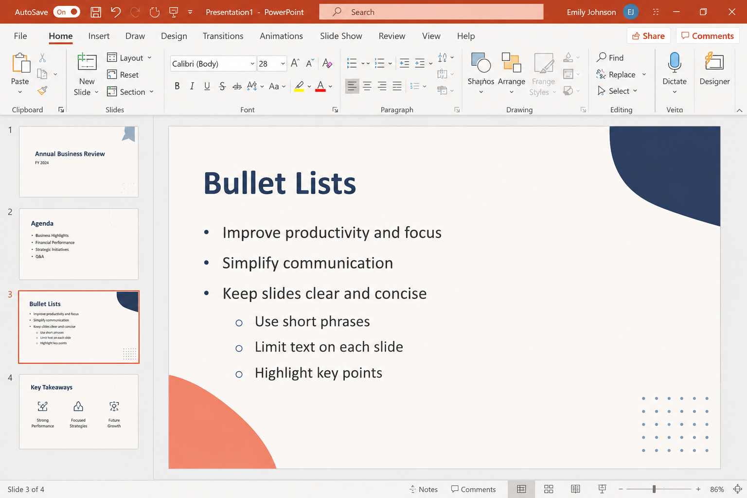
Instead of copying your script onto the screen, reduce each section to keywords or short phrases that reinforce what you're saying. Your audience should be listening to you, not racing to finish reading before you move to the next slide.
As a quick check, if your slide looks like something you'd print out and read later, it probably contains too much text.
3. Choose Fonts That Everyone Can Read
Typography has a bigger impact than many people realize.
Choose clean, readable fonts and use sizes that are comfortable to read from the back of the room. A clear hierarchy between headings and body text also helps people understand your content more quickly.
💡 Pro Tip
Stick to one or two font families throughout your presentation. Consistency makes your slides look cleaner and more professional.
4. Let Images Tell Part of the Story
People process visuals much faster than long paragraphs.
Whenever possible, replace blocks of text with photos, illustrations, icons, or simple diagrams that reinforce your message. A strong visual often communicates more than several bullet points.
Using a professionally designed presentation template can also improve consistency without adding extra design work.


5. Create a Clear Visual Hierarchy
Not everything deserves the same level of attention.
Your headline should immediately stand out, followed by supporting information in a logical order. Size, spacing, and color should naturally guide the audience's eyes through the slide.
If everything is bold, colorful, and oversized, nothing actually stands out.
6. Reduce Visual Clutter
Every text box, chart, icon, logo, image, and decorative element competes for attention. The more objects you place on a slide, the harder your audience has to work to understand it.
Instead of asking, "Can I fit one more thing?" ask yourself, "What can I remove?"
Simple slides are often the most memorable ones.
Browsing minimalist PowerPoint templates is an easy way to steal layouts that already protect white space.
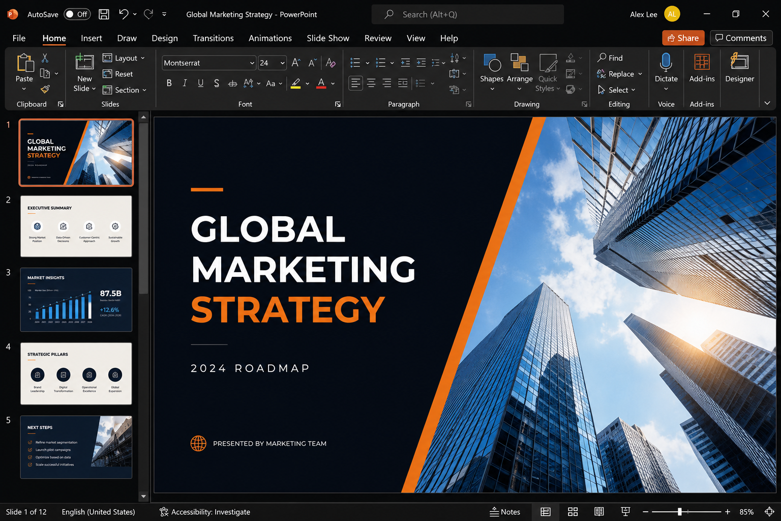
7. Use Contrast to Guide Attention
Contrast tells your audience where to look first.
Highlight the information you're discussing while keeping everything else visually secondary. Whether you're using color, bold text, or progressive reveals, the goal is to direct attention—not decorate the slide.
8. Add Animations Sparingly
Animations should improve clarity, not compete for attention.
Simple transitions can help reveal information step by step, but excessive movement quickly becomes distracting. If an animation doesn't make your message easier to understand, leave it out.
9. Don't Read Your Slides
When you do want motion, subtle options like the Morph transition in PowerPoint usually work better than flashy fly-ins. Your slides should support your presentation—not become the presentation.
If you're reading every sentence on the screen, your audience will usually finish reading before you've finished speaking. That's when attention starts drifting.
Instead, let the slide highlight the key idea while you provide the explanation, examples, and context.
10. Tell a Story Instead of Listing Facts
Facts are easier to remember when they're connected by a narrative.
Rather than presenting disconnected information, guide your audience through a problem, explain why it matters, and then introduce the solution. A simple storyline keeps people engaged far better than a sequence of unrelated bullet points.
11. Experiment With Faster Presentation Formats
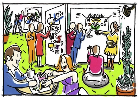
If you tend to overload your slides, try practicing with time-limited presentation formats that encourage concise communication. Setting a strict time limit for each slide forces you to focus on the essentials instead of trying to include everything.
Even if you don't use this style in real presentations, it's a great exercise for simplifying your content.
💡 Pro Tip: Try the PechaKucha Method
A popular way to practice concise presentations is the PechaKucha format, where you present 20 slides for 20 seconds each. Because every slide advances automatically, you're forced to focus on your key message instead of filling slides with paragraphs. Even if you never present this way in public, it's an excellent exercise for eliminating clutter and improving your storytelling.
12. Practice Before You Present
No slide deck can replace preparation.
Practicing helps you smooth out transitions, identify unnecessary content, and become confident enough that you no longer depend on reading the screen. The better you know your story, the simpler your slides can be. During rehearsals, PowerPoint Presenter View helps you keep speaker notes private while the audience only sees the clean slide.

Learning good presentation principles is one thing. Applying them consistently is another.
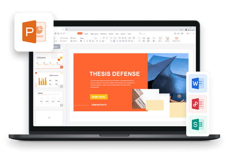
After redesigning presentations for meetings, reports, client pitches, and internal training, I've found that most of my time isn't spent thinking about ideas—it's spent adjusting layouts, resizing images, rewriting text, and making last-minute formatting changes. That's where WPS Office has genuinely improved my workflow.
Rather than focusing on flashy effects, WPS Office provides practical tools that make it easier to create presentations that are cleaner, more consistent, and easier for audiences to follow.
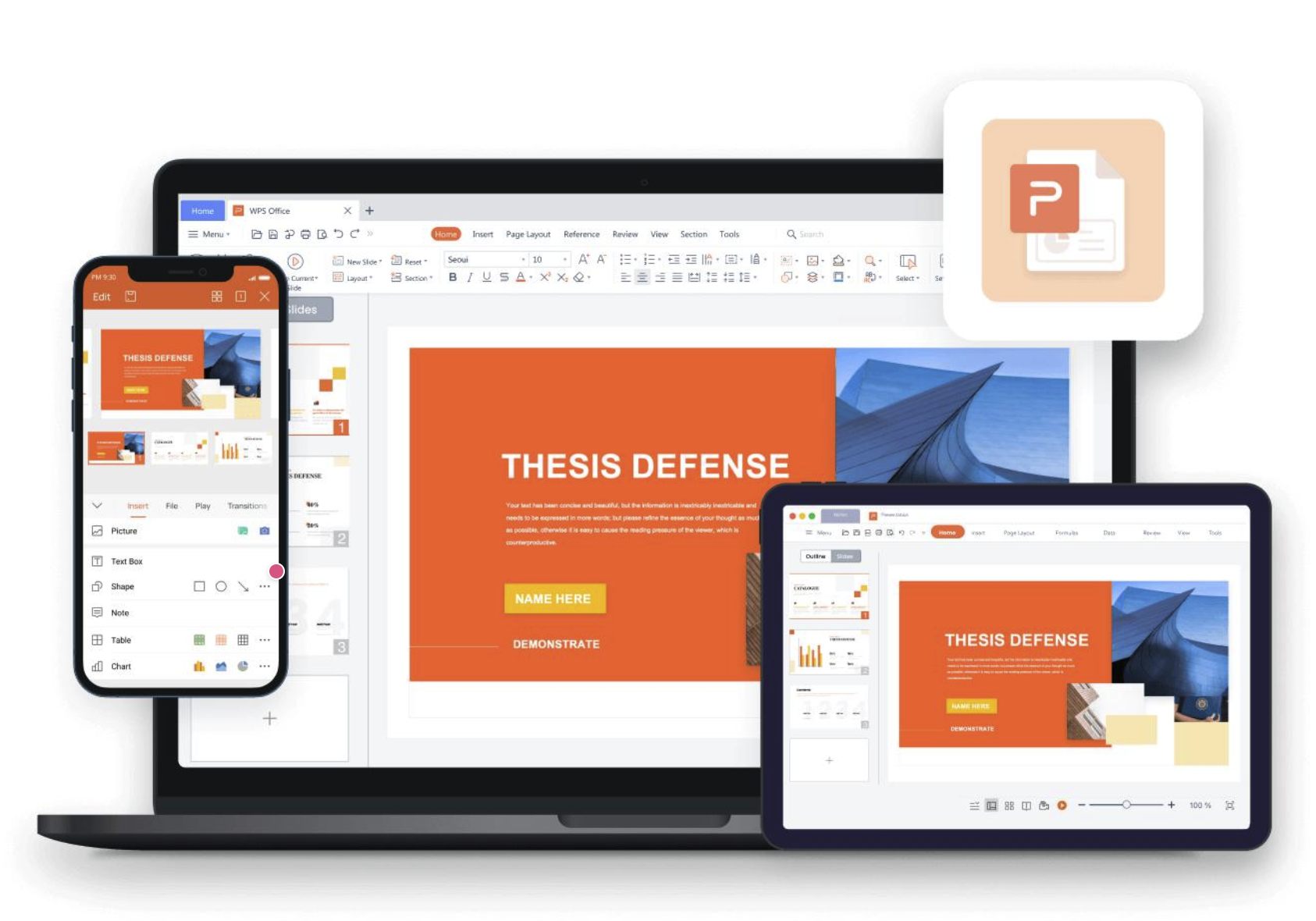
The hardest part of building a presentation is often getting started.
Instead of staring at an empty slide, I can enter a topic or prompt into WPS AI Presentation and generate a structured draft within seconds. It gives me a logical outline and a starting point that I can refine, rather than forcing me to build every slide from scratch. For brainstorming or creating a first draft, it saves a surprising amount of time.
If you want more options beyond a single tool, this roundup of free AI pitch deck generators shows how different AI workflows build a first draft.
Build Cleaner Slides With Professional Templates
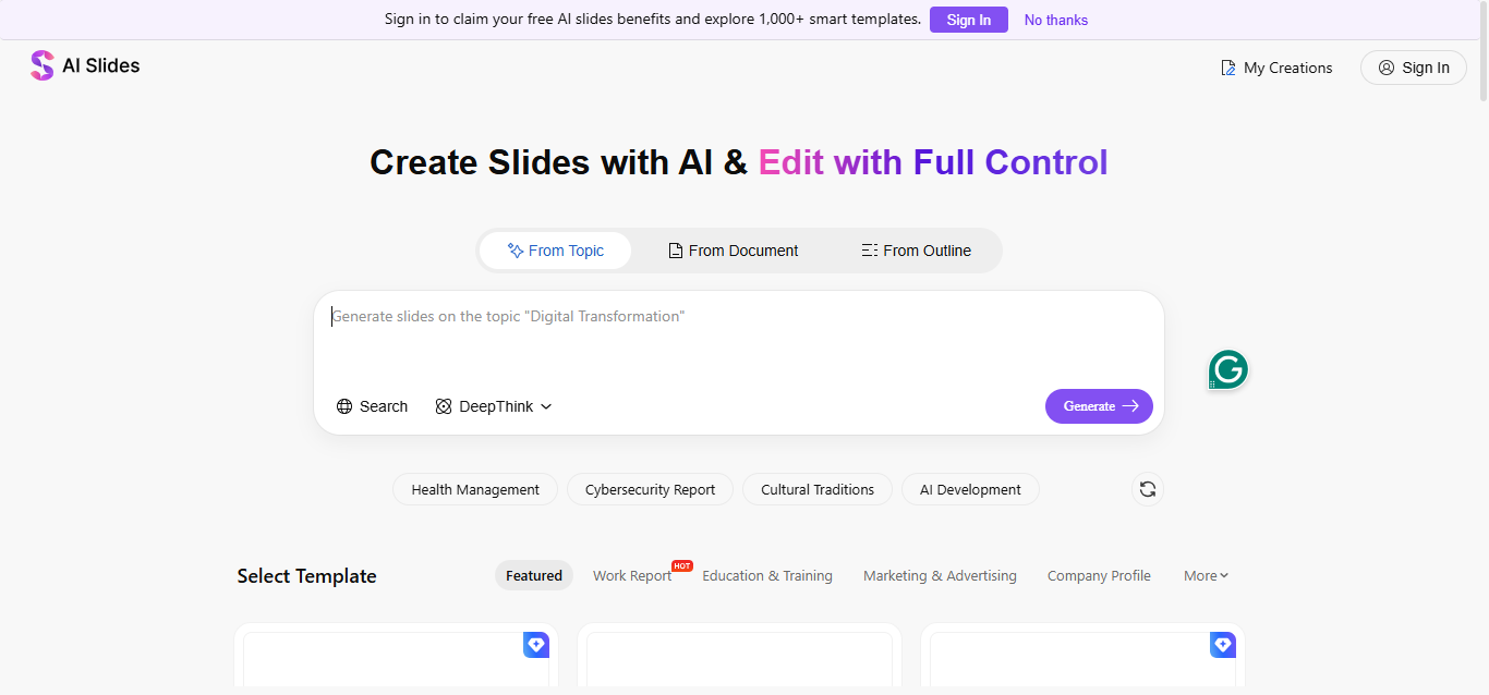
A well-designed template solves many presentation problems before they even happen.
WPS Office includes a large library of presentation templates with consistent typography, balanced layouts, and modern color schemes. Rather than manually aligning every element, I can focus on simplifying my content and tailoring it to my audience. This also makes it much easier to maintain visual consistency across an entire presentation. If you're building investor or sales decks, free pitch deck PPT templates are a strong starting point for cleaner storytelling slides.
Edit Everything Without Starting Over
Presentations almost always change at the last minute.
A manager wants another chart, a client requests different colors, or a teammate asks you to rearrange several slides. WPS makes these edits straightforward because every element remains fully editable. I can quickly adjust layouts, replace images, change fonts, or reorganize slides without rebuilding the presentation from scratch.
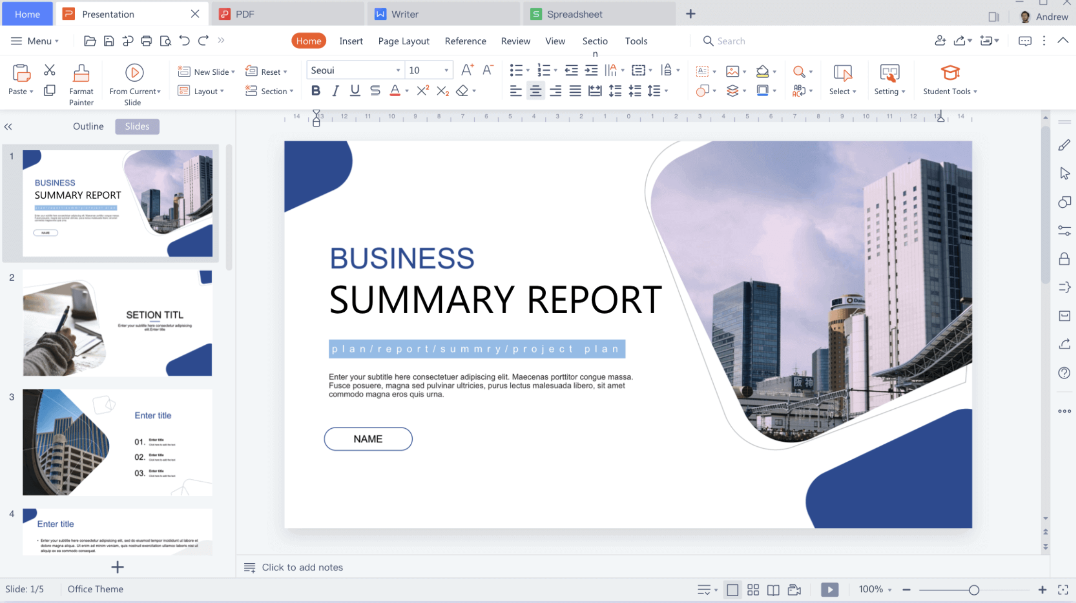
Polish Your Design Faster
Even after the content is finished, small design improvements can make a big difference.
I often use WPS Office to fine-tune spacing, alignment, colors, and visual hierarchy so that each slide feels less crowded. These adjustments only take a few minutes, but they noticeably improve readability and help the audience focus on the most important information. Features like PowerPoint Design Ideas can also suggest cleaner layouts when a slide still feels uneven.
Work Across Multiple File Formats
Presentation projects rarely involve PowerPoint files alone. It's common to receive PDFs, Word documents, spreadsheets, and PowerPoint presentations for the same project. Since WPS Office combines these tools into one office suite, I don't have to switch between multiple applications just to review supporting documents or export the final presentation as a PDF. Keeping everything in one workspace makes the entire workflow much smoother.
When I need to review or lightly edit a deck from the browser, PowerPoint Online is also handy—especially for quick updates without opening the desktop app. And if someone only needs to open a shared file quickly, a free online PPT viewer avoids the install friction while still keeping the conversation moving.
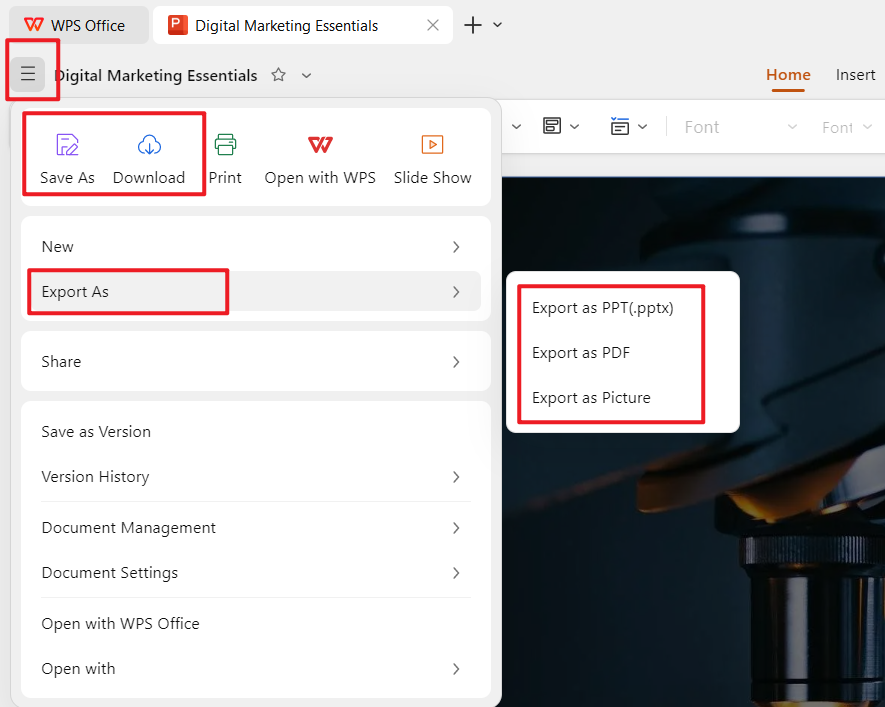
For me, WPS Office isn't simply a tool for making slides—it's where I handle the entire presentation process.
I can brainstorm ideas, generate an outline, build slides with professional templates, make revisions, collaborate with teammates, and export the finished presentation without constantly switching between different applications.
More importantly, it helps me follow the same principles that prevent Death by PowerPoint: keeping slides simple, highlighting one message at a time, and spending less time fighting formatting so I can spend more time improving the story.
FAQ
Where can I watch the original Death by PowerPoint TED Talk?
One of the most popular talks on presentation design is David Phillips' "How to Avoid Death by PowerPoint." You can watch it on TED's official website or YouTube to learn more about cognitive principles behind effective slide design.
What are some popular Death by PowerPoint memes?
Many memes joke about presentations filled with dozens of slides, tiny fonts, unreadable charts, and presenters who read every word aloud. Common formats include the "Slide 73" meme, walls of bullet points, overloaded pie charts, and audiences pretending to stay awake during long meetings. While humorous, these memes reflect real presentation mistakes that many professionals encounter.
What makes good PowerPoint content?
Good presentations focus on one idea per slide, use concise text, maintain a clear visual hierarchy, include meaningful visuals, and support the speaker rather than replacing them. The best slides help audiences understand the message quickly instead of forcing them to read large amounts of information.
Where can I find presentation templates that help avoid Death by PowerPoint?
Many presentation platforms provide professionally designed templates. Choosing clean, well-structured templates can improve consistency, readability, and overall visual appeal. WPS Presentation, for example, includes a wide variety of templates for business, education, and creative presentations that make it easier to build engaging slides.
Can AI help improve PowerPoint presentations?
Yes. AI tools can generate presentation outlines, suggest slide structures, rewrite text, summarize information, and even create complete slide decks based on a topic. They're especially useful for overcoming blank-page syndrome and speeding up the first draft, although reviewing and refining the final presentation is still essential.
Conclusion
Death by PowerPoint isn't caused by PowerPoint itself—it's caused by presentations that ask audiences to read, think, and process too much at once.
The good news is that avoiding it doesn't require advanced design skills. By focusing on one message per slide, reducing unnecessary text, using strong visuals, and telling a clear story, you can make your presentations far more engaging and memorable.
The tools you use can make that process easier, too. For me, WPS Office has become an important part of that workflow. Instead of spending time fixing layouts or jumping between different applications, I can focus on organizing ideas and delivering presentations that are simpler, clearer, and easier for people to follow.
The best presentations aren't the ones with the most slides or the fanciest animations—they're the ones your audience still remembers after the meeting is over.
'%3e%3cpath%20d='M19.9911%204.11386V6.471H18.5894C18.0775%206.471%2017.7322%206.57814%2017.5536%206.79243C17.3751%207.00671%2017.2858%207.32814%2017.2858%207.75671V9.44421H19.9019L19.5536%2012.0871H17.2858V18.8639H14.5536V12.0871H12.2769V9.44421H14.5536V7.49779C14.5536%206.39064%2014.8632%205.53201%2015.4822%204.92189C16.1013%204.31177%2016.9257%204.00671%2017.9554%204.00671C18.8304%204.00671%2019.509%204.04243%2019.9911%204.11386Z'%20fill='%23333333'/%3e%3c/g%3e%3cdefs%3e%3cclipPath%20id='clip0_2938_8199'%3e%3crect%20width='16'%20height='16'%20fill='white'%20transform='translate(8%204.00671)'/%3e%3c/clipPath%3e%3c/defs%3e%3c/svg%3e)
'%3e%3cpath%20d='M17.5237%2010.7813L23.4811%204H22.0699L16.8949%209.88693L12.7648%204H8L14.2469%2012.9029L8%2020.0133H9.4112L14.8725%2013.7952L19.2352%2020.0133H24M9.92053%205.04213H12.0885L22.0688%2019.0224H19.9003'%20fill='%23333333'/%3e%3c/g%3e%3cdefs%3e%3cclipPath%20id='clip0_2938_8200'%3e%3crect%20width='16'%20height='16.0134'%20fill='white'%20transform='translate(8%204)'/%3e%3c/clipPath%3e%3c/defs%3e%3c/svg%3e)


