

'%3e%3cpath%20d='M8%200C12.4183%200%2016%203.58172%2016%208C16%2012.4183%2012.4183%2016%208%2016C3.58172%2016%200%2012.4183%200%208C0%203.58172%203.58172%200%208%200ZM11.6162%204.38379C11.2257%203.99337%2010.5927%203.99338%2010.2021%204.38379L8%206.58594L5.79785%204.38379C5.40732%203.99334%204.77429%203.99329%204.38379%204.38379C3.99331%204.77429%203.99335%205.40733%204.38379%205.79785L6.58594%208L4.38379%2010.2021C3.99348%2010.5927%203.99341%2011.2257%204.38379%2011.6162C4.77426%2012.0066%205.40734%2012.0065%205.79785%2011.6162L8%209.41406L10.2021%2011.6162C10.5927%2012.0066%2011.2257%2012.0067%2011.6162%2011.6162C12.0067%2011.2257%2012.0066%2010.5927%2011.6162%2010.2021L9.41406%208L11.6162%205.79785C12.0066%205.40735%2012.0066%204.77429%2011.6162%204.38379Z'%20fill='%23080E17'%20fill-opacity='0.46'/%3e%3c/g%3e%3cdefs%3e%3cclipPath%20id='clip0_3761_713'%3e%3crect%20width='16'%20height='16'%20fill='white'/%3e%3c/clipPath%3e%3c/defs%3e%3c/svg%3e)



'%3e%3cpath%20fill-rule='evenodd'%20clip-rule='evenodd'%20d='M21.4999%2010.9993C21.4999%205.20009%2016.7986%200.498901%2010.9993%200.498901C5.19994%200.498901%200.498657%205.20009%200.498657%2010.9993C0.498657%2016.2404%204.33858%2020.5844%209.35855%2021.3722V14.0346H6.69238V10.9993H9.35855V8.68594C9.35855%206.05427%2010.9262%204.60062%2013.3248%204.60062C14.4736%204.60062%2015.6753%204.80571%2015.6753%204.80571V7.38979H14.3512C13.0468%207.38979%2012.64%208.19921%2012.64%209.0296V10.9993H15.5523L15.0867%2014.0346H12.64V21.3722C17.66%2020.5844%2021.4999%2016.2404%2021.4999%2010.9993Z'%20fill='%231568EA'/%3e%3c/g%3e%3c/svg%3e)


'%3e%3cpath%20d='M2.42045%2022.1876H6.31818V12.7217L0.75%208.54553V20.5171C0.75%2021.4414%201.49892%2022.1876%202.42045%2022.1876Z'%20fill='%234285F4'/%3e%3cpath%20d='M19.682%2022.1876H23.5797C24.5041%2022.1876%2025.2502%2021.4387%2025.2502%2020.5171V8.54553L19.682%2012.7217'%20fill='%2334A853'/%3e%3cpath%20d='M19.682%205.48293V12.7216L25.2502%208.54543V6.31816C25.2502%204.25236%2022.8921%203.07469%2021.2411%204.31361'%20fill='%23FBBC04'/%3e%3cpath%20d='M6.31824%2012.7217V5.48303L13.0001%2010.4944L19.6819%205.48303V12.7217L13.0001%2017.733'%20fill='%23EA4335'/%3e%3cpath%20d='M0.75%206.31816V8.54543L6.31818%2012.7216V5.48293L4.75909%204.31361C3.10534%203.07469%200.75%204.25236%200.75%206.31816Z'%20fill='%23C5221F'/%3e%3c/g%3e%3cdefs%3e%3cclipPath%20id='clip0_2954_7305'%3e%3crect%20width='24.5'%20height='18.375'%20fill='white'%20transform='translate(0.75%203.8125)'/%3e%3c/clipPath%3e%3c/defs%3e%3c/svg%3e)


How to Change Axis Labels in a Chart: Edit Category Text and Its Source Range
Category axis labels are not typed onto the chart. They come from the range the chart reads, which is why editing the axis in place rarely works and why renaming a month on the chart seems to have no effect. Once you know that the text lives in the worksheet, changing axis labels in a chart becomes a short, predictable task.
This guide separates the two jobs people mix up, then covers the two equivalent ways to change the category text, the specific problems behind placeholder labels such as 1, 2, 3, multi-level categories that collapse, and the symptoms you see when the axis still shows the old text after an edit. Menu names involved in the source-range route are described as steps to verify, since they vary by version and platform.
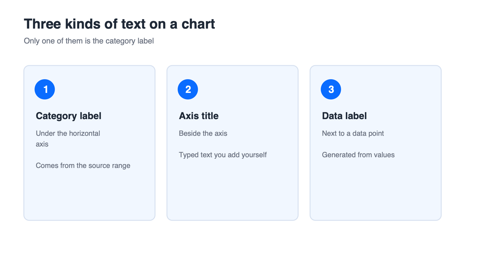
How to Change Axis Labels in a Chart: Edit Category Text and Its Source Range
Change Axis Labels in a Chart: Two Different Jobs
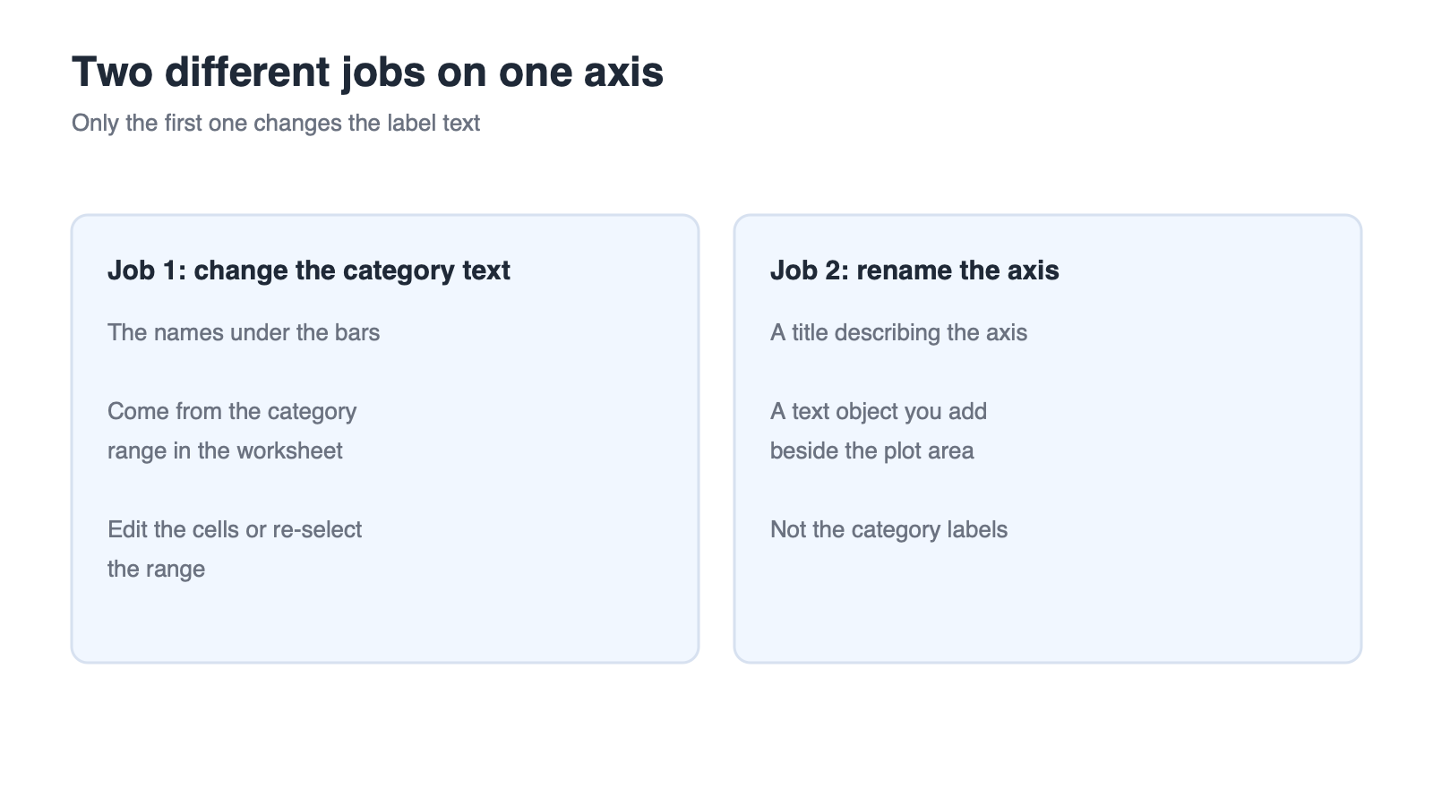
There are two jobs on an axis and only one of them is about the text under the bars. Changing the category text means editing the source range. Renaming the axis means editing the axis title, which is a separate text object. This guide handles the first job only.
Job 1: Change the Category Text
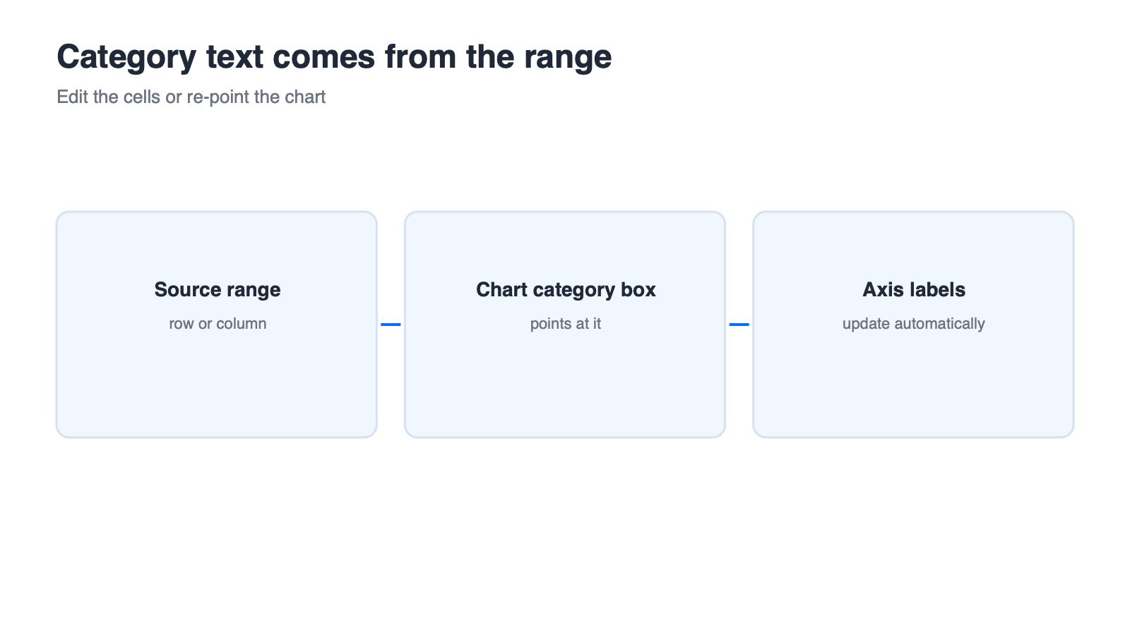
The horizontal axis labels come from the category range: the column or row of names the chart was built from. To turn Jan into January, you edit that range — either in the worksheet, or by pointing the chart at a different range.
Job 2: Rename the Axis (A Different Feature)
An axis title describes what the axis represents, for example Revenue by quarter. It sits outside the plot area and is added or edited independently of the category text. If you need one, start from the existing walkthrough on add Excel axis labels in WPS Office or add axis titles in Excel, then return here for the category text.
What You Need Before Editing
An editable chart, not a picture of a chart pasted onto a slide.
The source range still present in the workbook, with no hidden or filtered columns in the middle of it.
Enough empty cells beside the range to add or rename categories without overwriting data.
Two different jobs on one axis


Edit Category Label Text Through the Source Range
There are two equivalent routes: edit the worksheet cells the chart already points at, or re-select a different range. They produce the same result, but the side effects differ, so pick deliberately.
Path A: Edit the Worksheet Cells
Select the chart so the source range highlights in the worksheet.
Find the category range — the row or column of names behind the horizontal axis.
Type the new names over the old ones; the chart updates as you edit.
This is the fastest route, and the one to prefer when only the wording changes. Its side effect is that the chart keeps following the range, so inserting or deleting rows inside it can shift which labels appear.
Path B: Re-select the Range in the Data Source Dialog
Select the chart and open its chart design or chart tools entry.
Open the chart data source dialog.
Locate the horizontal category axis label field and choose the edit option next to it.
Drag over the new category range and confirm.
Treat the exact command names in this path as steps to verify against the official documentation for your version and platform. The concept — pointing the chart at a category range — is the part that does not change.
Check the Series and Category Boxes Separately
In the same dialog, the series box controls the values and the category box controls the labels. Mixing them up is common in a hurry, and it produces a chart whose numbers look correct but whose labels are drawn from the wrong column.
Verify Before You Publish
Compare the label order left to right with the order of the source rows, and check that each label sits under the value it names. An off-by-one label is easy to spot here and embarrassing anywhere else.
Category range feeding the axis labels
Fix Multi-Level, Missing, and Reversed Category Labels
When the axis shows something other than your names, the symptom tells you which fix to apply. Match the symptom first, then make one change at a time.
Symptom: Labels Show 1, 2, 3
This happens when the category range is empty, contains blank cells, or no longer includes the header row the chart expects. Select the full column or row of names, including any header, and point the category range at it again.
Symptom: Multi-Level Labels Collapse
If your source has two category columns, for example region and month, both have to be included in the category range for the hierarchy to show. Select the block that spans both columns and the rows you need, and confirm the order of the levels reads the way you expect.
Symptom: Categories Are Reversed
Reversed order is an axis setting rather than a label problem. That lives in the axis format options, and the current site already covers the relevant axis options separately; adjust the category order there rather than editing the source rows into a different sequence. If a plain reorder is all you need, changing the source row order is the simplest fix.
Symptom: Duplicate Text Appears Twice
A duplicated label usually means the range includes a merged cell that repeats its value, or that the same column was selected twice. Deselect and re-select the range cleanly.
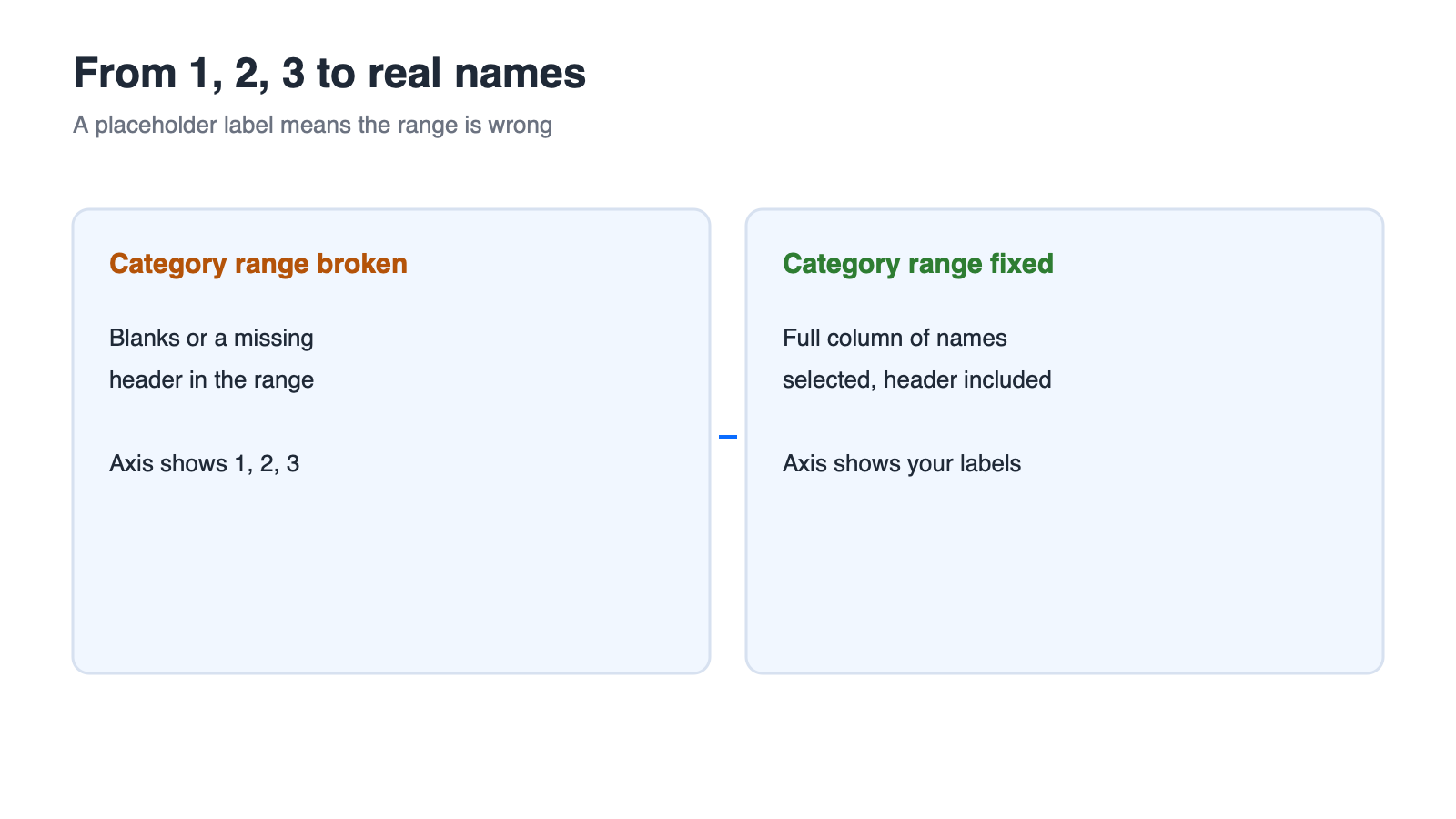
Placeholder labels replaced with category names
Category Labels vs Axis Titles vs Data Labels
Three things on a chart carry text, and they are edited in three different places. Mixing them up is the reason people conclude that an edit "did not work".
The Three-Label Table
| Label | Where it appears | Where the text comes from | How to change it |
|---|---|---|---|
| Category label | Along the horizontal axis | The category range in the worksheet | Edit the cells or re-select the range |
| Axis title | Beside the axis, outside the plot | Typed text you add | Add or edit the axis title object |
| Data label | Next to a data point | The value of that point | Add, remove, rename, or format the label |
Where Each One Gets Its Text
Category labels are dynamic: change the worksheet and the chart follows. Axis titles are static text you type. Data labels are usually generated from values, which is why removing or renaming them is its own workflow — see remove data labels from an Excel chart. The full set of available elements, and how to add them, is covered in how to add chart elements in Excel on Mac, and step-by-step label work is shown in how to add axis labels in Excel. This article stays on the first row of the table.
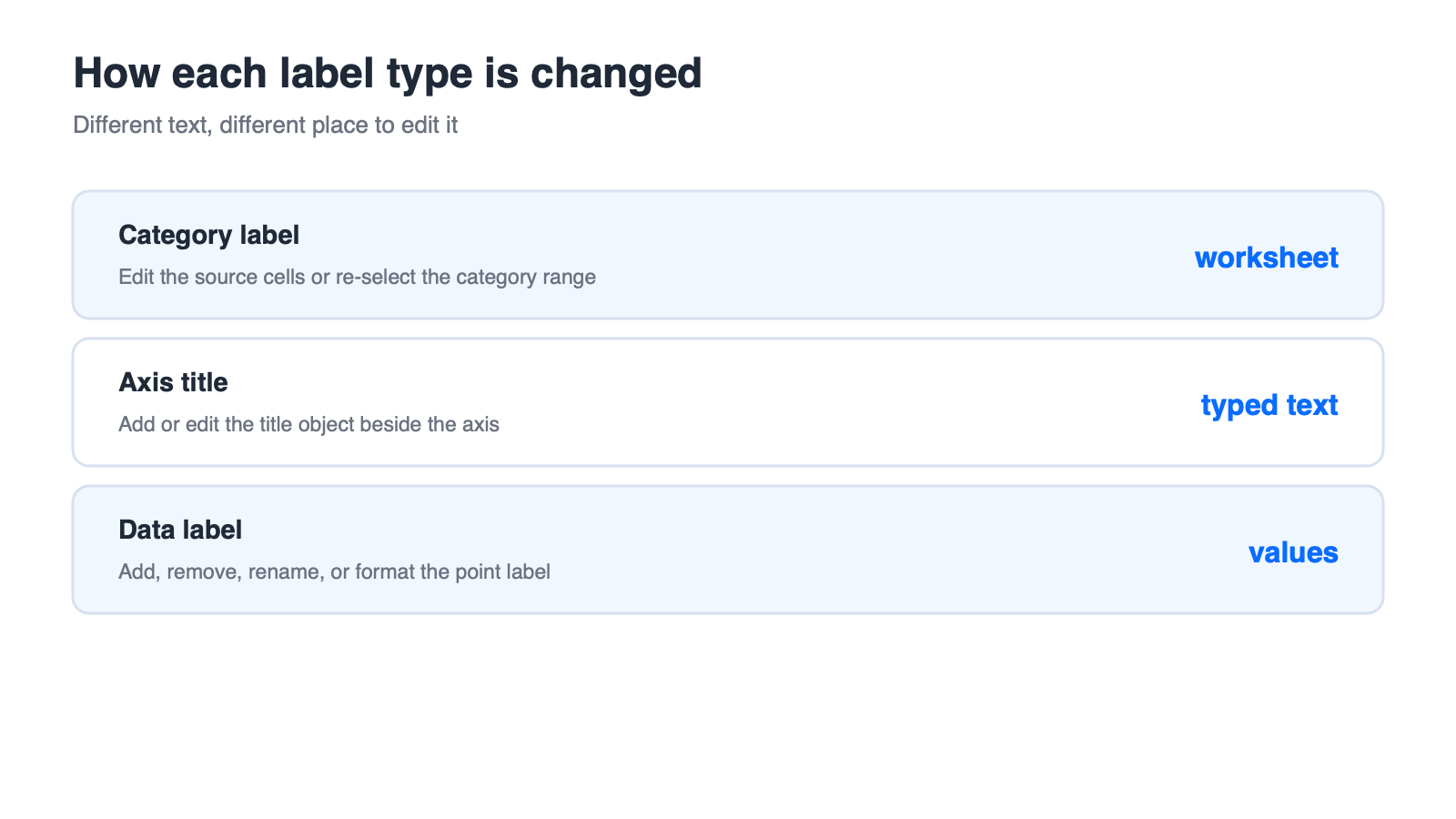
Editing each chart label type
WPS Spreadsheet: Editing Category Ranges in a Chart
Category ranges are a chart concept rather than a product-specific trick, so the same task chain applies when the workbook is open in WPS Spreadsheet.
Open the Chart Data Source Dialog
Select the chart and open its data source settings from the chart tools. You are looking for the same two boxes you use elsewhere: one for the series values and one for the horizontal category labels.
Re-select the Category Range
Open the edit option beside the horizontal category label field.
Select the worksheet range that holds your category names.
Confirm and check the axis labels update.
What Still Needs Verification
Treat the exact menu labels as items to verify against the official documentation for your version, along with whether multi-level category ranges are supported the same way in every chart type. If a step looks different on screen, the concept to look for is the entry that redefines the category range, not a specific button name. WPS Office is available as a free download at wps.com if you want to test the same workbook on another machine.
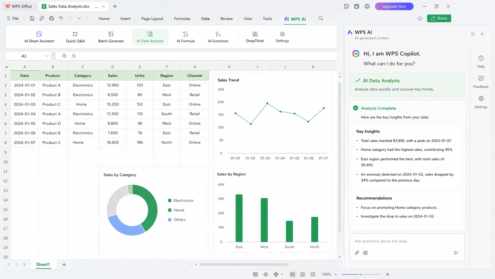
WPS Spreadsheet insights panel overview
When the Axis Still Shows Old Labels
You changed something and the axis disagrees. These four branches cover almost every case, and each one points at a different layer of the file.
Symptom: Nothing Changed
You probably edited the axis title box rather than the category range, or the chart is a pasted picture. Select the chart and confirm it is a live object with an editable source range.
Symptom: Only Some Labels Changed
Multi-series charts can carry more than one category setup. Open the data source dialog and check each series entry rather than assuming the first one is the only one.
Symptom: Labels Revert After Reopening
The edit was made in a copy, in a shared location you do not own, or in a file that was closed without saving. Reopen the file you actually saved and compare.
Symptom: Print Output Differs
Rotated or truncated labels behave differently on paper, and a print area that cuts the chart will hide labels that are visible on screen. Check the print preview rather than the screen view before you conclude the labels are wrong.
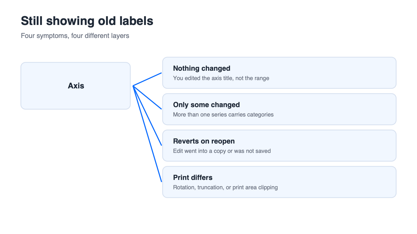
Four reasons old axis labels remain
FAQs
Can I type category labels directly on the axis instead of in the data?
Not as normal labels. Category text is read from the source range. If you need fixed wording that no longer follows the data, replace the category range with a range of typed values.
How do I stop the axis from showing 1, 2, 3 instead of my names?
The category range is empty or incomplete. Select the full column or row that holds your names, including the header, and point the horizontal category label field at it again.
Can I format the category labels as dates or currency?
Yes, but that is display formatting rather than a label text change. Apply the number format to the axis labels and check that the underlying values in the worksheet are unchanged.
Do these steps work in WPS Spreadsheet?
The concept is the same, because category labels always come from the chart source range. Confirm the exact menu names in the official documentation for the version you are running.
Why do my labels appear in the wrong order?
Either the source rows are in another order, or the axis is set to plot categories in reverse. Check the worksheet order first, then the axis options for the reverse setting.



'%3e%3cpath%20d='M19.9911%204.11386V6.471H18.5894C18.0775%206.471%2017.7322%206.57814%2017.5536%206.79243C17.3751%207.00671%2017.2858%207.32814%2017.2858%207.75671V9.44421H19.9019L19.5536%2012.0871H17.2858V18.8639H14.5536V12.0871H12.2769V9.44421H14.5536V7.49779C14.5536%206.39064%2014.8632%205.53201%2015.4822%204.92189C16.1013%204.31177%2016.9257%204.00671%2017.9554%204.00671C18.8304%204.00671%2019.509%204.04243%2019.9911%204.11386Z'%20fill='%23333333'/%3e%3c/g%3e%3cdefs%3e%3cclipPath%20id='clip0_2938_8199'%3e%3crect%20width='16'%20height='16'%20fill='white'%20transform='translate(8%204.00671)'/%3e%3c/clipPath%3e%3c/defs%3e%3c/svg%3e)
'%3e%3cpath%20d='M17.5237%2010.7813L23.4811%204H22.0699L16.8949%209.88693L12.7648%204H8L14.2469%2012.9029L8%2020.0133H9.4112L14.8725%2013.7952L19.2352%2020.0133H24M9.92053%205.04213H12.0885L22.0688%2019.0224H19.9003'%20fill='%23333333'/%3e%3c/g%3e%3cdefs%3e%3cclipPath%20id='clip0_2938_8200'%3e%3crect%20width='16'%20height='16.0134'%20fill='white'%20transform='translate(8%204)'/%3e%3c/clipPath%3e%3c/defs%3e%3c/svg%3e)


